Probabilistic Sensitivity Analysis
Why uncertainty in parameters demands a distribution, not a point estimate
R for HTA (Basics) — Workshop 2026
RRC-HTA, AIIMS Bhopal | HTAIn, DHR
Why Probabilistic Sensitivity Analysis?
When you submit a cost-effectiveness model to NICE, CADTH, or India’s NITI Aayog, you make implicit claims:
“This transition probability is 0.10. This cost is ₹45,000. This utility weight is 0.72.”
But are they really?
- Clinical trials have limited sample sizes
- Cost data come from specific regions and time periods
- Utility estimates vary across populations
The question decision-makers now demand:
If true parameters vary within plausible ranges, does your recommendation change? How confident are you really?
Point Estimates vs Distributions
Old approach (still common in Excel): - One transition probability: 0.10 - One cost: ₹45,000 - One result: ICER ₹80,000/QALY
Modern approach (PSA): - Transition probability drawn from Beta(α, β) - Cost drawn from Gamma(shape, rate) - Run model 5,000 times → distribution of ICERs
Gain: Not just “the ICER is ₹80,000” but “there is 85% probability the intervention is cost-effective at ₹1,70,000/QALY”
The PSA Workflow
Which Distribution for Which Parameter?
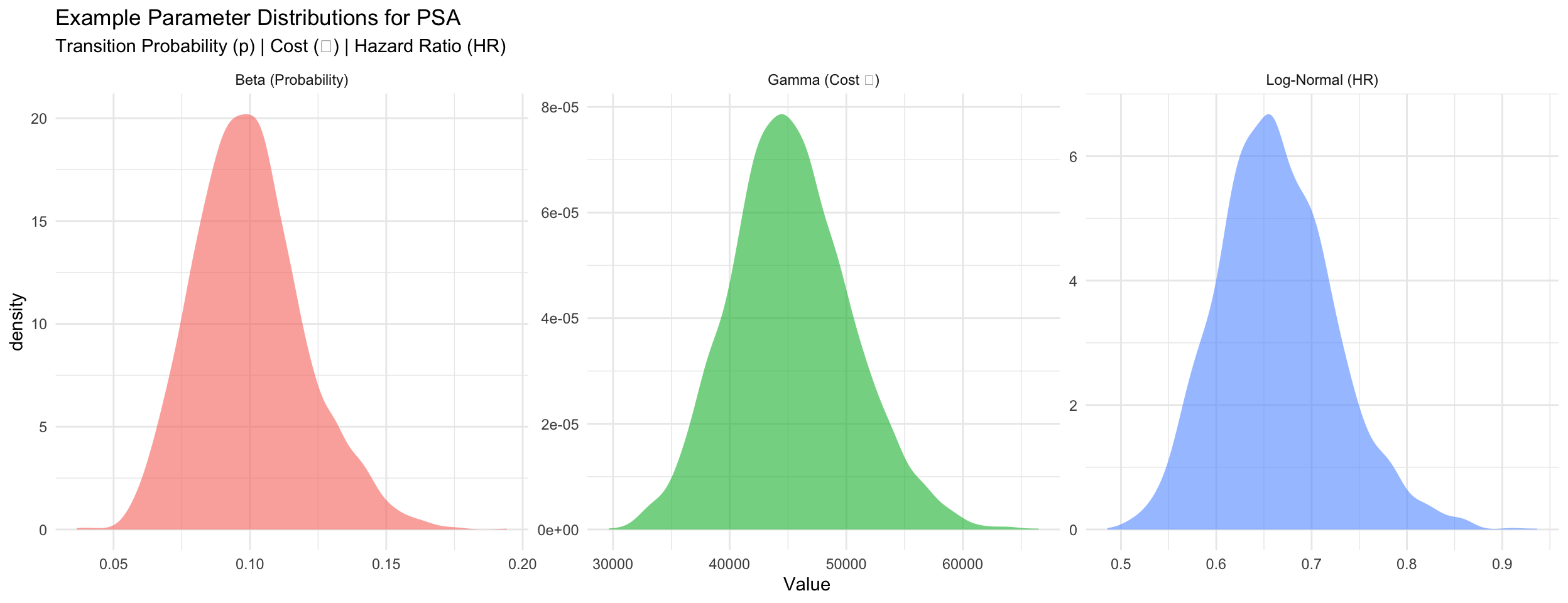
Beta Distribution for Probabilities
When: Transition probabilities, event rates (bounded 0–1)
Convert from mean and SE: \[\alpha = \mu \left(\frac{\mu(1-\mu)}{\sigma^2} - 1\right), \quad \beta = (1-\mu) \left(\frac{\mu(1-\mu)}{\sigma^2} - 1\right)\]
Gamma Distribution for Costs
When: Annual costs (non-negative, right-skewed)
Convert from mean and SE: \[\text{shape} = \frac{\mu^2}{\sigma^2}, \quad \text{rate} = \frac{\mu}{\sigma^2}\]
Log-Normal Distribution for Hazard Ratios
When: Hazard ratios, relative risks (positive, usually < 1)
Convert from point estimate and 95% CI: \[\text{SE}_{\log(\text{HR})} = \frac{\log(\text{upper}) - \log(\text{lower})}{3.92}\]
Example: Parameter Distributions
The PSA Loop (Pseudocode)
for (i in 1:5000) {
  # Sample parameters from distributions
  p_12_sampled <- rbeta(1, alpha_12, beta_12)
  cost_moderate_sampled <- rgamma(1, shape_m, rate_m)
  hr_sampled <- rlnorm(1, log_hr_mean, log_hr_se)
  # ... sample all other parameters ...

  # Run model with these sampled values
  result <- run_markov(p_12_sampled, cost_moderate_sampled, hr_sampled, ...)

  # Store outcomes
  results_df[i, "inc_cost"] <- result$inc_cost
  results_df[i, "inc_qaly"] <- result$inc_qaly
  results_df[i, "inc_nmb"]  <- wtp * result$inc_qaly - result$inc_cost
}
Outcome: 5,000 rows of inc_cost, inc_qaly, and incremental NMB.
Why NMB, not ICER? A few iterations with near-zero ΔQALYs produce extreme ICERs that distort the average. NMB has no such problem.
Cost-Effectiveness Plane Explained
The CE plane plots all 5,000 PSA iterations as points: - X-axis: Incremental QALYs (treatment gained) - Y-axis: Incremental cost (₹)
Four quadrants: - Bottom-right (SE): DOMINANT (better + cheaper) - Top-right (NE): Cost-effective if below WTP line - Top-left (NW): DOMINATED (worse + costlier) - Bottom-left (SW): Trade-off (cheaper but worse)
Red dashed line = WTP threshold (₹1,70,000/QALY in India)
Points below the line are cost-effective; above are not.
Cost-Effectiveness Acceptability Curve (CEAC)
Question answered by CEAC:
“Across different willingness-to-pay thresholds, what is the probability the intervention is cost-effective?”
Method: For each WTP threshold, calculate using NMB:
\[\text{Prob}_{\text{CE}} = \frac{\text{# iterations with } \Delta\text{NMB} > 0}{\text{total iterations}}\]
where ΔNMB = WTP × ΔQALYs − ΔCost (equivalent to ICER < WTP but works in all quadrants)
Reading the CEAC: - At ₹0/QALY threshold: 0% (almost never cost-effective) - At ₹1,70,000/QALY: 85% (highly likely) - At ₹5,00,000/QALY: >95% (very confident)
This directly answers decision-makers’ uncertainty.
PSA in Excel vs R
Excel approach: - Create 5,000 rows of random numbers for each parameter - Use VLOOKUP or INDEX/MATCH to match to distributions - Copy model formula down 5,000 times - Hope formatting doesn’t break…
R approach:
Advantages of R: - Transparent and reproducible - Far fewer manual steps - Easy to modify or re-run - Direct integration with visualization
Key Takeaways: PSA
PSA answers uncertainty: Not just “what is the ICER?” but “given parameter uncertainty, what is the probability the intervention is cost-effective?”
Choose distributions carefully: Beta for probabilities, Gamma for costs, Log-Normal for relative effects
Parameterize correctly: Converting mean/SE to shape parameters is critical (and error-prone in Excel)
Interpret results properly:
- CE plane shows scatter of outcomes
- CEAC shows decision robustness across WTP thresholds
This is now the standard: NICE, CADTH, NITI Aayog all require PSA in submissions
Next: Session 7 — Using Generative AI for HTA coding (AI as your R assistant)
R for HTA (Basics) — RRC-HTA, AIIMS Bhopal