A chronological journey through the charts, maps, and dashboards that saved millions of lives — with a special focus on India
Teaching resource for medical students
Why This Matters
Data visualization is not just about making pretty charts. In public health, the right graph at the right time has ended epidemics, reshaped government policy, exposed injustice, and saved millions of lives. From John Snow’s 1854 cholera map to the COVID-19 dashboards you watched in real time, data visualization has been a secret weapon of medicine.
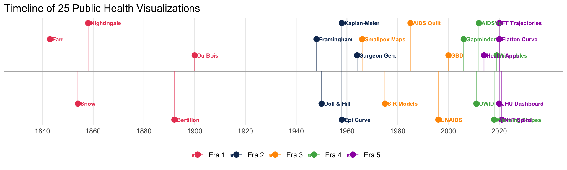
This site walks you through 25 landmark visualizations — organized into five historical eras — plus a dedicated India Focus section with 7 additional visualizations from Indian public health. Each includes interactive R recreations and embedded originals where possible.
---title: ""---::: {.hero-banner}# 25 Visualizations That Changed Public Health**A chronological journey through the charts, maps, and dashboards that saved millions of lives — with a special focus on India***Teaching resource for medical students*:::## Why This MattersData visualization is not just about making pretty charts. In public health, the right graph at the right time has ended epidemics, reshaped government policy, exposed injustice, and saved millions of lives. From John Snow's 1854 cholera map to the COVID-19 dashboards you watched in real time, data visualization has been a secret weapon of medicine.This site walks you through **25 landmark visualizations** — organized into five historical eras — plus a dedicated **India Focus** section with 7 additional visualizations from Indian public health. Each includes interactive R recreations and embedded originals where possible.## The Five Eras::: {.era-grid}::: {.era-grid-item}### [Era 1: Foundations of Epidemiology](era1-foundations.qmd)**1843 – 1900**::: {.count}5:::visualizations including Snow, Nightingale, and Farr:::::: {.era-grid-item}### [Era 2: Chronic Disease Epidemiology](era2-chronic-disease.qmd)**1948 – 1964**::: {.count}5:::visualizations including Framingham, Doll & Hill, and the Kaplan-Meier curve:::::: {.era-grid-item}### [Era 3: Global Health Campaigns](era3-global-campaigns.qmd)**1958 – 2000s**::: {.count}5:::visualizations including smallpox eradication, epi curves, and HIV/AIDS:::::: {.era-grid-item}### [Era 4: The Data Revolution](era4-data-revolution.qmd)**2006 – 2019**::: {.count}5:::visualizations including Gapminder, GBD, Our World in Data, and warming stripes:::::: {.era-grid-item}### [Era 5: COVID-19 & The Modern Era](era5-covid-modern.qmd)**2020 – present**::: {.count}5:::visualizations including Flatten the Curve, JHU Dashboard, and health wearables:::::: {.era-grid-item}### [🇮🇳 India Focus](india-public-health.qmd)**1995 – present**::: {.count}7:::visualizations including Polio eradication, Kerala Model, COVID19India.org, Nipah, NFHS, and IDSP::::::## How to Use This Site- **Browse by era** using the navigation bar above- **Click "Show R Code"** to see how each visualization was recreated- **Embedded links** take you to the original interactive dashboards- **Discussion prompts** at the end of each section encourage critical thinking## Quick Timeline```{r}#| fig-height: 3#| fig-width: 10#| code-fold: truelibrary(ggplot2)timeline <-data.frame(year =c(1843, 1854, 1858, 1892, 1900,1948, 1950, 1958, 1958, 1964,1966, 1975, 1985, 1996, 2000,2006, 2011, 2012, 2018, 2019,2020, 2020, 2020, 2021, 2014),label =c("Farr", "Snow", "Nightingale", "Bertillon", "Du Bois","Framingham", "Doll & Hill", "Kaplan-Meier", "Epi Curve", "Surgeon Gen.","Smallpox Maps", "SIR Models", "AIDS Quilt", "UNAIDS", "GBD","Gapminder", "OWID", "AIDSVu", "Warming Stripes", "Wearables","Flatten Curve", "JHU Dashboard", "FT Trajectories", "NYT Spiral", "Health Apps"),era =c(rep("Era 1", 5), rep("Era 2", 5), rep("Era 3", 5), rep("Era 4", 5), rep("Era 5", 5)),y =rep(c(1, -1, 1.5, -1.5, 0.5), 5))era_colours <-c("Era 1"="#e94560", "Era 2"="#0f3460","Era 3"="#ff9800", "Era 4"="#4caf50", "Era 5"="#9c27b0")ggplot(timeline, aes(x = year, y = y, colour = era)) +geom_hline(yintercept =0, linewidth =0.8, colour ="grey70") +geom_segment(aes(xend = year, yend =0), linewidth =0.4, alpha =0.6) +geom_point(size =3) +geom_text(aes(label = label), size =2.5, hjust =0, nudge_x =1, fontface ="bold") +scale_colour_manual(values = era_colours, name ="") +scale_x_continuous(breaks =seq(1840, 2030, 20), limits =c(1835, 2035)) +theme_minimal(base_size =11) +theme(axis.text.y =element_blank(),axis.title =element_blank(),panel.grid.minor =element_blank(),panel.grid.major.y =element_blank(),legend.position ="bottom" ) +labs(title ="Timeline of 25 Public Health Visualizations")```