The COVID-19 pandemic was the first crisis in history where data visualization was itself a public health intervention. “Flatten the Curve” changed behaviour, the Johns Hopkins dashboard became the world’s most-watched chart, and the Financial Times’ trajectory graphs set a new standard for communicating uncertainty. This era proved that visualization literacy is a matter of life and death.
21. The “Flatten the Curve” Graphic (2020)
The Story
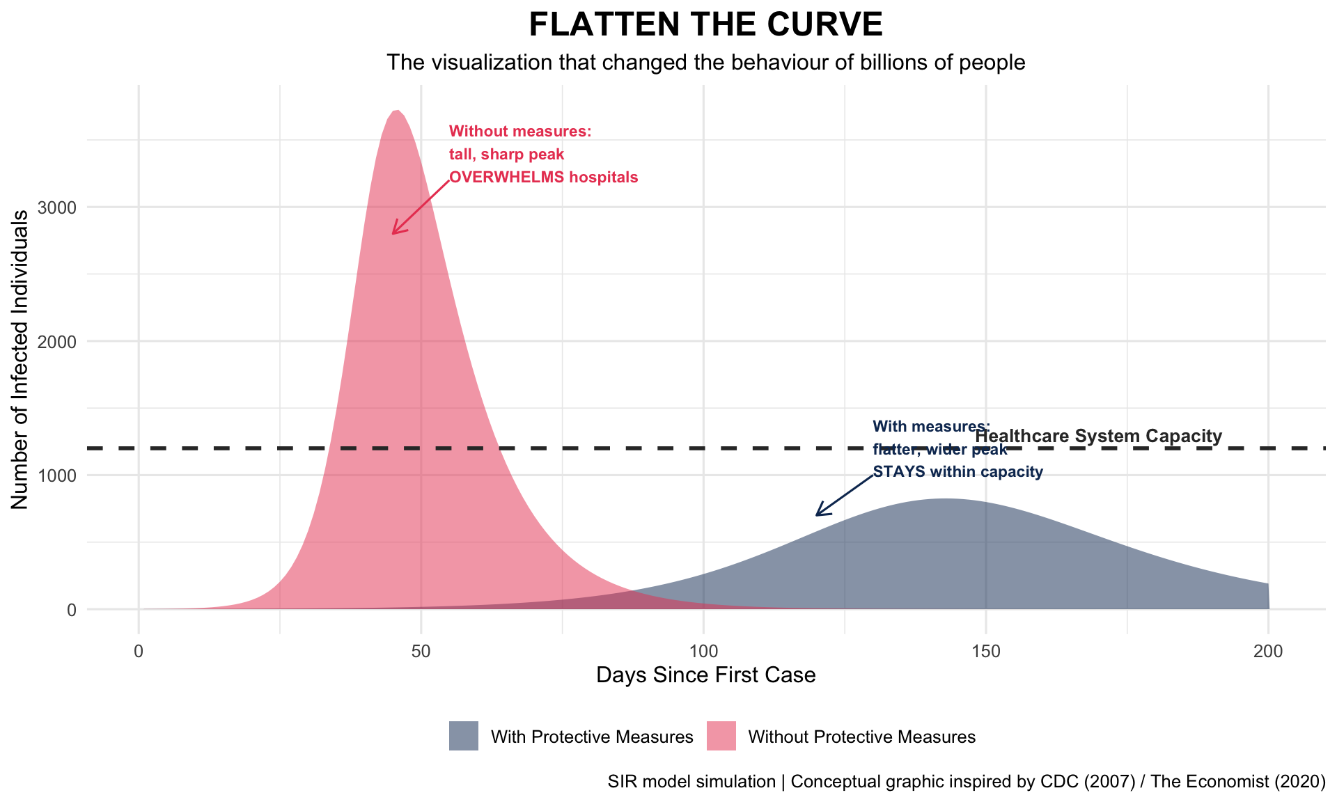
Originally based on a 2007 CDC conceptual graphic, “Flatten the Curve” became the most influential public health visualization of the 21st century when redrawn by The Economist’s Rosamund Pearce in February 2020. The Washington Post’s animated version by Harry Stevens became the most-viewed page in the paper’s history.
2020Conceptual InfographicPandemic Communication
R Recreation Using SIR Model
Show R Code
# SIR model to demonstrate "flatten the curve"sir <-function(beta, gamma, S0, I0, R0, days) { N <- S0 + I0 + R0 S <- I <- R <-numeric(days) S[1] <- S0; I[1] <- I0; R[1] <- R0for (t in2:days) { dS <--beta * S[t-1] * I[t-1] / N dI <- beta * S[t-1] * I[t-1] / N - gamma * I[t-1] dR <- gamma * I[t-1] S[t] <-max(0, S[t-1] + dS) I[t] <-max(0, I[t-1] + dI) R[t] <-max(0, R[t-1] + dR) }data.frame(day =1:days, Infected = I)}# No intervention vs. social distancingno_action <-sir(beta =0.35, gamma =0.1, S0 =9999, I0 =1, R0 =0, days =200)no_action$scenario <-"Without Protective Measures"with_action <-sir(beta =0.16, gamma =0.1, S0 =9999, I0 =1, R0 =0, days =200)with_action$scenario <-"With Protective Measures"flatten_data <-bind_rows(no_action, with_action)hospital_capacity <-1200# Illustrativeggplot(flatten_data, aes(x = day, y = Infected, fill = scenario)) +geom_area(alpha =0.5, position ="identity") +geom_hline(yintercept = hospital_capacity, linetype ="dashed",colour ="#333333", linewidth =1) +annotate("text", x =170, y = hospital_capacity +100,label ="Healthcare System Capacity", fontface ="bold",size =3.5, colour ="#333333") +annotate("segment", x =55, y =3200, xend =45, yend =2800,arrow =arrow(length =unit(0.3, "cm")), colour ="#e94560") +annotate("text", x =55, y =3400, label ="Without measures:\ntall, sharp peak\nOVERWHELMS hospitals",size =3, colour ="#e94560", fontface ="bold", hjust =0) +annotate("segment", x =130, y =1000, xend =120, yend =700,arrow =arrow(length =unit(0.3, "cm")), colour ="#0f3460") +annotate("text", x =130, y =1200, label ="With measures:\nflatter, wider peak\nSTAYS within capacity",size =3, colour ="#0f3460", fontface ="bold", hjust =0) +scale_fill_manual(values =c("Without Protective Measures"="#e94560","With Protective Measures"="#0f3460")) +labs(title ="FLATTEN THE CURVE",subtitle ="The visualization that changed the behaviour of billions of people",x ="Days Since First Case", y ="Number of Infected Individuals",fill ="",caption ="SIR model simulation | Conceptual graphic inspired by CDC (2007) / The Economist (2020)" ) +theme_minimal(base_size =12) +theme(plot.title =element_text(face ="bold", size =18, hjust =0.5),plot.subtitle =element_text(hjust =0.5),legend.position ="bottom" )
Key Insight for Students: “Flatten the Curve” is probably the most successful public health communication in history. It translated a complex epidemiological concept (reducing R effective) into a simple visual that billions of people understood. But it was also conceptual, not based on real data — and some critics argued it oversimplified the trade-offs involved. Great visualization can simplify; the question is whether it simplifies enough or too much.
22. Johns Hopkins COVID-19 Dashboard (2020)
The Story
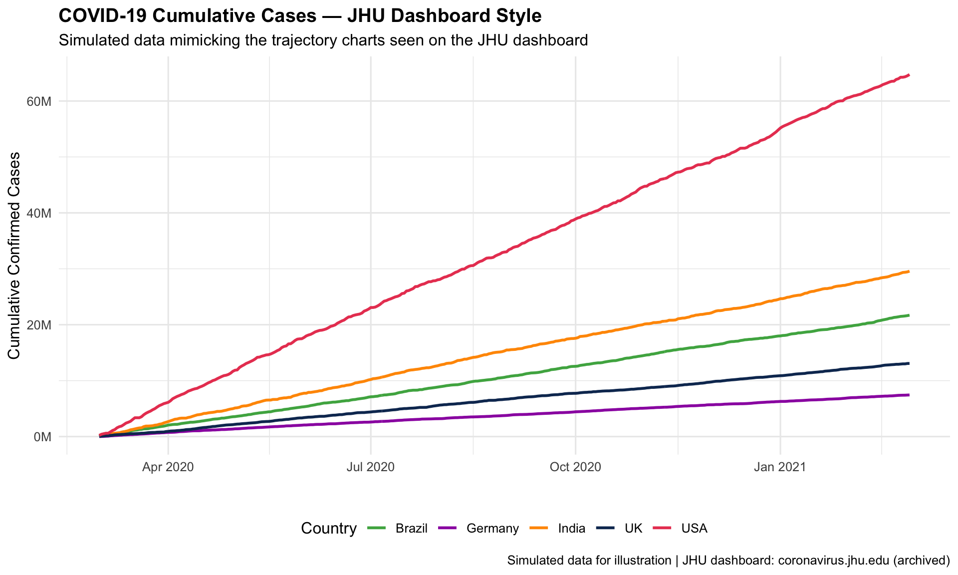
Created by Lauren Gardner and her team at the Johns Hopkins Center for Systems Science and Engineering, the COVID-19 dashboard became the most-viewed data visualization in history. It aggregated real-time case data from hundreds of sources and was watched by billions, including heads of state.
2020Real-Time DashboardPandemic Surveillance
Simulated Dashboard View
Show R Code
# Simulated cumulative COVID-19-style data for select countriesset.seed(2020)days <-1:365covid_sim <-data.frame(day =rep(days, 5),country =rep(c("USA", "Brazil", "India", "UK", "Germany"), each =365),cases =c(cumsum(pmax(0, round(rnorm(365, 180000, 80000)))),cumsum(pmax(0, round(rnorm(365, 60000, 30000)))),cumsum(pmax(0, round(rnorm(365, 80000, 50000)))),cumsum(pmax(0, round(rnorm(365, 35000, 20000)))),cumsum(pmax(0, round(rnorm(365, 20000, 12000)))) )) %>%mutate(date =as.Date("2020-03-01") + day -1)ggplot(covid_sim, aes(x = date, y = cases /1e6, colour = country)) +geom_line(linewidth =1) +scale_y_continuous(labels =function(x) paste0(x, "M")) +scale_colour_manual(values =c("USA"="#e94560", "Brazil"="#4caf50","India"="#ff9800", "UK"="#0f3460","Germany"="#9c27b0")) +labs(title ="COVID-19 Cumulative Cases — JHU Dashboard Style",subtitle ="Simulated data mimicking the trajectory charts seen on the JHU dashboard",x ="", y ="Cumulative Confirmed Cases", colour ="Country",caption ="Simulated data for illustration | JHU dashboard: coronavirus.jhu.edu (archived)" ) +theme_minimal(base_size =12) +theme(plot.title =element_text(face ="bold"), legend.position ="bottom")
Key Insight for Students: The JHU dashboard demonstrated both the power and peril of real-time data. It kept the world informed, but the constant updating of case counts also contributed to information fatigue and anxiety. In your career, you’ll face the same tension: how much data transparency is too much? When does surveillance become surveillance stress?
23. John Burn-Murdoch’s FT Trajectory Charts (2020)
The Story
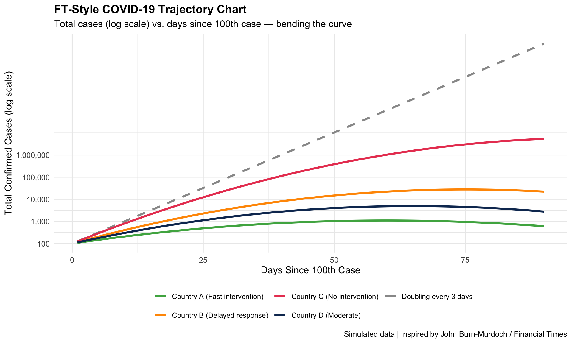
John Burn-Murdoch at the Financial Times created the defining analytical charts of the pandemic: log-scale trajectory plots comparing countries from the day they hit 100 cases. These charts let readers see — at a glance — which countries were bending the curve and which weren’t.
2020Log-Scale TrajectoriesCountry Comparison
R Recreation
Show R Code
# Simulated trajectory data (days since 100th case)set.seed(42)days_since_100 <-1:90trajectories <-data.frame(day =rep(days_since_100, 5),country =rep(c("Country A (Fast intervention)","Country B (Delayed response)","Country C (No intervention)","Country D (Moderate)","Doubling every 3 days"), each =90),cases =c(100*exp(0.08* days_since_100 * (1- days_since_100/120)), # Fast flatten100*exp(0.15* days_since_100 * (1- days_since_100/150)), # Delayed100*exp(0.22* days_since_100 * (1- days_since_100/200)), # No action100*exp(0.12* days_since_100 * (1- days_since_100/130)), # Moderate100*2^(days_since_100/3) # Reference line ))ggplot(trajectories, aes(x = day, y = cases, colour = country)) +geom_line(aes(linetype =ifelse(country =="Doubling every 3 days", "dashed", "solid")),linewidth =1.2) +scale_y_log10(labels = scales::comma,breaks =c(100, 1000, 10000, 100000, 1000000)) +scale_linetype_identity() +scale_colour_manual(values =c("Country A (Fast intervention)"="#4caf50","Country B (Delayed response)"="#ff9800","Country C (No intervention)"="#e94560","Country D (Moderate)"="#0f3460","Doubling every 3 days"="grey60" )) +labs(title ="FT-Style COVID-19 Trajectory Chart",subtitle ="Total cases (log scale) vs. days since 100th case — bending the curve",x ="Days Since 100th Case", y ="Total Confirmed Cases (log scale)",colour ="",caption ="Simulated data | Inspired by John Burn-Murdoch / Financial Times" ) +theme_minimal(base_size =12) +theme(plot.title =element_text(face ="bold"),legend.position ="bottom",legend.text =element_text(size =9) ) +guides(colour =guide_legend(nrow =2))
Key Insight for Students: The FT charts used three key design choices that made them brilliant: (1) log scale to show exponential growth intuitively, (2) aligning countries by “days since 100th case” rather than calendar date, and (3) a reference line showing unchecked doubling. These are techniques you can use whenever you need to compare trajectories — of disease outbreaks, treatment responses, or health system performance.
24. The NYT COVID-19 Spiral Graph (2021)
The Story
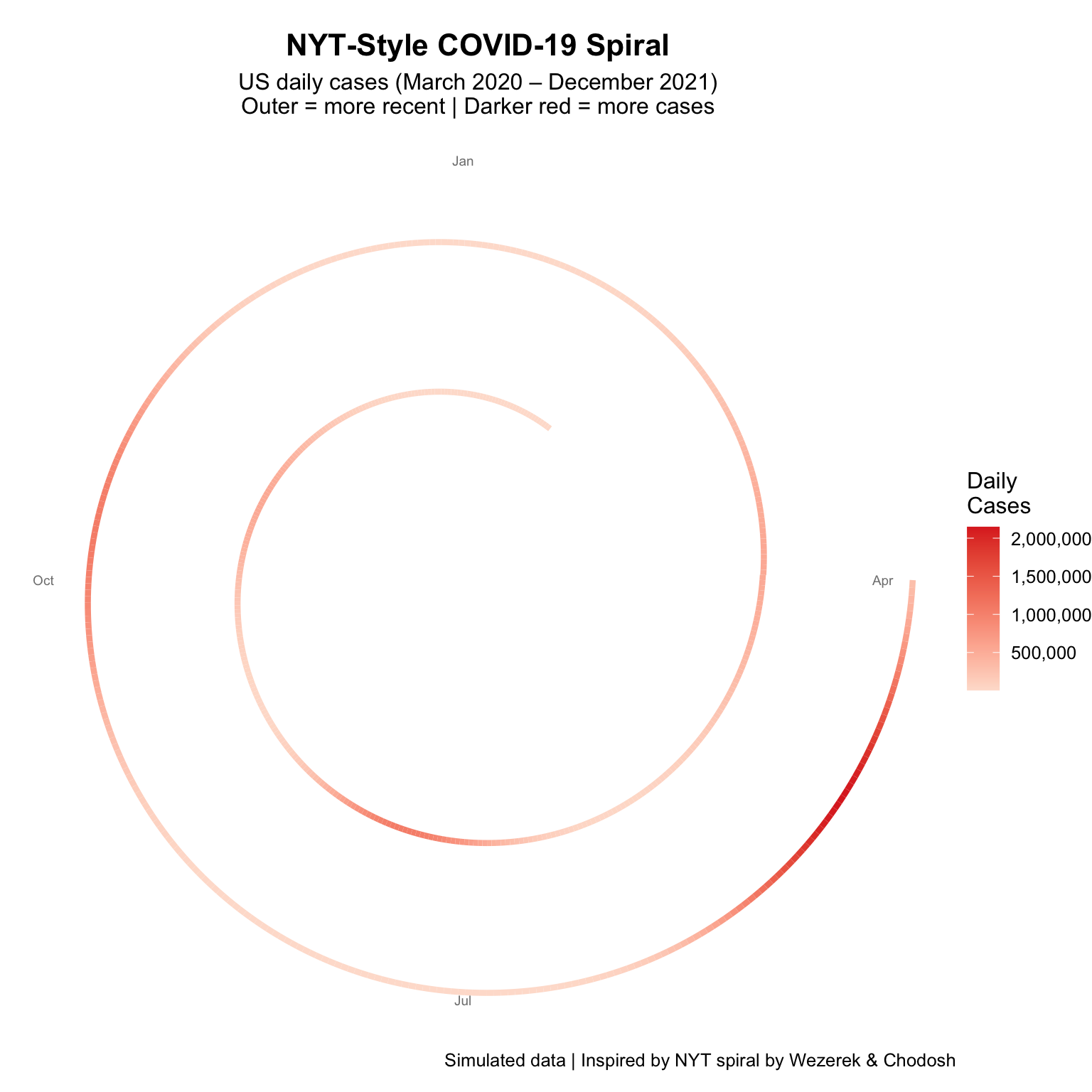
The New York Times published a controversial spiral graph of US COVID-19 cases that went viral — attracting both praise for its visual impact and criticism from data visualization experts who argued it was hard to read precisely. It sparked an important debate about aesthetics vs. accuracy in health communication.
2021Spiral ChartVisualization Debate
R Recreation
Show R Code
# Simulated US daily COVID cases over 2 years (2020-2021)set.seed(2021)dates <-seq(as.Date("2020-03-01"), as.Date("2021-12-31"), by ="day")n <-length(dates)# Create wave patternst <-1:nwave1 <-40000*dnorm(t, 100, 20) * nwave2 <-60000*dnorm(t, 200, 15) * nwave3 <-50000*dnorm(t, 310, 25) * nwave4 <-80000*dnorm(t, 480, 20) * nwave5 <-120000*dnorm(t, 640, 15) * ndaily_cases <-pmax(5000, wave1 + wave2 + wave3 + wave4 + wave5 +rnorm(n, 0, 3000))spiral_data <-data.frame(date = dates,day_of_year =as.numeric(format(dates, "%j")),year_frac =as.numeric(dates -as.Date("2020-01-01")) /365.25,cases = daily_cases)# Convert to polar coordinates for spiralspiral_data <- spiral_data %>%mutate(angle =2* pi * (day_of_year /365),radius = year_frac,x = (1+ radius) *cos(angle),y = (1+ radius) *sin(angle) )ggplot(spiral_data, aes(x = x, y = y, colour = cases)) +geom_path(linewidth =1.5) +scale_colour_gradient(low ="#fee0d2", high ="#de2d26",labels = scales::comma, name ="Daily\nCases") +# Add month labelsannotate("text", x =0, y =2.8, label ="Jan", size =2.5, colour ="grey50") +annotate("text", x =2.8, y =0, label ="Apr", size =2.5, colour ="grey50") +annotate("text", x =0, y =-2.8, label ="Jul", size =2.5, colour ="grey50") +annotate("text", x =-2.8, y =0, label ="Oct", size =2.5, colour ="grey50") +coord_equal() +labs(title ="NYT-Style COVID-19 Spiral",subtitle ="US daily cases (March 2020 – December 2021)\nOuter = more recent | Darker red = more cases",caption ="Simulated data | Inspired by NYT spiral by Wezerek & Chodosh" ) +theme_void(base_size =12) +theme(plot.title =element_text(face ="bold", hjust =0.5, size =16),plot.subtitle =element_text(hjust =0.5),legend.position ="right" )
Key Insight for Students: The spiral graph debate illustrates a core tension in health communication: attention vs. accuracy. The spiral was eye-catching and showed seasonality beautifully, but was hard to read precisely. The standard line chart is more precise but less attention-grabbing. In public health, sometimes you need to grab attention first, then follow up with precision. Know your audience and your goal.
25. The GBD Smoking–Cancer Burden Visualizations
The Story
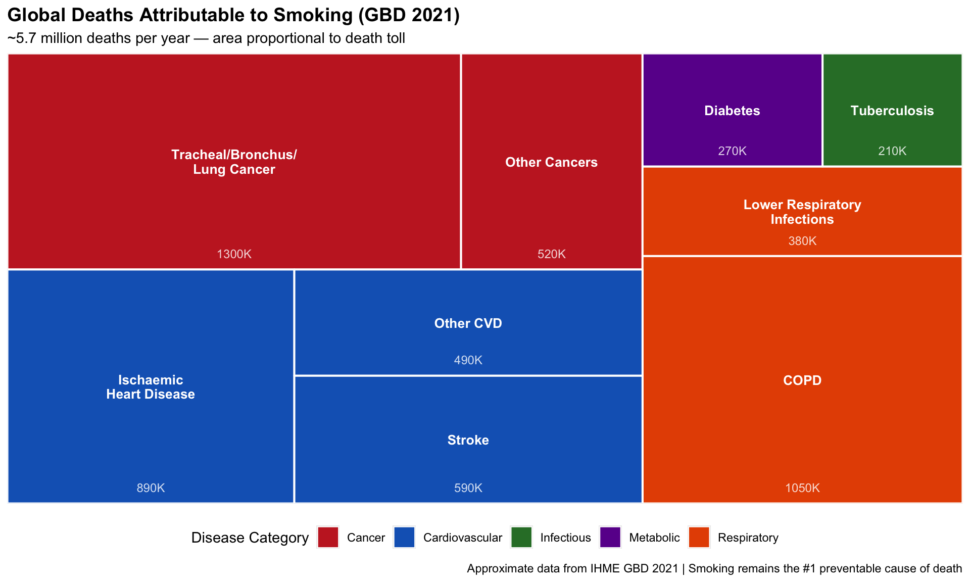
The Global Burden of Disease Study’s visualizations of smoking-attributable disease represent the culmination of the data story that began with Doll & Hill in 1950. Modern GBD treemaps and heatmaps now quantify, with unprecedented precision, the toll of tobacco across 204 countries and dozens of diseases.
OngoingTreemap / HeatmapTobacco Policy
R Recreation: Global Smoking Burden Treemap
Show R Code
if (!requireNamespace("treemapify", quietly =TRUE)) {install.packages("treemapify", repos ="https://cloud.r-project.org")}library(treemapify)# Approximate GBD 2021 smoking-attributable deaths by causesmoking_burden <-data.frame(cause =c("Tracheal/Bronchus/\nLung Cancer", "COPD", "Ischaemic\nHeart Disease","Stroke", "Other Cancers", "Lower Respiratory\nInfections","Diabetes", "Tuberculosis", "Other CVD"),deaths_thousands =c(1300, 1050, 890, 590, 520, 380, 270, 210, 490),category =c("Cancer", "Respiratory", "Cardiovascular", "Cardiovascular","Cancer", "Respiratory", "Metabolic", "Infectious", "Cardiovascular"))ggplot(smoking_burden, aes(area = deaths_thousands, fill = category, label = cause,subgroup = category)) +geom_treemap(colour ="white", size =2) +geom_treemap_text(colour ="white", place ="centre", size =10, fontface ="bold",min.size =4) +geom_treemap_text(aes(label =paste0(deaths_thousands, "K")),colour ="white", place ="bottom", size =9, alpha =0.8,padding.y = grid::unit(3, "mm")) +scale_fill_manual(values =c("Cancer"="#c62828", "Respiratory"="#e65100","Cardiovascular"="#1565c0", "Metabolic"="#6a1b9a","Infectious"="#2e7d32")) +labs(title ="Global Deaths Attributable to Smoking (GBD 2021)",subtitle ="~5.7 million deaths per year — area proportional to death toll",fill ="Disease Category",caption ="Approximate data from IHME GBD 2021 | Smoking remains the #1 preventable cause of death" ) +theme(plot.title =element_text(face ="bold", size =14),legend.position ="bottom" )
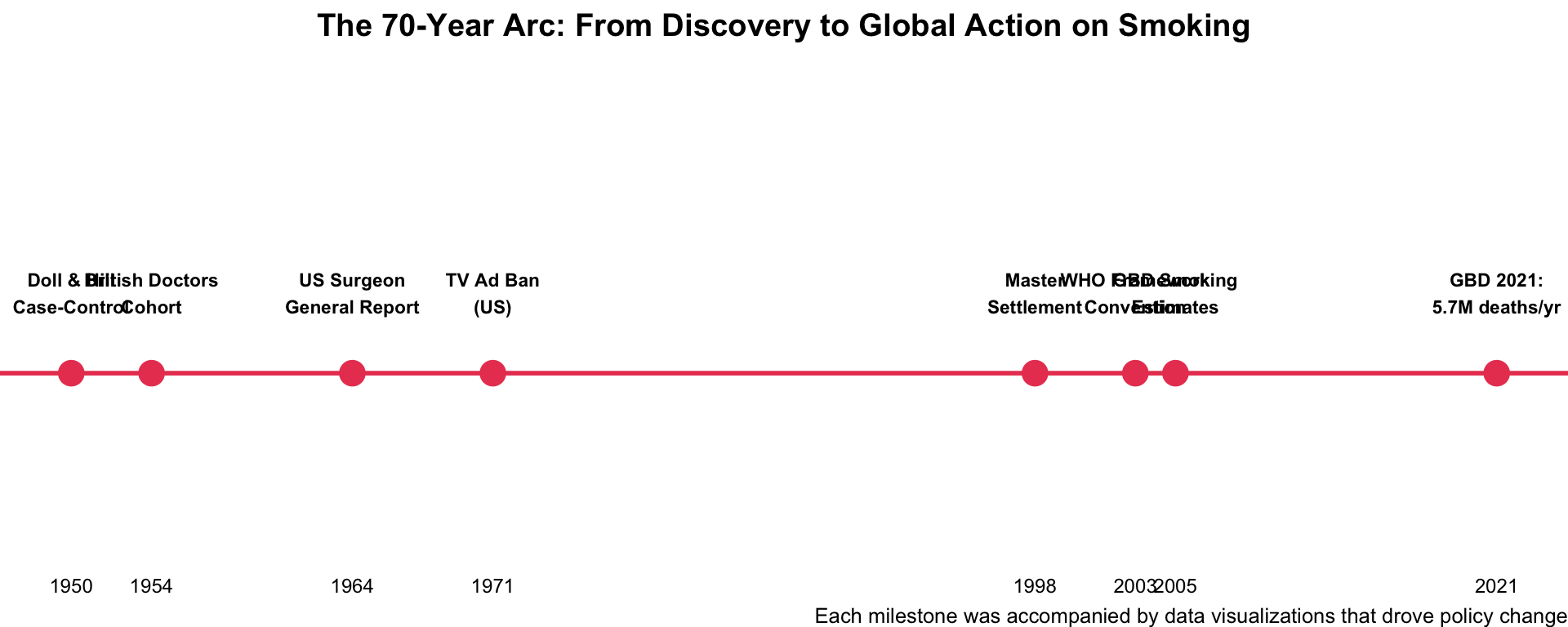
The Arc: From Doll & Hill to GBD
Show R Code
# The journey from discovery to global burden quantificationtobacco_timeline <-data.frame(year =c(1950, 1954, 1964, 1971, 1998, 2003, 2005, 2021),event =c("Doll & Hill\nCase-Control", "British Doctors\nCohort", "US Surgeon\nGeneral Report","TV Ad Ban\n(US)", "Master\nSettlement", "WHO Framework\nConvention","GBD Smoking\nEstimates", "GBD 2021:\n5.7M deaths/yr"),y =c(1, 1, 1, 1, 1, 1, 1, 1))ggplot(tobacco_timeline, aes(x = year, y = y)) +geom_hline(yintercept =1, colour ="#e94560", linewidth =1) +geom_point(size =5, colour ="#e94560") +geom_text(aes(label = event), vjust =-1.5, size =3, fontface ="bold") +scale_x_continuous(breaks = tobacco_timeline$year) +scale_y_continuous(limits =c(0.3, 2.2)) +labs(title ="The 70-Year Arc: From Discovery to Global Action on Smoking",caption ="Each milestone was accompanied by data visualizations that drove policy change" ) +theme_void(base_size =12) +theme(plot.title =element_text(face ="bold", hjust =0.5),axis.text.x =element_text(size =9) )
Key Insight for Students: This is the full arc of a public health data story. It took 70 years from Doll & Hill’s first graph to the precise GBD quantification of 5.7 million annual deaths. Each step along the way, data visualization was the bridge between research and action. As future physicians, you are inheritors of this tradition — and the next chapter may be written about vaping, ultra-processed food, or climate change.
Discussion Questions for Era 5
Flatten the Curve: Did this visualization save lives or oversimplify the pandemic? Could it have been improved?
Dashboard fatigue: Did constant exposure to COVID dashboards help or harm public understanding? How do you balance transparency with cognitive overload?
Visualization as persuasion: The spiral graph was controversial. When is it OK for a health visualization to prioritize emotional impact over precision?
Looking ahead: What will the next “visualization that changed public health” be about? AI diagnostics? Antimicrobial resistance? Climate-health? Mental health?
Final Reflection
The Common Thread
Every visualization on this site shares three qualities:
It made the invisible visible — whether cholera in water, disease in soldiers, or an epidemic’s trajectory
It moved people to action — changing laws, funding campaigns, and altering individual behaviour
It combined data with narrative — the numbers alone weren’t enough; the way they were shown mattered
As future physicians, you will both consume and create health data visualizations. You will read Kaplan-Meier curves in journals, encounter warming stripes in policy debates, and explain wearable data to worried patients. Visual literacy is clinical literacy.
The history of public health visualization is ultimately a story of compassion: people who cared enough about human suffering to find a way to make the data speak.
Source Code
---title: "Era 5: COVID-19 & The Modern Era (2020–present)"subtitle: "When the whole world watched the same charts"---```{r}#| include: falselibrary(ggplot2)library(dplyr)library(tidyr)```::: {.era-card}The COVID-19 pandemic was the first crisis in history where **data visualization was itself a public health intervention**. "Flatten the Curve" changed behaviour, the Johns Hopkins dashboard became the world's most-watched chart, and the Financial Times' trajectory graphs set a new standard for communicating uncertainty. This era proved that visualization literacy is a matter of life and death.:::---## 21. The "Flatten the Curve" Graphic (2020) {#flattenthecurve}::: {.viz-box}### The StoryOriginally based on a 2007 CDC conceptual graphic, "Flatten the Curve" became the most influential public health visualization of the 21st century when redrawn by The Economist's Rosamund Pearce in February 2020. The Washington Post's animated version by Harry Stevens became the most-viewed page in the paper's history.::: {.viz-meta}[2020]{.timeline-marker}[Conceptual Infographic]{style="background:#e8eaf6;padding:0.2rem 0.7rem;border-radius:15px;font-size:0.85rem;"}[Pandemic Communication]{style="background:#e8eaf6;padding:0.2rem 0.7rem;border-radius:15px;font-size:0.85rem;"}:::### R Recreation Using SIR Model```{r}#| fig-height: 6#| fig-width: 10# SIR model to demonstrate "flatten the curve"sir <-function(beta, gamma, S0, I0, R0, days) { N <- S0 + I0 + R0 S <- I <- R <-numeric(days) S[1] <- S0; I[1] <- I0; R[1] <- R0for (t in2:days) { dS <--beta * S[t-1] * I[t-1] / N dI <- beta * S[t-1] * I[t-1] / N - gamma * I[t-1] dR <- gamma * I[t-1] S[t] <-max(0, S[t-1] + dS) I[t] <-max(0, I[t-1] + dI) R[t] <-max(0, R[t-1] + dR) }data.frame(day =1:days, Infected = I)}# No intervention vs. social distancingno_action <-sir(beta =0.35, gamma =0.1, S0 =9999, I0 =1, R0 =0, days =200)no_action$scenario <-"Without Protective Measures"with_action <-sir(beta =0.16, gamma =0.1, S0 =9999, I0 =1, R0 =0, days =200)with_action$scenario <-"With Protective Measures"flatten_data <-bind_rows(no_action, with_action)hospital_capacity <-1200# Illustrativeggplot(flatten_data, aes(x = day, y = Infected, fill = scenario)) +geom_area(alpha =0.5, position ="identity") +geom_hline(yintercept = hospital_capacity, linetype ="dashed",colour ="#333333", linewidth =1) +annotate("text", x =170, y = hospital_capacity +100,label ="Healthcare System Capacity", fontface ="bold",size =3.5, colour ="#333333") +annotate("segment", x =55, y =3200, xend =45, yend =2800,arrow =arrow(length =unit(0.3, "cm")), colour ="#e94560") +annotate("text", x =55, y =3400, label ="Without measures:\ntall, sharp peak\nOVERWHELMS hospitals",size =3, colour ="#e94560", fontface ="bold", hjust =0) +annotate("segment", x =130, y =1000, xend =120, yend =700,arrow =arrow(length =unit(0.3, "cm")), colour ="#0f3460") +annotate("text", x =130, y =1200, label ="With measures:\nflatter, wider peak\nSTAYS within capacity",size =3, colour ="#0f3460", fontface ="bold", hjust =0) +scale_fill_manual(values =c("Without Protective Measures"="#e94560","With Protective Measures"="#0f3460")) +labs(title ="FLATTEN THE CURVE",subtitle ="The visualization that changed the behaviour of billions of people",x ="Days Since First Case", y ="Number of Infected Individuals",fill ="",caption ="SIR model simulation | Conceptual graphic inspired by CDC (2007) / The Economist (2020)" ) +theme_minimal(base_size =12) +theme(plot.title =element_text(face ="bold", size =18, hjust =0.5),plot.subtitle =element_text(hjust =0.5),legend.position ="bottom" )```::: {.callout-insight}**Key Insight for Students:** "Flatten the Curve" is probably the most successful public health communication in history. It translated a complex epidemiological concept (reducing R effective) into a simple visual that billions of people understood. But it was also *conceptual*, not based on real data — and some critics argued it oversimplified the trade-offs involved. Great visualization can simplify; the question is whether it simplifies *enough* or *too much*.::::::---## 22. Johns Hopkins COVID-19 Dashboard (2020) {#jhu}::: {.viz-box}### The StoryCreated by Lauren Gardner and her team at the Johns Hopkins Center for Systems Science and Engineering, the COVID-19 dashboard became the most-viewed data visualization in history. It aggregated real-time case data from hundreds of sources and was watched by billions, including heads of state.::: {.viz-meta}[2020]{.timeline-marker}[Real-Time Dashboard]{style="background:#e8eaf6;padding:0.2rem 0.7rem;border-radius:15px;font-size:0.85rem;"}[Pandemic Surveillance]{style="background:#e8eaf6;padding:0.2rem 0.7rem;border-radius:15px;font-size:0.85rem;"}:::### Simulated Dashboard View```{r}#| fig-height: 6#| fig-width: 10# Simulated cumulative COVID-19-style data for select countriesset.seed(2020)days <-1:365covid_sim <-data.frame(day =rep(days, 5),country =rep(c("USA", "Brazil", "India", "UK", "Germany"), each =365),cases =c(cumsum(pmax(0, round(rnorm(365, 180000, 80000)))),cumsum(pmax(0, round(rnorm(365, 60000, 30000)))),cumsum(pmax(0, round(rnorm(365, 80000, 50000)))),cumsum(pmax(0, round(rnorm(365, 35000, 20000)))),cumsum(pmax(0, round(rnorm(365, 20000, 12000)))) )) %>%mutate(date =as.Date("2020-03-01") + day -1)ggplot(covid_sim, aes(x = date, y = cases /1e6, colour = country)) +geom_line(linewidth =1) +scale_y_continuous(labels =function(x) paste0(x, "M")) +scale_colour_manual(values =c("USA"="#e94560", "Brazil"="#4caf50","India"="#ff9800", "UK"="#0f3460","Germany"="#9c27b0")) +labs(title ="COVID-19 Cumulative Cases — JHU Dashboard Style",subtitle ="Simulated data mimicking the trajectory charts seen on the JHU dashboard",x ="", y ="Cumulative Confirmed Cases", colour ="Country",caption ="Simulated data for illustration | JHU dashboard: coronavirus.jhu.edu (archived)" ) +theme_minimal(base_size =12) +theme(plot.title =element_text(face ="bold"), legend.position ="bottom")```### The Original (Archived)🔗 **[JHU COVID-19 Dashboard (archived) →](https://coronavirus.jhu.edu/map.html)**🔗 **[WHO COVID-19 Dashboard (current) →](https://data.who.int/dashboards/covid19/)**::: {.callout-insight}**Key Insight for Students:** The JHU dashboard demonstrated both the power and peril of real-time data. It kept the world informed, but the constant updating of case counts also contributed to **information fatigue** and **anxiety**. In your career, you'll face the same tension: how much data transparency is too much? When does surveillance become surveillance *stress*?::::::---## 23. John Burn-Murdoch's FT Trajectory Charts (2020) {#ft}::: {.viz-box}### The StoryJohn Burn-Murdoch at the Financial Times created the defining analytical charts of the pandemic: log-scale trajectory plots comparing countries from the day they hit 100 cases. These charts let readers see — at a glance — which countries were bending the curve and which weren't.::: {.viz-meta}[2020]{.timeline-marker}[Log-Scale Trajectories]{style="background:#e8eaf6;padding:0.2rem 0.7rem;border-radius:15px;font-size:0.85rem;"}[Country Comparison]{style="background:#e8eaf6;padding:0.2rem 0.7rem;border-radius:15px;font-size:0.85rem;"}:::### R Recreation```{r}#| fig-height: 6#| fig-width: 10# Simulated trajectory data (days since 100th case)set.seed(42)days_since_100 <-1:90trajectories <-data.frame(day =rep(days_since_100, 5),country =rep(c("Country A (Fast intervention)","Country B (Delayed response)","Country C (No intervention)","Country D (Moderate)","Doubling every 3 days"), each =90),cases =c(100*exp(0.08* days_since_100 * (1- days_since_100/120)), # Fast flatten100*exp(0.15* days_since_100 * (1- days_since_100/150)), # Delayed100*exp(0.22* days_since_100 * (1- days_since_100/200)), # No action100*exp(0.12* days_since_100 * (1- days_since_100/130)), # Moderate100*2^(days_since_100/3) # Reference line ))ggplot(trajectories, aes(x = day, y = cases, colour = country)) +geom_line(aes(linetype =ifelse(country =="Doubling every 3 days", "dashed", "solid")),linewidth =1.2) +scale_y_log10(labels = scales::comma,breaks =c(100, 1000, 10000, 100000, 1000000)) +scale_linetype_identity() +scale_colour_manual(values =c("Country A (Fast intervention)"="#4caf50","Country B (Delayed response)"="#ff9800","Country C (No intervention)"="#e94560","Country D (Moderate)"="#0f3460","Doubling every 3 days"="grey60" )) +labs(title ="FT-Style COVID-19 Trajectory Chart",subtitle ="Total cases (log scale) vs. days since 100th case — bending the curve",x ="Days Since 100th Case", y ="Total Confirmed Cases (log scale)",colour ="",caption ="Simulated data | Inspired by John Burn-Murdoch / Financial Times" ) +theme_minimal(base_size =12) +theme(plot.title =element_text(face ="bold"),legend.position ="bottom",legend.text =element_text(size =9) ) +guides(colour =guide_legend(nrow =2))```::: {.callout-insight}**Key Insight for Students:** The FT charts used **three key design choices** that made them brilliant: (1) log scale to show exponential growth intuitively, (2) aligning countries by "days since 100th case" rather than calendar date, and (3) a reference line showing unchecked doubling. These are techniques you can use whenever you need to compare trajectories — of disease outbreaks, treatment responses, or health system performance.::::::---## 24. The NYT COVID-19 Spiral Graph (2021) {#spiral}::: {.viz-box}### The StoryThe New York Times published a controversial spiral graph of US COVID-19 cases that went viral — attracting both praise for its visual impact and criticism from data visualization experts who argued it was hard to read precisely. It sparked an important debate about **aesthetics vs. accuracy** in health communication.::: {.viz-meta}[2021]{.timeline-marker}[Spiral Chart]{style="background:#e8eaf6;padding:0.2rem 0.7rem;border-radius:15px;font-size:0.85rem;"}[Visualization Debate]{style="background:#e8eaf6;padding:0.2rem 0.7rem;border-radius:15px;font-size:0.85rem;"}:::### R Recreation```{r}#| fig-height: 8#| fig-width: 8# Simulated US daily COVID cases over 2 years (2020-2021)set.seed(2021)dates <-seq(as.Date("2020-03-01"), as.Date("2021-12-31"), by ="day")n <-length(dates)# Create wave patternst <-1:nwave1 <-40000*dnorm(t, 100, 20) * nwave2 <-60000*dnorm(t, 200, 15) * nwave3 <-50000*dnorm(t, 310, 25) * nwave4 <-80000*dnorm(t, 480, 20) * nwave5 <-120000*dnorm(t, 640, 15) * ndaily_cases <-pmax(5000, wave1 + wave2 + wave3 + wave4 + wave5 +rnorm(n, 0, 3000))spiral_data <-data.frame(date = dates,day_of_year =as.numeric(format(dates, "%j")),year_frac =as.numeric(dates -as.Date("2020-01-01")) /365.25,cases = daily_cases)# Convert to polar coordinates for spiralspiral_data <- spiral_data %>%mutate(angle =2* pi * (day_of_year /365),radius = year_frac,x = (1+ radius) *cos(angle),y = (1+ radius) *sin(angle) )ggplot(spiral_data, aes(x = x, y = y, colour = cases)) +geom_path(linewidth =1.5) +scale_colour_gradient(low ="#fee0d2", high ="#de2d26",labels = scales::comma, name ="Daily\nCases") +# Add month labelsannotate("text", x =0, y =2.8, label ="Jan", size =2.5, colour ="grey50") +annotate("text", x =2.8, y =0, label ="Apr", size =2.5, colour ="grey50") +annotate("text", x =0, y =-2.8, label ="Jul", size =2.5, colour ="grey50") +annotate("text", x =-2.8, y =0, label ="Oct", size =2.5, colour ="grey50") +coord_equal() +labs(title ="NYT-Style COVID-19 Spiral",subtitle ="US daily cases (March 2020 – December 2021)\nOuter = more recent | Darker red = more cases",caption ="Simulated data | Inspired by NYT spiral by Wezerek & Chodosh" ) +theme_void(base_size =12) +theme(plot.title =element_text(face ="bold", hjust =0.5, size =16),plot.subtitle =element_text(hjust =0.5),legend.position ="right" )```::: {.callout-insight}**Key Insight for Students:** The spiral graph debate illustrates a core tension in health communication: **attention vs. accuracy**. The spiral was eye-catching and showed seasonality beautifully, but was hard to read precisely. The standard line chart is more precise but less attention-grabbing. In public health, sometimes you need to **grab attention first**, then follow up with precision. Know your audience and your goal.::::::---## 25. The GBD Smoking–Cancer Burden Visualizations {#smokingburden}::: {.viz-box}### The StoryThe Global Burden of Disease Study's visualizations of smoking-attributable disease represent the culmination of the data story that began with Doll & Hill in 1950. Modern GBD treemaps and heatmaps now quantify, with unprecedented precision, the toll of tobacco across 204 countries and dozens of diseases.::: {.viz-meta}[Ongoing]{.timeline-marker}[Treemap / Heatmap]{style="background:#e8eaf6;padding:0.2rem 0.7rem;border-radius:15px;font-size:0.85rem;"}[Tobacco Policy]{style="background:#e8eaf6;padding:0.2rem 0.7rem;border-radius:15px;font-size:0.85rem;"}:::### R Recreation: Global Smoking Burden Treemap```{r}#| fig-height: 6#| fig-width: 10if (!requireNamespace("treemapify", quietly =TRUE)) {install.packages("treemapify", repos ="https://cloud.r-project.org")}library(treemapify)# Approximate GBD 2021 smoking-attributable deaths by causesmoking_burden <-data.frame(cause =c("Tracheal/Bronchus/\nLung Cancer", "COPD", "Ischaemic\nHeart Disease","Stroke", "Other Cancers", "Lower Respiratory\nInfections","Diabetes", "Tuberculosis", "Other CVD"),deaths_thousands =c(1300, 1050, 890, 590, 520, 380, 270, 210, 490),category =c("Cancer", "Respiratory", "Cardiovascular", "Cardiovascular","Cancer", "Respiratory", "Metabolic", "Infectious", "Cardiovascular"))ggplot(smoking_burden, aes(area = deaths_thousands, fill = category, label = cause,subgroup = category)) +geom_treemap(colour ="white", size =2) +geom_treemap_text(colour ="white", place ="centre", size =10, fontface ="bold",min.size =4) +geom_treemap_text(aes(label =paste0(deaths_thousands, "K")),colour ="white", place ="bottom", size =9, alpha =0.8,padding.y = grid::unit(3, "mm")) +scale_fill_manual(values =c("Cancer"="#c62828", "Respiratory"="#e65100","Cardiovascular"="#1565c0", "Metabolic"="#6a1b9a","Infectious"="#2e7d32")) +labs(title ="Global Deaths Attributable to Smoking (GBD 2021)",subtitle ="~5.7 million deaths per year — area proportional to death toll",fill ="Disease Category",caption ="Approximate data from IHME GBD 2021 | Smoking remains the #1 preventable cause of death" ) +theme(plot.title =element_text(face ="bold", size =14),legend.position ="bottom" )```### The Arc: From Doll & Hill to GBD```{r}#| fig-height: 4#| fig-width: 10# The journey from discovery to global burden quantificationtobacco_timeline <-data.frame(year =c(1950, 1954, 1964, 1971, 1998, 2003, 2005, 2021),event =c("Doll & Hill\nCase-Control", "British Doctors\nCohort", "US Surgeon\nGeneral Report","TV Ad Ban\n(US)", "Master\nSettlement", "WHO Framework\nConvention","GBD Smoking\nEstimates", "GBD 2021:\n5.7M deaths/yr"),y =c(1, 1, 1, 1, 1, 1, 1, 1))ggplot(tobacco_timeline, aes(x = year, y = y)) +geom_hline(yintercept =1, colour ="#e94560", linewidth =1) +geom_point(size =5, colour ="#e94560") +geom_text(aes(label = event), vjust =-1.5, size =3, fontface ="bold") +scale_x_continuous(breaks = tobacco_timeline$year) +scale_y_continuous(limits =c(0.3, 2.2)) +labs(title ="The 70-Year Arc: From Discovery to Global Action on Smoking",caption ="Each milestone was accompanied by data visualizations that drove policy change" ) +theme_void(base_size =12) +theme(plot.title =element_text(face ="bold", hjust =0.5),axis.text.x =element_text(size =9) )```::: {.callout-insight}**Key Insight for Students:** This is the **full arc** of a public health data story. It took 70 years from Doll & Hill's first graph to the precise GBD quantification of 5.7 million annual deaths. Each step along the way, data visualization was the bridge between research and action. As future physicians, you are inheritors of this tradition — and the next chapter may be written about vaping, ultra-processed food, or climate change.::::::---## Discussion Questions for Era 51. **Flatten the Curve:** Did this visualization save lives or oversimplify the pandemic? Could it have been improved?2. **Dashboard fatigue:** Did constant exposure to COVID dashboards help or harm public understanding? How do you balance transparency with cognitive overload?3. **Visualization as persuasion:** The spiral graph was controversial. When is it OK for a health visualization to prioritize emotional impact over precision?4. **Looking ahead:** What will the next "visualization that changed public health" be about? AI diagnostics? Antimicrobial resistance? Climate-health? Mental health?---## Final Reflection::: {.era-card}### The Common ThreadEvery visualization on this site shares three qualities:1. **It made the invisible visible** — whether cholera in water, disease in soldiers, or an epidemic's trajectory2. **It moved people to action** — changing laws, funding campaigns, and altering individual behaviour3. **It combined data with narrative** — the numbers alone weren't enough; the *way* they were shown matteredAs future physicians, you will both consume and create health data visualizations. You will read Kaplan-Meier curves in journals, encounter warming stripes in policy debates, and explain wearable data to worried patients. **Visual literacy is clinical literacy.**The history of public health visualization is ultimately a story of compassion: people who cared enough about human suffering to find a way to make the data *speak*.:::