This era established the revolutionary idea that data could diagnose a population’s illness, not just an individual’s. The pioneers here — Farr, Snow, Nightingale, Bertillon, and Du Bois — invented the visual language of epidemiology that we still use today.
1. William Farr’s Mortality Line Graphs (1843)
The Story
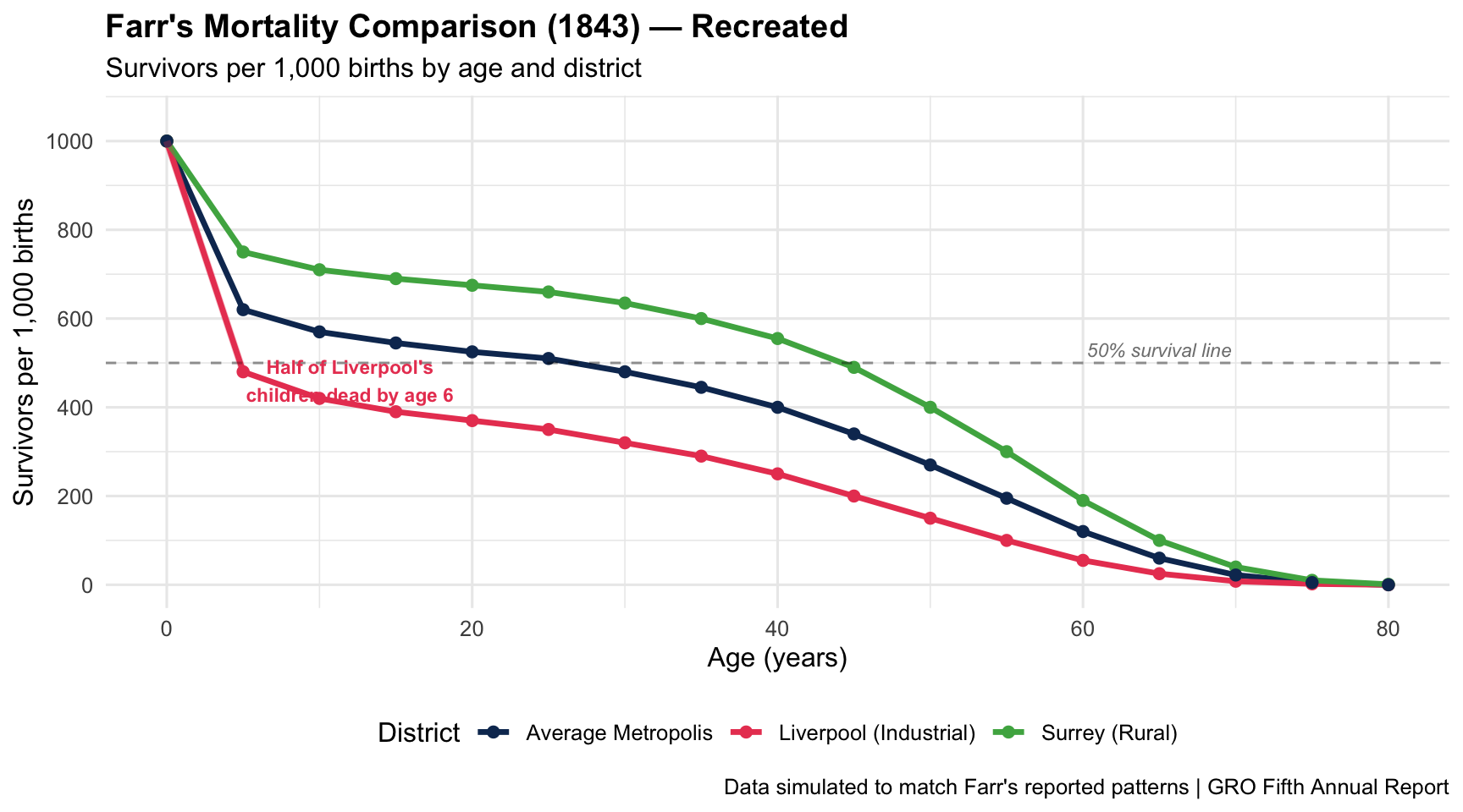
William Farr, founder of medical statistics, used line graphs at the General Register Office to compare mortality rates across English districts. His charts showing that half of Liverpool’s children died before age 6 shattered the assumption that a booming city must be a healthy one.
1843Line GraphMortality Comparison
R Recreation
Show R Code
# Simulated mortality data inspired by Farr's 1843 reportage <-seq(0, 80, by =5)# Survivorship per 1000 births (approximate historical patterns)farr_data <-data.frame(age =rep(age, 3),survivors =c(# Liverpool (industrial, high infant mortality)1000, 480, 420, 390, 370, 350, 320, 290, 250, 200, 150, 100, 55, 25, 8, 2, 0,# Surrey (rural, lower mortality)1000, 750, 710, 690, 675, 660, 635, 600, 555, 490, 400, 300, 190, 100, 40, 10, 1,# Average Metropolis1000, 620, 570, 545, 525, 510, 480, 445, 400, 340, 270, 195, 120, 60, 22, 5, 0 ),district =rep(c("Liverpool (Industrial)", "Surrey (Rural)", "Average Metropolis"), each =17))ggplot(farr_data, aes(x = age, y = survivors, colour = district)) +geom_line(linewidth =1.2) +geom_point(size =2) +geom_hline(yintercept =500, linetype ="dashed", alpha =0.4) +annotate("text", x =65, y =530, label ="50% survival line",size =3, colour ="grey50", fontface ="italic") +annotate("segment", x =0, xend =5, y =1000, yend =480,colour ="#e94560", linewidth =1.5, alpha =0.3) +annotate("text", x =12, y =460, label ="Half of Liverpool's\nchildren dead by age 6",size =3, colour ="#e94560", fontface ="bold") +scale_colour_manual(values =c("Liverpool (Industrial)"="#e94560","Surrey (Rural)"="#4caf50","Average Metropolis"="#0f3460")) +scale_y_continuous(limits =c(0, 1050), breaks =seq(0, 1000, 200)) +labs(title ="Farr's Mortality Comparison (1843) — Recreated",subtitle ="Survivors per 1,000 births by age and district",x ="Age (years)", y ="Survivors per 1,000 births",colour ="District",caption ="Data simulated to match Farr's reported patterns | GRO Fifth Annual Report" ) +theme_minimal(base_size =12) +theme(legend.position ="bottom",plot.title =element_text(face ="bold"))
Key Insight for Students: Farr’s simple line graph did something revolutionary — it used comparative data to challenge a political narrative. Liverpool’s growth was seen as proof of prosperity. Farr’s chart showed it was a death trap for children. This is the origin of health inequalities research.
2. John Snow’s Cholera Map (1854)
The Story
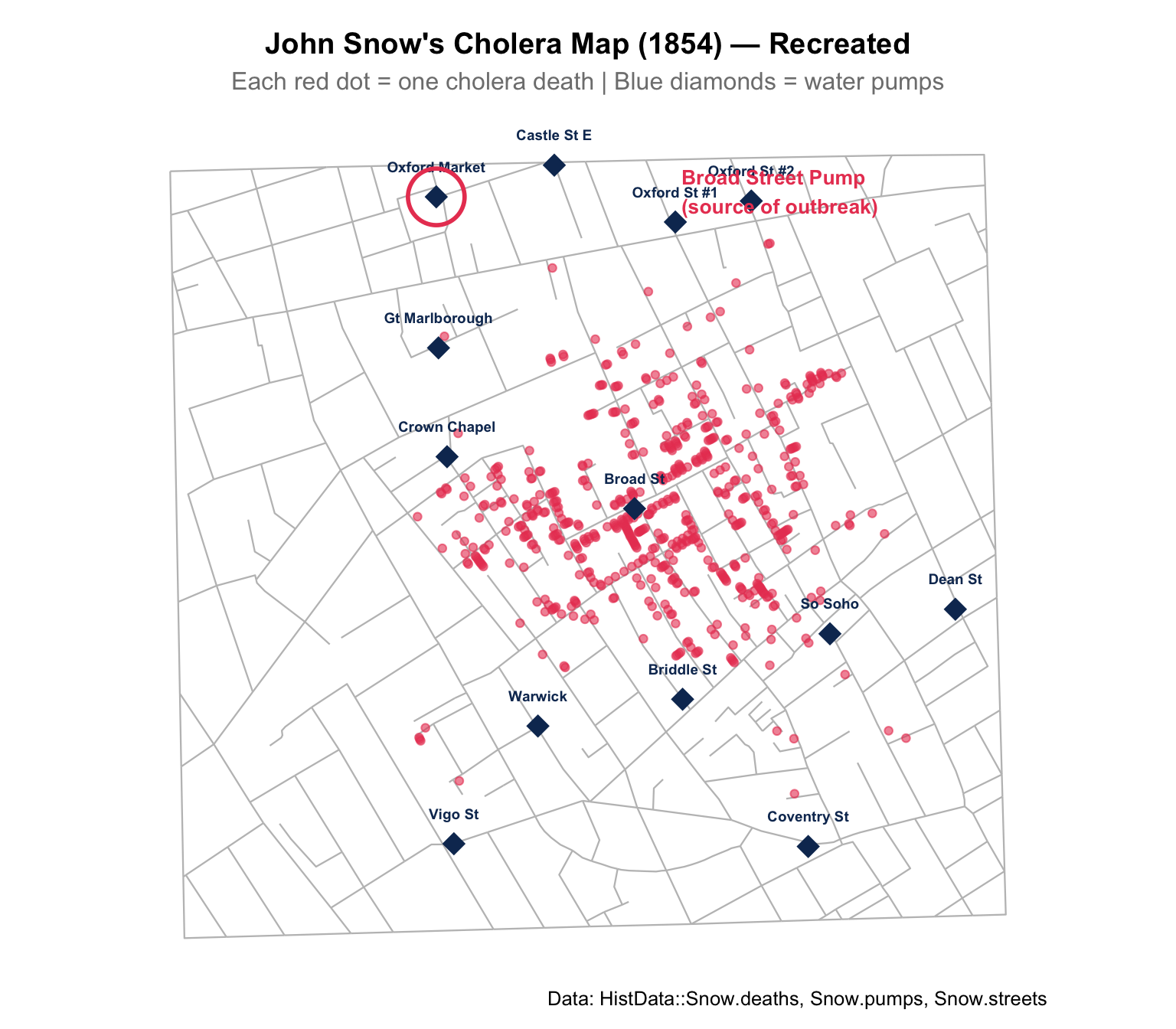
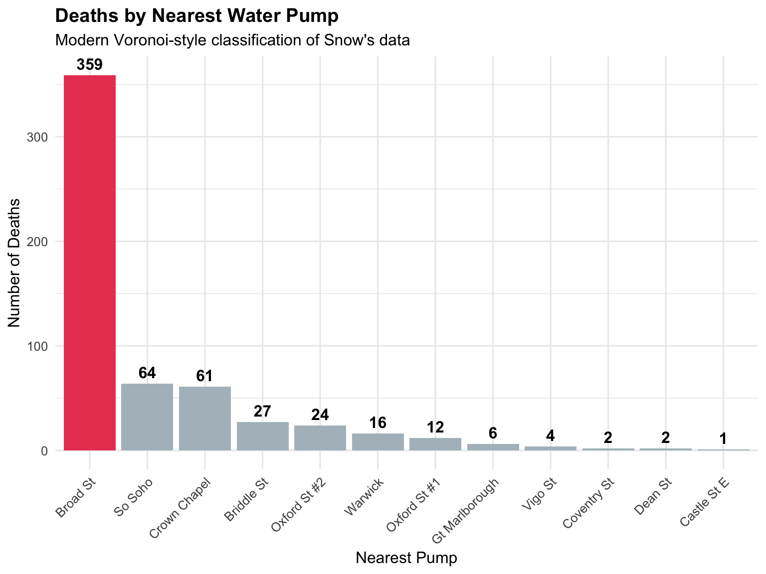
During London’s 1854 cholera outbreak, Dr. John Snow plotted each death on a street map, revealing their clustering around the Broad Street water pump. This map didn’t just locate the source — it disproved the miasma theory and laid the foundation for modern epidemiology.
1854Dot MapSpatial Epidemiology
R Recreation
Show R Code
# Using the HistData package for Snow's original dataif (!requireNamespace("HistData", quietly =TRUE)) {install.packages("HistData", repos ="https://cloud.r-project.org")}library(HistData)# Snow's street map, deaths, and pump locationsggplot() +# Draw streetsgeom_path(data = Snow.streets, aes(x = x, y = y, group = street),colour ="grey75", linewidth =0.4) +# Plot deathsgeom_point(data = Snow.deaths, aes(x = x, y = y),colour ="#e94560", size =1.5, alpha =0.6) +# Plot pumpsgeom_point(data = Snow.pumps, aes(x = x, y = y),colour ="#0f3460", size =5, shape =18) +geom_text(data = Snow.pumps, aes(x = x, y = y, label = label),nudge_y =0.6, size =2.5, fontface ="bold", colour ="#0f3460") +# Highlight Broad Street pumpannotate("point", x = Snow.pumps$x[1], y = Snow.pumps$y[1],size =12, shape =1, colour ="#e94560", stroke =1.5) +annotate("text", x =13.5, y =18, hjust =0,label ="Broad Street Pump\n(source of outbreak)",size =3.5, colour ="#e94560", fontface ="bold") +labs(title ="John Snow's Cholera Map (1854) — Recreated",subtitle ="Each red dot = one cholera death | Blue diamonds = water pumps",caption ="Data: HistData::Snow.deaths, Snow.pumps, Snow.streets" ) +coord_equal() +theme_void(base_size =12) +theme(plot.title =element_text(face ="bold", hjust =0.5),plot.subtitle =element_text(hjust =0.5, colour ="grey50"),plot.margin =margin(10, 10, 10, 10))
Key Insight for Students: Snow’s map is often called the birth of epidemiology, but the map actually confirmed a hypothesis he already held. The lesson? Visualization is most powerful when paired with a clear analytical question. Snow wasn’t just plotting dots — he was testing a theory.
3. Florence Nightingale’s Rose Diagram (1858)
The Story
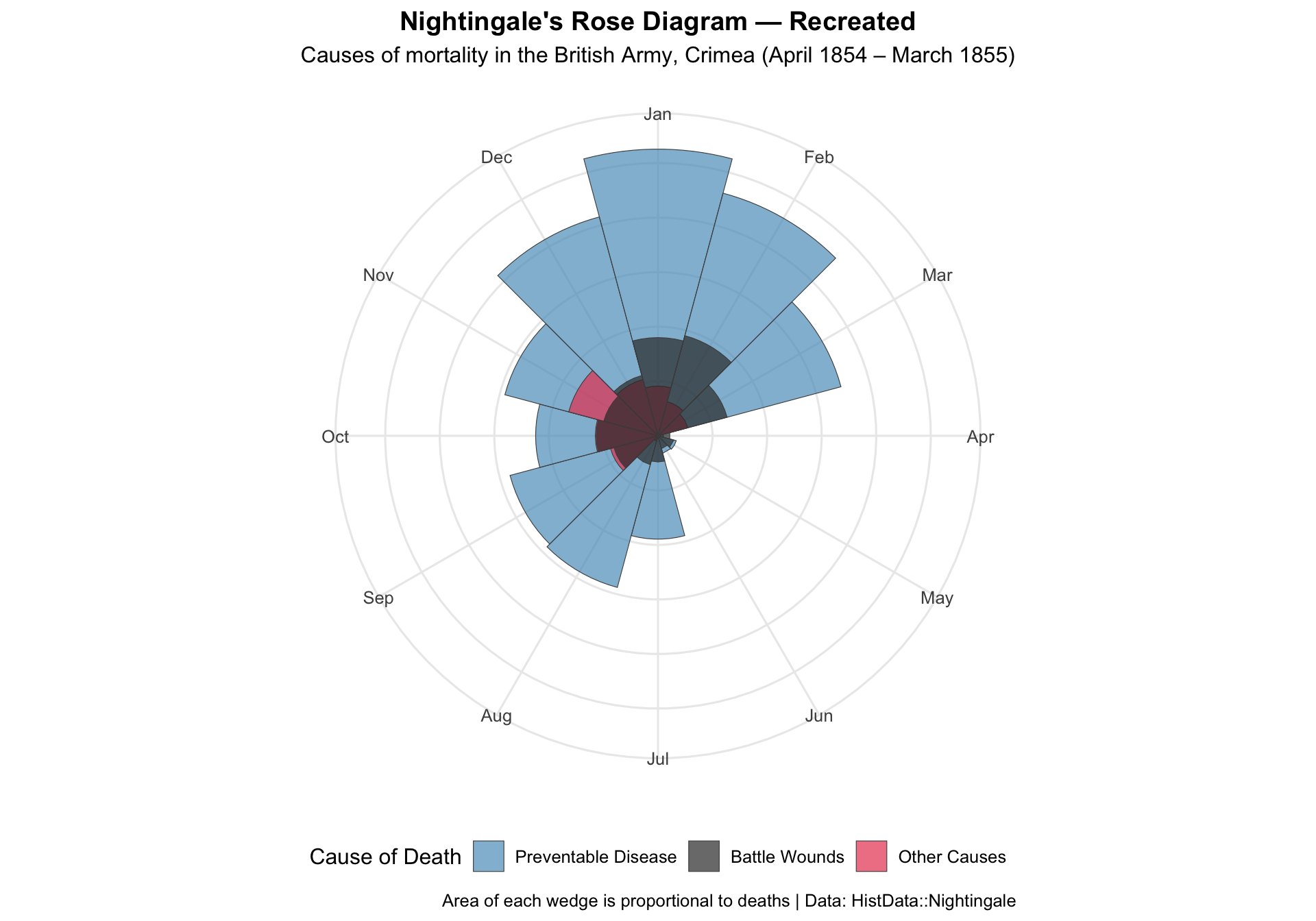
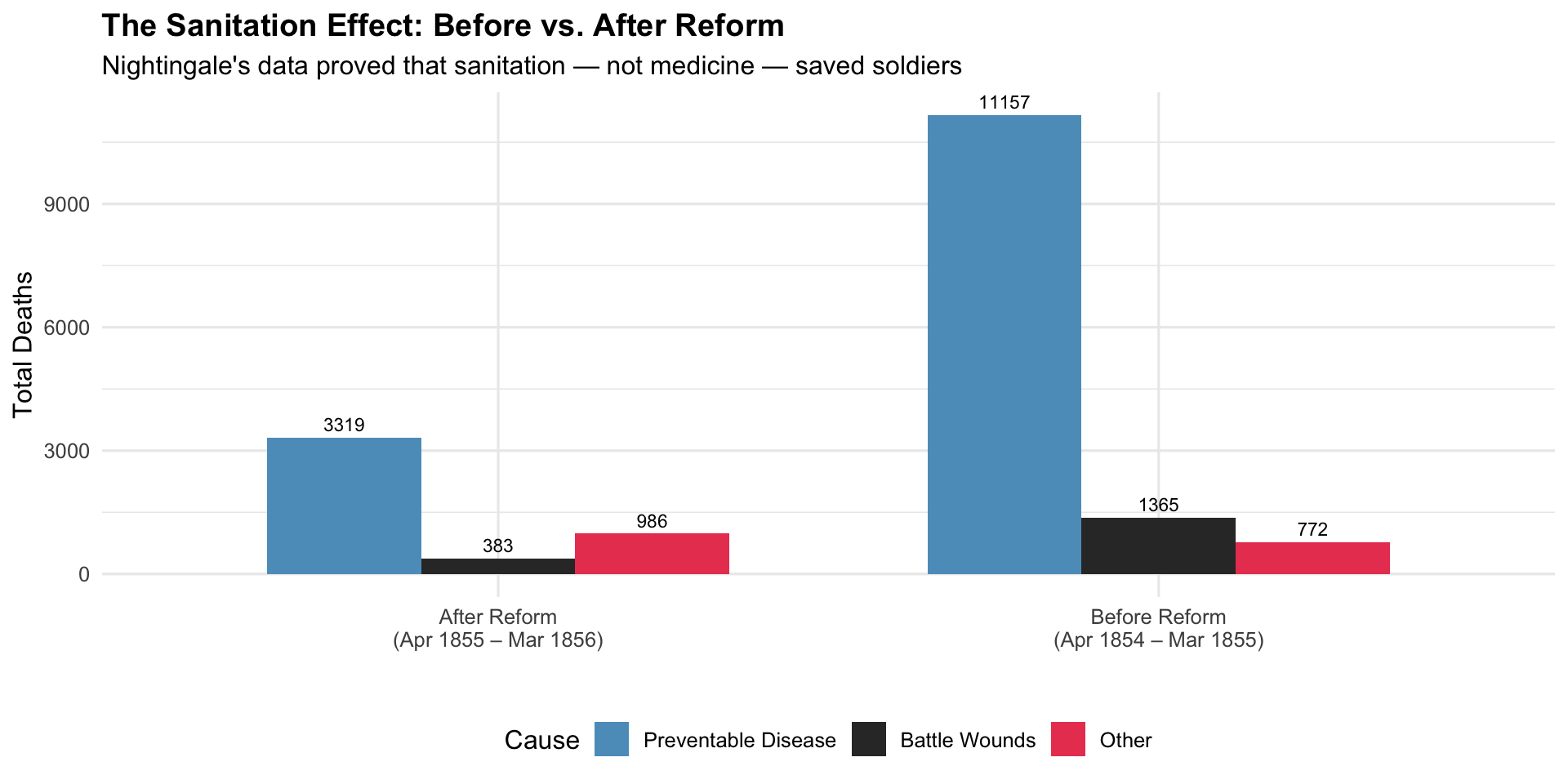
Florence Nightingale’s “coxcomb chart” showed that during the Crimean War, soldiers were 7× more likely to die from preventable disease than from battle wounds. She used this chart to lobby Queen Victoria and Parliament for sanitation reform — and won.
1858Polar Area ChartMilitary Health Reform
R Recreation
Show R Code
library(HistData)# Reshape Nightingale's datanightingale_long <- Nightingale %>%select(Date, Month, Year, Disease, Wounds, Other) %>%pivot_longer(cols =c(Disease, Wounds, Other),names_to ="Cause", values_to ="Deaths") %>%mutate(period =ifelse(Date <as.Date("1855-04-01"), "Before Sanitary Commission", "After Sanitary Commission"),month_label =paste(Month, Year) )# Create the classic rose/coxcomb diagramggplot(nightingale_long %>%filter(Date >=as.Date("1854-04-01") & Date <=as.Date("1855-03-01")),aes(x =factor(Month, levels = month.abb), y =sqrt(Deaths), fill = Cause)) +geom_col(width =1, colour ="grey30", linewidth =0.2, position ="identity", alpha =0.7) +coord_polar(start =-pi/12) +scale_fill_manual(values =c("Disease"="#5c9dc4", "Wounds"="#e94560", "Other"="#333333"),labels =c("Preventable Disease", "Battle Wounds", "Other Causes") ) +labs(title ="Nightingale's Rose Diagram — Recreated",subtitle ="Causes of mortality in the British Army, Crimea (April 1854 – March 1855)",fill ="Cause of Death",caption ="Area of each wedge is proportional to deaths | Data: HistData::Nightingale" ) +theme_minimal(base_size =12) +theme(axis.text.y =element_blank(),axis.title =element_blank(),plot.title =element_text(face ="bold", hjust =0.5),plot.subtitle =element_text(hjust =0.5),legend.position ="bottom",panel.grid.minor =element_blank() )
Before vs. After Sanitation Reform
Show R Code
# Compare periodsnightingale_summary <- Nightingale %>%mutate(period =ifelse(Date <as.Date("1855-04-01"),"Before Reform\n(Apr 1854 – Mar 1855)","After Reform\n(Apr 1855 – Mar 1856)")) %>%group_by(period) %>%summarise(Disease =sum(Disease),Wounds =sum(Wounds),Other =sum(Other),.groups ="drop" ) %>%pivot_longer(cols =c(Disease, Wounds, Other), names_to ="Cause", values_to ="Deaths")ggplot(nightingale_summary, aes(x = period, y = Deaths, fill = Cause)) +geom_col(position ="dodge", width =0.7) +geom_text(aes(label = Deaths), position =position_dodge(0.7), vjust =-0.5, size =3) +scale_fill_manual(values =c("Disease"="#5c9dc4", "Wounds"="#e94560", "Other"="#333333"),labels =c("Preventable Disease", "Battle Wounds", "Other") ) +labs(title ="The Sanitation Effect: Before vs. After Reform",subtitle ="Nightingale's data proved that sanitation — not medicine — saved soldiers",y ="Total Deaths", x ="", fill ="Cause" ) +theme_minimal(base_size =12) +theme(plot.title =element_text(face ="bold"), legend.position ="bottom")
Key Insight for Students: Nightingale was not just a nurse — she was a data scientist and political strategist. She chose the polar area chart deliberately because it was more striking than a bar chart. The lesson: when advocating for health policy, how you present data is as important as the data itself.
4. Jacques Bertillon’s Influenza Maps (1892)
The Story
The Paris city statistician published pioneering geographic visualizations of influenza prevalence by age and location in 1892, extending the disease mapping tradition beyond cholera. His work demonstrated that spatial epidemiology could work for respiratory diseases too.
1892Choropleth MapRespiratory Disease
Concept Recreation: Age-Stratified Mortality
Show R Code
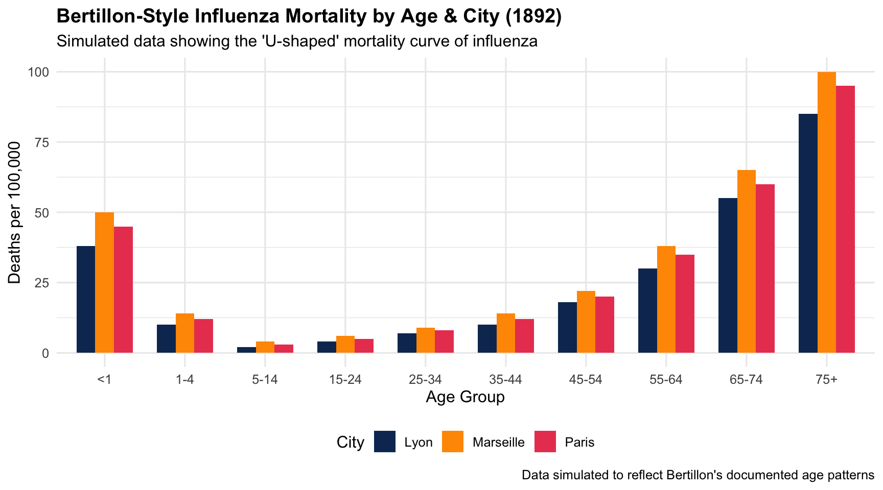
# Simulated data inspired by Bertillon's age-stratified influenza mortalitybertillon_data <-data.frame(age_group =factor(c("<1", "1-4", "5-14", "15-24", "25-34", "35-44","45-54", "55-64", "65-74", "75+"),levels =c("<1", "1-4", "5-14", "15-24", "25-34", "35-44","45-54", "55-64", "65-74", "75+")),paris =c(45, 12, 3, 5, 8, 12, 20, 35, 60, 95),lyon =c(38, 10, 2, 4, 7, 10, 18, 30, 55, 85),marseille =c(50, 14, 4, 6, 9, 14, 22, 38, 65, 100))bertillon_long <- bertillon_data %>%pivot_longer(cols =c(paris, lyon, marseille),names_to ="city", values_to ="mortality_rate") %>%mutate(city = tools::toTitleCase(city))ggplot(bertillon_long, aes(x = age_group, y = mortality_rate, fill = city)) +geom_col(position ="dodge", width =0.7) +scale_fill_manual(values =c("Paris"="#e94560", "Lyon"="#0f3460", "Marseille"="#ff9800")) +labs(title ="Bertillon-Style Influenza Mortality by Age & City (1892)",subtitle ="Simulated data showing the 'U-shaped' mortality curve of influenza",x ="Age Group", y ="Deaths per 100,000", fill ="City",caption ="Data simulated to reflect Bertillon's documented age patterns" ) +theme_minimal(base_size =12) +theme(plot.title =element_text(face ="bold"), legend.position ="bottom")
Key Insight for Students: Bertillon’s work is the ancestor of the age-stratified mortality tables you’ll encounter in every infectious disease textbook. The U-shaped mortality curve of influenza (high in very young and very old) was first documented through exactly this type of visualization.
5. W.E.B. Du Bois’s Health Data Portraits (1900)
The Story
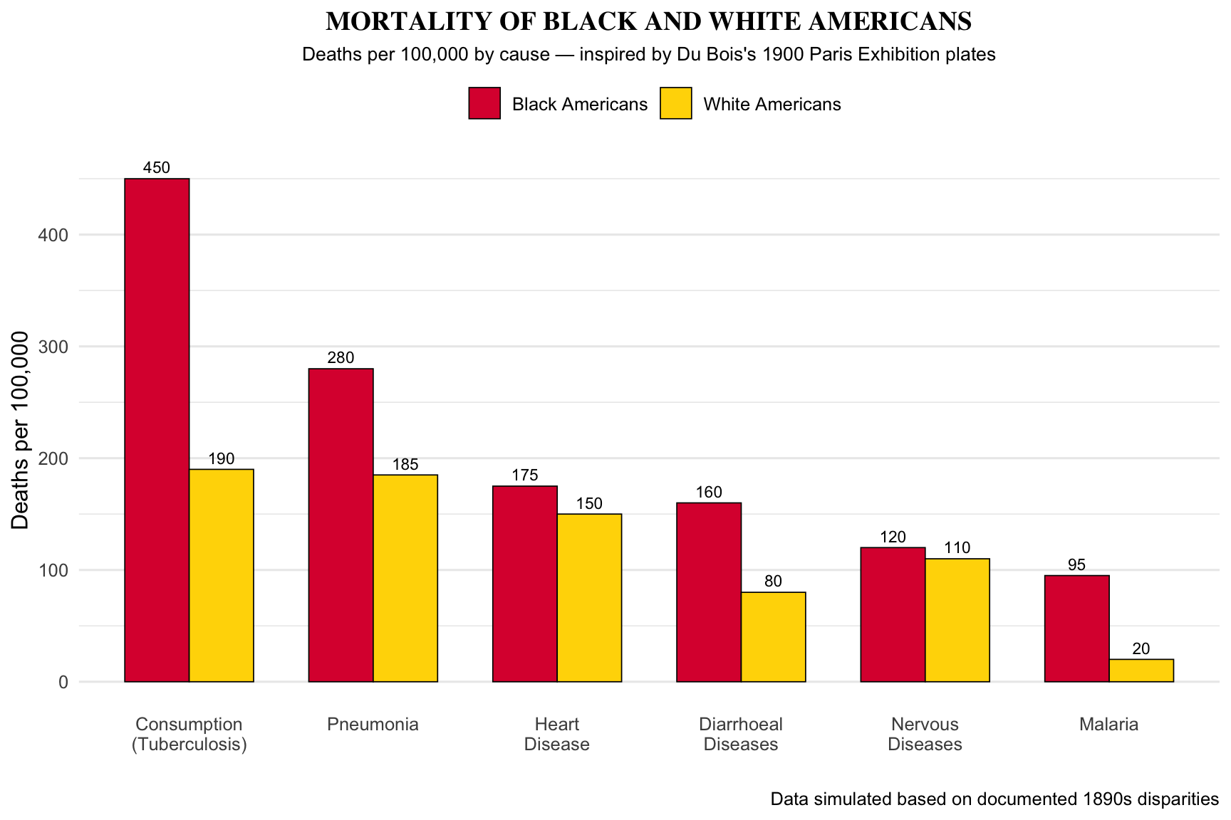
At the 1900 Paris World’s Fair, W.E.B. Du Bois and his students at Atlanta University exhibited striking data visualizations exposing the health and social conditions of Black Americans. These charts were simultaneously art, data, and activism — using innovative design to make racial health inequity undeniable.
1900Innovative InfographicsHealth Equity
Recreation: Mortality Comparison
Show R Code
# Simulated data inspired by Du Bois's documented disparities (~1899)dubois_mortality <-data.frame(cause =factor(c("Consumption\n(Tuberculosis)", "Pneumonia", "Heart\nDisease","Diarrhoeal\nDiseases", "Nervous\nDiseases", "Malaria"),levels =c("Consumption\n(Tuberculosis)", "Pneumonia", "Heart\nDisease","Diarrhoeal\nDiseases", "Nervous\nDiseases", "Malaria")),black =c(450, 280, 175, 160, 120, 95),white =c(190, 185, 150, 80, 110, 20))dubois_long <- dubois_mortality %>%pivot_longer(cols =c(black, white), names_to ="group", values_to ="rate") %>%mutate(group =ifelse(group =="black", "Black Americans", "White Americans"))# Du Bois used bold, flat colour and strong geometric shapesggplot(dubois_long, aes(x = cause, y = rate, fill = group)) +geom_col(position ="dodge", width =0.7, colour ="black", linewidth =0.3) +scale_fill_manual(values =c("Black Americans"="#dc143c", "White Americans"="#ffd700")) +geom_text(aes(label = rate), position =position_dodge(0.7), vjust =-0.5, size =3) +labs(title ="MORTALITY OF BLACK AND WHITE AMERICANS",subtitle ="Deaths per 100,000 by cause — inspired by Du Bois's 1900 Paris Exhibition plates",x ="", y ="Deaths per 100,000", fill ="",caption ="Data simulated based on documented 1890s disparities" ) +theme_minimal(base_size =12) +theme(plot.title =element_text(face ="bold", hjust =0.5, size =14, family ="serif"),plot.subtitle =element_text(hjust =0.5, size =10),legend.position ="top",panel.grid.major.x =element_blank() )
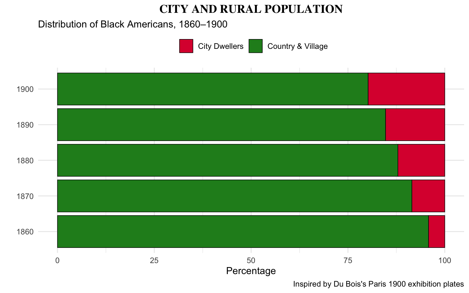
Du Bois–Style Population Chart
Show R Code
# Inspired by Du Bois's "City and Rural Dwellers" spiral chartdubois_pop <-data.frame(year =seq(1860, 1900, by =10),urban_pct =c(4.2, 8.5, 12.1, 15.3, 19.8),rural_pct =c(95.8, 91.5, 87.9, 84.7, 80.2))dubois_pop_long <- dubois_pop %>%pivot_longer(cols =c(urban_pct, rural_pct), names_to ="type", values_to ="pct") %>%mutate(type =ifelse(type =="urban_pct", "City Dwellers", "Country & Village"))ggplot(dubois_pop_long, aes(x =factor(year), y = pct, fill = type)) +geom_col(colour ="black", linewidth =0.3) +scale_fill_manual(values =c("City Dwellers"="#dc143c", "Country & Village"="#228b22")) +coord_flip() +labs(title ="CITY AND RURAL POPULATION",subtitle ="Distribution of Black Americans, 1860–1900",x ="", y ="Percentage", fill ="",caption ="Inspired by Du Bois's Paris 1900 exhibition plates" ) +theme_minimal(base_size =12) +theme(plot.title =element_text(face ="bold", hjust =0.5, family ="serif"),legend.position ="top" )
Key Insight for Students: Du Bois’s work is the intellectual ancestor of health equity dashboards you’ll see at the CDC and state health departments today. He showed that health data is never neutral — who gets measured, how it’s presented, and who sees it are all political acts. The social determinants of health were visible in his data 120 years ago.
Discussion Questions for Era 1
Snow vs. modern contact tracing: How does Snow’s geographic approach compare to the contact-tracing apps used during COVID-19?
Nightingale’s advocacy: Should scientists also be advocates? How did Nightingale use visualization as a political tool?
Du Bois and health equity: How are the racial health disparities Du Bois documented in 1900 reflected in modern data (e.g., COVID-19 mortality by race)?
Farr’s lesson: Can you think of a modern example where economic growth is mistaken for population health?
Source Code
---title: "Era 1: Foundations of Epidemiology (1843–1900)"subtitle: "When data first saved lives"---```{r}#| include: falselibrary(ggplot2)library(dplyr)library(tidyr)```::: {.era-card}This era established the revolutionary idea that **data could diagnose a population's illness**, not just an individual's. The pioneers here — Farr, Snow, Nightingale, Bertillon, and Du Bois — invented the visual language of epidemiology that we still use today.:::---## 1. William Farr's Mortality Line Graphs (1843) {#farr}::: {.viz-box}### The StoryWilliam Farr, founder of medical statistics, used line graphs at the General Register Office to compare mortality rates across English districts. His charts showing that **half of Liverpool's children died before age 6** shattered the assumption that a booming city must be a healthy one.::: {.viz-meta}[1843]{.timeline-marker}[Line Graph]{style="background:#e8eaf6;padding:0.2rem 0.7rem;border-radius:15px;font-size:0.85rem;"}[Mortality Comparison]{style="background:#e8eaf6;padding:0.2rem 0.7rem;border-radius:15px;font-size:0.85rem;"}:::### R Recreation```{r}#| fig-height: 5#| fig-width: 9# Simulated mortality data inspired by Farr's 1843 reportage <-seq(0, 80, by =5)# Survivorship per 1000 births (approximate historical patterns)farr_data <-data.frame(age =rep(age, 3),survivors =c(# Liverpool (industrial, high infant mortality)1000, 480, 420, 390, 370, 350, 320, 290, 250, 200, 150, 100, 55, 25, 8, 2, 0,# Surrey (rural, lower mortality)1000, 750, 710, 690, 675, 660, 635, 600, 555, 490, 400, 300, 190, 100, 40, 10, 1,# Average Metropolis1000, 620, 570, 545, 525, 510, 480, 445, 400, 340, 270, 195, 120, 60, 22, 5, 0 ),district =rep(c("Liverpool (Industrial)", "Surrey (Rural)", "Average Metropolis"), each =17))ggplot(farr_data, aes(x = age, y = survivors, colour = district)) +geom_line(linewidth =1.2) +geom_point(size =2) +geom_hline(yintercept =500, linetype ="dashed", alpha =0.4) +annotate("text", x =65, y =530, label ="50% survival line",size =3, colour ="grey50", fontface ="italic") +annotate("segment", x =0, xend =5, y =1000, yend =480,colour ="#e94560", linewidth =1.5, alpha =0.3) +annotate("text", x =12, y =460, label ="Half of Liverpool's\nchildren dead by age 6",size =3, colour ="#e94560", fontface ="bold") +scale_colour_manual(values =c("Liverpool (Industrial)"="#e94560","Surrey (Rural)"="#4caf50","Average Metropolis"="#0f3460")) +scale_y_continuous(limits =c(0, 1050), breaks =seq(0, 1000, 200)) +labs(title ="Farr's Mortality Comparison (1843) — Recreated",subtitle ="Survivors per 1,000 births by age and district",x ="Age (years)", y ="Survivors per 1,000 births",colour ="District",caption ="Data simulated to match Farr's reported patterns | GRO Fifth Annual Report" ) +theme_minimal(base_size =12) +theme(legend.position ="bottom",plot.title =element_text(face ="bold"))```::: {.callout-insight}**Key Insight for Students:** Farr's simple line graph did something revolutionary — it used *comparative* data to challenge a political narrative. Liverpool's growth was seen as proof of prosperity. Farr's chart showed it was a death trap for children. This is the origin of **health inequalities research**.::::::---## 2. John Snow's Cholera Map (1854) {#snow}::: {.viz-box}### The StoryDuring London's 1854 cholera outbreak, Dr. John Snow plotted each death on a street map, revealing their clustering around the Broad Street water pump. This map didn't just locate the source — it **disproved the miasma theory** and laid the foundation for modern epidemiology.::: {.viz-meta}[1854]{.timeline-marker}[Dot Map]{style="background:#e8eaf6;padding:0.2rem 0.7rem;border-radius:15px;font-size:0.85rem;"}[Spatial Epidemiology]{style="background:#e8eaf6;padding:0.2rem 0.7rem;border-radius:15px;font-size:0.85rem;"}:::### R Recreation```{r}#| fig-height: 7#| fig-width: 8# Using the HistData package for Snow's original dataif (!requireNamespace("HistData", quietly =TRUE)) {install.packages("HistData", repos ="https://cloud.r-project.org")}library(HistData)# Snow's street map, deaths, and pump locationsggplot() +# Draw streetsgeom_path(data = Snow.streets, aes(x = x, y = y, group = street),colour ="grey75", linewidth =0.4) +# Plot deathsgeom_point(data = Snow.deaths, aes(x = x, y = y),colour ="#e94560", size =1.5, alpha =0.6) +# Plot pumpsgeom_point(data = Snow.pumps, aes(x = x, y = y),colour ="#0f3460", size =5, shape =18) +geom_text(data = Snow.pumps, aes(x = x, y = y, label = label),nudge_y =0.6, size =2.5, fontface ="bold", colour ="#0f3460") +# Highlight Broad Street pumpannotate("point", x = Snow.pumps$x[1], y = Snow.pumps$y[1],size =12, shape =1, colour ="#e94560", stroke =1.5) +annotate("text", x =13.5, y =18, hjust =0,label ="Broad Street Pump\n(source of outbreak)",size =3.5, colour ="#e94560", fontface ="bold") +labs(title ="John Snow's Cholera Map (1854) — Recreated",subtitle ="Each red dot = one cholera death | Blue diamonds = water pumps",caption ="Data: HistData::Snow.deaths, Snow.pumps, Snow.streets" ) +coord_equal() +theme_void(base_size =12) +theme(plot.title =element_text(face ="bold", hjust =0.5),plot.subtitle =element_text(hjust =0.5, colour ="grey50"),plot.margin =margin(10, 10, 10, 10))```### Voronoi Analysis — Which Pump Was Closest?```{r}#| fig-height: 6#| fig-width: 8# Modern Voronoi approach to Snow's dataif (!requireNamespace("ggvoronoi", quietly =TRUE)) {install.packages("ggvoronoi", repos ="https://cloud.r-project.org")}# Simple distance-based classificationsnow_deaths_classified <- Snow.deaths %>%mutate(nearest_pump =apply( Snow.deaths[, c("x", "y")], 1,function(d) { dists <-sqrt((Snow.pumps$x - d[1])^2+ (Snow.pumps$y - d[2])^2) Snow.pumps$label[which.min(dists)] } ) )# Count deaths by nearest pumppump_counts <- snow_deaths_classified %>%count(nearest_pump, sort =TRUE) %>%mutate(nearest_pump =factor(nearest_pump, levels = nearest_pump))ggplot(pump_counts, aes(x = nearest_pump, y = n,fill =ifelse(nearest_pump =="Broad St", "highlight", "normal"))) +geom_col(show.legend =FALSE) +geom_text(aes(label = n), vjust =-0.5, fontface ="bold") +scale_fill_manual(values =c("highlight"="#e94560", "normal"="#b0bec5")) +labs(title ="Deaths by Nearest Water Pump",subtitle ="Modern Voronoi-style classification of Snow's data",x ="Nearest Pump", y ="Number of Deaths" ) +theme_minimal(base_size =12) +theme(plot.title =element_text(face ="bold"),axis.text.x =element_text(angle =45, hjust =1))```::: {.callout-insight}**Key Insight for Students:** Snow's map is often called the birth of epidemiology, but the map actually *confirmed* a hypothesis he already held. The lesson? Visualization is most powerful when paired with a clear analytical question. Snow wasn't just plotting dots — he was testing a theory.::::::---## 3. Florence Nightingale's Rose Diagram (1858) {#nightingale}::: {.viz-box}### The StoryFlorence Nightingale's "coxcomb chart" showed that during the Crimean War, **soldiers were 7× more likely to die from preventable disease than from battle wounds**. She used this chart to lobby Queen Victoria and Parliament for sanitation reform — and won.::: {.viz-meta}[1858]{.timeline-marker}[Polar Area Chart]{style="background:#e8eaf6;padding:0.2rem 0.7rem;border-radius:15px;font-size:0.85rem;"}[Military Health Reform]{style="background:#e8eaf6;padding:0.2rem 0.7rem;border-radius:15px;font-size:0.85rem;"}:::### R Recreation```{r}#| fig-height: 7#| fig-width: 10library(HistData)# Reshape Nightingale's datanightingale_long <- Nightingale %>%select(Date, Month, Year, Disease, Wounds, Other) %>%pivot_longer(cols =c(Disease, Wounds, Other),names_to ="Cause", values_to ="Deaths") %>%mutate(period =ifelse(Date <as.Date("1855-04-01"), "Before Sanitary Commission", "After Sanitary Commission"),month_label =paste(Month, Year) )# Create the classic rose/coxcomb diagramggplot(nightingale_long %>%filter(Date >=as.Date("1854-04-01") & Date <=as.Date("1855-03-01")),aes(x =factor(Month, levels = month.abb), y =sqrt(Deaths), fill = Cause)) +geom_col(width =1, colour ="grey30", linewidth =0.2, position ="identity", alpha =0.7) +coord_polar(start =-pi/12) +scale_fill_manual(values =c("Disease"="#5c9dc4", "Wounds"="#e94560", "Other"="#333333"),labels =c("Preventable Disease", "Battle Wounds", "Other Causes") ) +labs(title ="Nightingale's Rose Diagram — Recreated",subtitle ="Causes of mortality in the British Army, Crimea (April 1854 – March 1855)",fill ="Cause of Death",caption ="Area of each wedge is proportional to deaths | Data: HistData::Nightingale" ) +theme_minimal(base_size =12) +theme(axis.text.y =element_blank(),axis.title =element_blank(),plot.title =element_text(face ="bold", hjust =0.5),plot.subtitle =element_text(hjust =0.5),legend.position ="bottom",panel.grid.minor =element_blank() )```### Before vs. After Sanitation Reform```{r}#| fig-height: 5#| fig-width: 10# Compare periodsnightingale_summary <- Nightingale %>%mutate(period =ifelse(Date <as.Date("1855-04-01"),"Before Reform\n(Apr 1854 – Mar 1855)","After Reform\n(Apr 1855 – Mar 1856)")) %>%group_by(period) %>%summarise(Disease =sum(Disease),Wounds =sum(Wounds),Other =sum(Other),.groups ="drop" ) %>%pivot_longer(cols =c(Disease, Wounds, Other), names_to ="Cause", values_to ="Deaths")ggplot(nightingale_summary, aes(x = period, y = Deaths, fill = Cause)) +geom_col(position ="dodge", width =0.7) +geom_text(aes(label = Deaths), position =position_dodge(0.7), vjust =-0.5, size =3) +scale_fill_manual(values =c("Disease"="#5c9dc4", "Wounds"="#e94560", "Other"="#333333"),labels =c("Preventable Disease", "Battle Wounds", "Other") ) +labs(title ="The Sanitation Effect: Before vs. After Reform",subtitle ="Nightingale's data proved that sanitation — not medicine — saved soldiers",y ="Total Deaths", x ="", fill ="Cause" ) +theme_minimal(base_size =12) +theme(plot.title =element_text(face ="bold"), legend.position ="bottom")```::: {.callout-insight}**Key Insight for Students:** Nightingale was not just a nurse — she was a **data scientist** and political strategist. She chose the polar area chart deliberately because it was more striking than a bar chart. The lesson: when advocating for health policy, how you present data is as important as the data itself.::::::---## 4. Jacques Bertillon's Influenza Maps (1892) {#bertillon}::: {.viz-box}### The StoryThe Paris city statistician published pioneering geographic visualizations of influenza prevalence by age and location in 1892, extending the disease mapping tradition beyond cholera. His work demonstrated that **spatial epidemiology** could work for respiratory diseases too.::: {.viz-meta}[1892]{.timeline-marker}[Choropleth Map]{style="background:#e8eaf6;padding:0.2rem 0.7rem;border-radius:15px;font-size:0.85rem;"}[Respiratory Disease]{style="background:#e8eaf6;padding:0.2rem 0.7rem;border-radius:15px;font-size:0.85rem;"}:::### Concept Recreation: Age-Stratified Mortality```{r}#| fig-height: 5#| fig-width: 9# Simulated data inspired by Bertillon's age-stratified influenza mortalitybertillon_data <-data.frame(age_group =factor(c("<1", "1-4", "5-14", "15-24", "25-34", "35-44","45-54", "55-64", "65-74", "75+"),levels =c("<1", "1-4", "5-14", "15-24", "25-34", "35-44","45-54", "55-64", "65-74", "75+")),paris =c(45, 12, 3, 5, 8, 12, 20, 35, 60, 95),lyon =c(38, 10, 2, 4, 7, 10, 18, 30, 55, 85),marseille =c(50, 14, 4, 6, 9, 14, 22, 38, 65, 100))bertillon_long <- bertillon_data %>%pivot_longer(cols =c(paris, lyon, marseille),names_to ="city", values_to ="mortality_rate") %>%mutate(city = tools::toTitleCase(city))ggplot(bertillon_long, aes(x = age_group, y = mortality_rate, fill = city)) +geom_col(position ="dodge", width =0.7) +scale_fill_manual(values =c("Paris"="#e94560", "Lyon"="#0f3460", "Marseille"="#ff9800")) +labs(title ="Bertillon-Style Influenza Mortality by Age & City (1892)",subtitle ="Simulated data showing the 'U-shaped' mortality curve of influenza",x ="Age Group", y ="Deaths per 100,000", fill ="City",caption ="Data simulated to reflect Bertillon's documented age patterns" ) +theme_minimal(base_size =12) +theme(plot.title =element_text(face ="bold"), legend.position ="bottom")```::: {.callout-insight}**Key Insight for Students:** Bertillon's work is the ancestor of the age-stratified mortality tables you'll encounter in every infectious disease textbook. The U-shaped mortality curve of influenza (high in very young and very old) was first documented through exactly this type of visualization.::::::---## 5. W.E.B. Du Bois's Health Data Portraits (1900) {#dubois}::: {.viz-box}### The StoryAt the 1900 Paris World's Fair, W.E.B. Du Bois and his students at Atlanta University exhibited striking data visualizations exposing the health and social conditions of Black Americans. These charts were **simultaneously art, data, and activism** — using innovative design to make racial health inequity undeniable.::: {.viz-meta}[1900]{.timeline-marker}[Innovative Infographics]{style="background:#e8eaf6;padding:0.2rem 0.7rem;border-radius:15px;font-size:0.85rem;"}[Health Equity]{style="background:#e8eaf6;padding:0.2rem 0.7rem;border-radius:15px;font-size:0.85rem;"}:::### Recreation: Mortality Comparison```{r}#| fig-height: 6#| fig-width: 9# Simulated data inspired by Du Bois's documented disparities (~1899)dubois_mortality <-data.frame(cause =factor(c("Consumption\n(Tuberculosis)", "Pneumonia", "Heart\nDisease","Diarrhoeal\nDiseases", "Nervous\nDiseases", "Malaria"),levels =c("Consumption\n(Tuberculosis)", "Pneumonia", "Heart\nDisease","Diarrhoeal\nDiseases", "Nervous\nDiseases", "Malaria")),black =c(450, 280, 175, 160, 120, 95),white =c(190, 185, 150, 80, 110, 20))dubois_long <- dubois_mortality %>%pivot_longer(cols =c(black, white), names_to ="group", values_to ="rate") %>%mutate(group =ifelse(group =="black", "Black Americans", "White Americans"))# Du Bois used bold, flat colour and strong geometric shapesggplot(dubois_long, aes(x = cause, y = rate, fill = group)) +geom_col(position ="dodge", width =0.7, colour ="black", linewidth =0.3) +scale_fill_manual(values =c("Black Americans"="#dc143c", "White Americans"="#ffd700")) +geom_text(aes(label = rate), position =position_dodge(0.7), vjust =-0.5, size =3) +labs(title ="MORTALITY OF BLACK AND WHITE AMERICANS",subtitle ="Deaths per 100,000 by cause — inspired by Du Bois's 1900 Paris Exhibition plates",x ="", y ="Deaths per 100,000", fill ="",caption ="Data simulated based on documented 1890s disparities" ) +theme_minimal(base_size =12) +theme(plot.title =element_text(face ="bold", hjust =0.5, size =14, family ="serif"),plot.subtitle =element_text(hjust =0.5, size =10),legend.position ="top",panel.grid.major.x =element_blank() )```### Du Bois–Style Population Chart```{r}#| fig-height: 5#| fig-width: 8# Inspired by Du Bois's "City and Rural Dwellers" spiral chartdubois_pop <-data.frame(year =seq(1860, 1900, by =10),urban_pct =c(4.2, 8.5, 12.1, 15.3, 19.8),rural_pct =c(95.8, 91.5, 87.9, 84.7, 80.2))dubois_pop_long <- dubois_pop %>%pivot_longer(cols =c(urban_pct, rural_pct), names_to ="type", values_to ="pct") %>%mutate(type =ifelse(type =="urban_pct", "City Dwellers", "Country & Village"))ggplot(dubois_pop_long, aes(x =factor(year), y = pct, fill = type)) +geom_col(colour ="black", linewidth =0.3) +scale_fill_manual(values =c("City Dwellers"="#dc143c", "Country & Village"="#228b22")) +coord_flip() +labs(title ="CITY AND RURAL POPULATION",subtitle ="Distribution of Black Americans, 1860–1900",x ="", y ="Percentage", fill ="",caption ="Inspired by Du Bois's Paris 1900 exhibition plates" ) +theme_minimal(base_size =12) +theme(plot.title =element_text(face ="bold", hjust =0.5, family ="serif"),legend.position ="top" )```::: {.callout-insight}**Key Insight for Students:** Du Bois's work is the intellectual ancestor of **health equity dashboards** you'll see at the CDC and state health departments today. He showed that health data is never neutral — who gets measured, how it's presented, and who sees it are all political acts. The social determinants of health were visible in his data 120 years ago.::::::---## Discussion Questions for Era 11. **Snow vs. modern contact tracing:** How does Snow's geographic approach compare to the contact-tracing apps used during COVID-19?2. **Nightingale's advocacy:** Should scientists also be advocates? How did Nightingale use visualization as a *political* tool?3. **Du Bois and health equity:** How are the racial health disparities Du Bois documented in 1900 reflected in modern data (e.g., COVID-19 mortality by race)?4. **Farr's lesson:** Can you think of a modern example where economic growth is mistaken for population health?