The mid-20th century shifted public health from infectious to chronic diseases. Heart disease and cancer became the leading killers, and a new generation of studies — Framingham, Doll & Hill — produced the graphs that changed medicine forever. This era also gave us the Kaplan-Meier survival curve and the epidemic curve, tools you’ll use throughout your medical career.
6. The Framingham Heart Study Risk Visualizations (1948–present)
The Story
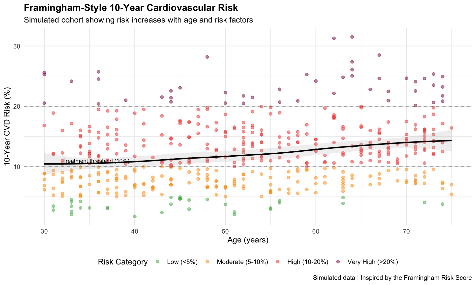
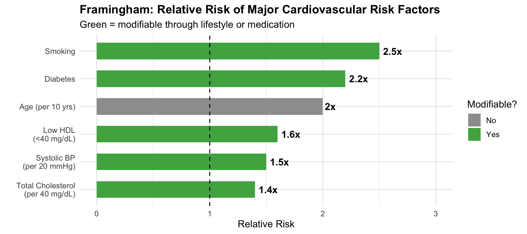
The Framingham Heart Study, launched in 1948 with 5,209 participants, identified the major modifiable risk factors for cardiovascular disease. Its risk score calculator — visualizing 10-year heart attack probability — changed how doctors practice preventive medicine.
# Show relative impact of each factorrisk_factors <-data.frame(factor_name =c("Age (per 10 yrs)", "Smoking", "Diabetes","Total Cholesterol\n(per 40 mg/dL)", "Low HDL\n(<40 mg/dL)","Systolic BP\n(per 20 mmHg)"),relative_risk =c(2.0, 2.5, 2.2, 1.4, 1.6, 1.5),modifiable =c("No", "Yes", "Yes", "Yes", "Yes", "Yes"))risk_factors$factor_name <-factor(risk_factors$factor_name,levels = risk_factors$factor_name[order(risk_factors$relative_risk)])ggplot(risk_factors, aes(x = factor_name, y = relative_risk, fill = modifiable)) +geom_col(width =0.6) +geom_hline(yintercept =1, linetype ="dashed") +geom_text(aes(label =paste0(relative_risk, "x")), hjust =-0.2, fontface ="bold") +scale_fill_manual(values =c("Yes"="#4caf50", "No"="#9e9e9e")) +coord_flip() +scale_y_continuous(limits =c(0, 3)) +labs(title ="Framingham: Relative Risk of Major Cardiovascular Risk Factors",subtitle ="Green = modifiable through lifestyle or medication",x ="", y ="Relative Risk", fill ="Modifiable?" ) +theme_minimal(base_size =12) +theme(plot.title =element_text(face ="bold"))
Key Insight for Students: Framingham transformed medicine from reactive to preventive. Before Framingham, doctors waited for heart attacks. After Framingham, they could predict and prevent them. The risk score you’ll use in clinical practice was born from these visualizations.
7. Doll & Hill’s Smoking–Lung Cancer Dose-Response (1950–1954)
The Story
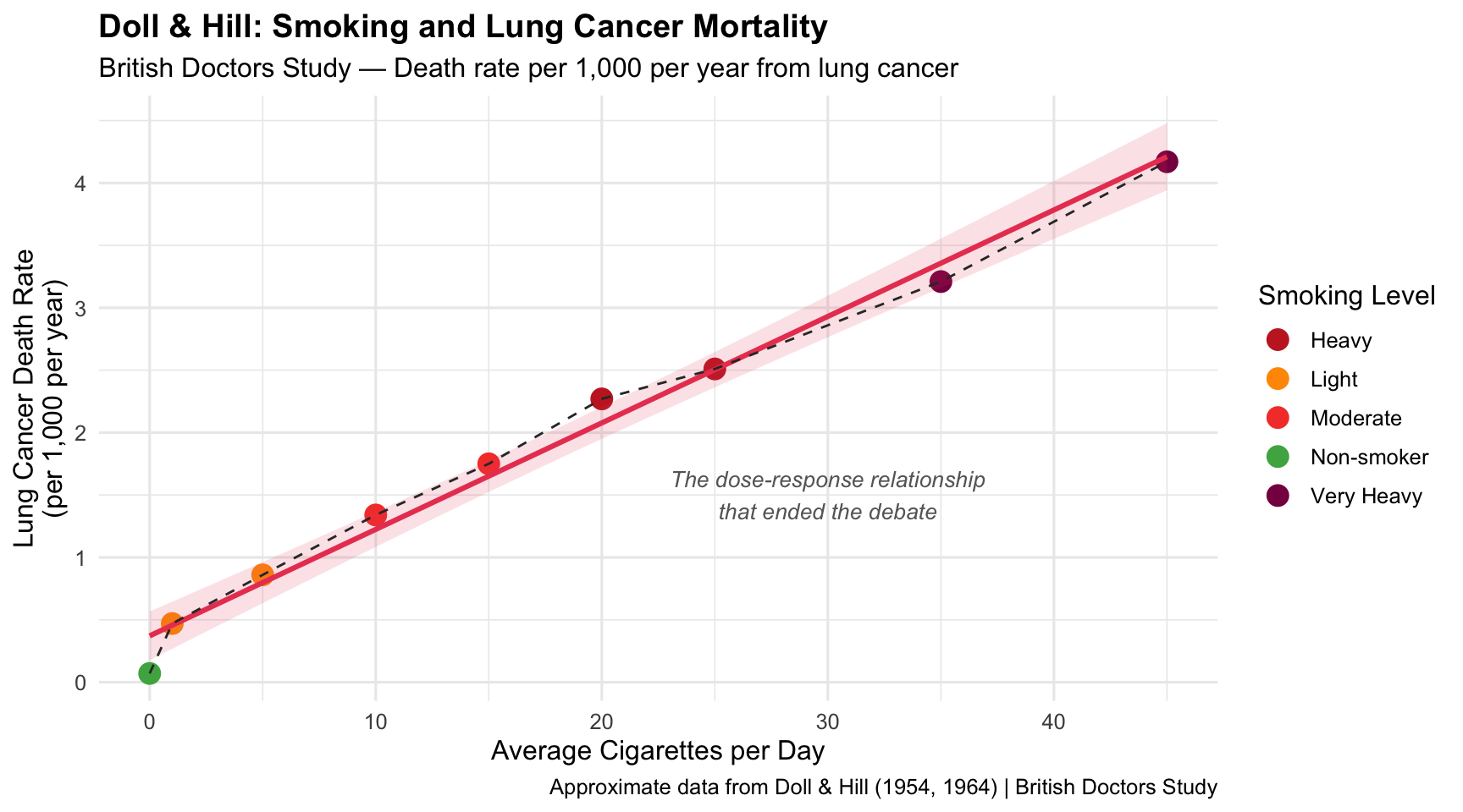
Richard Doll and Austin Bradford Hill’s British Doctors Study provided the first definitive dose-response evidence linking smoking to lung cancer. Their graphs — showing a near-linear increase in lung cancer mortality with cigarettes smoked — changed the world.
1950–1954Dose-Response CurveTobacco & Cancer
R Recreation
Show R Code
# Data from Doll & Hill's British Doctors Study (approximate published values)doll_hill <-data.frame(cigs_per_day =c(0, 1, 5, 10, 15, 20, 25, 35, 45),lung_cancer_rate =c(0.07, 0.47, 0.86, 1.34, 1.75, 2.27, 2.51, 3.21, 4.17),category =c("Non-smoker", rep("Light", 2), rep("Moderate", 2),rep("Heavy", 2), rep("Very Heavy", 2)))ggplot(doll_hill, aes(x = cigs_per_day, y = lung_cancer_rate)) +geom_point(aes(colour = category), size =4) +geom_smooth(method ="lm", se =TRUE, colour ="#e94560", fill ="#e94560", alpha =0.15) +geom_line(colour ="#333333", linewidth =0.5, linetype ="dashed") +scale_colour_manual(values =c("Non-smoker"="#4caf50", "Light"="#ff9800","Moderate"="#f44336", "Heavy"="#c62828","Very Heavy"="#880e4f")) +annotate("text", x =30, y =1.5, label ="The dose-response relationship\nthat ended the debate",size =3.5, fontface ="italic", colour ="grey40") +labs(title ="Doll & Hill: Smoking and Lung Cancer Mortality",subtitle ="British Doctors Study — Death rate per 1,000 per year from lung cancer",x ="Average Cigarettes per Day", y ="Lung Cancer Death Rate\n(per 1,000 per year)",colour ="Smoking Level",caption ="Approximate data from Doll & Hill (1954, 1964) | British Doctors Study" ) +theme_minimal(base_size =12) +theme(plot.title =element_text(face ="bold"), legend.position ="right")
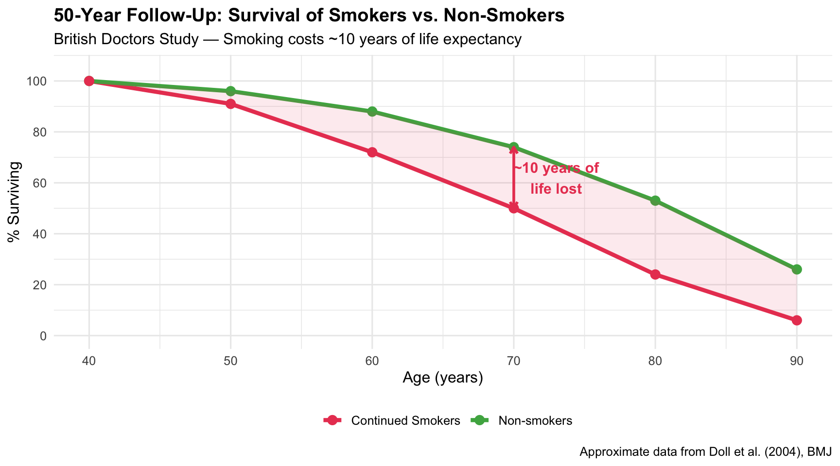
All-Cause Mortality: The Full Picture
Show R Code
# 50-year follow-up data (approximate from Doll et al. 2004)doll_survival <-data.frame(age =rep(seq(40, 90, by =10), 2),survival_pct =c(# Non-smokers100, 96, 88, 74, 53, 26,# Continued smokers100, 91, 72, 50, 24, 6 ),group =rep(c("Non-smokers", "Continued Smokers"), each =6))ggplot(doll_survival, aes(x = age, y = survival_pct, colour = group)) +geom_line(linewidth =1.5) +geom_point(size =3) +geom_ribbon(data = doll_survival %>%pivot_wider(names_from = group, values_from = survival_pct),aes(x = age, ymin =`Continued Smokers`, ymax =`Non-smokers`),fill ="#e94560", alpha =0.1, inherit.aes =FALSE) +annotate("text", x =73, y =62, label ="~10 years of\nlife lost",size =4, fontface ="bold", colour ="#e94560") +annotate("segment", x =70, xend =70, y =50, yend =74,colour ="#e94560", linewidth =1, arrow =arrow(ends ="both", length =unit(0.2, "cm"))) +scale_colour_manual(values =c("Non-smokers"="#4caf50", "Continued Smokers"="#e94560")) +scale_y_continuous(limits =c(0, 105), breaks =seq(0, 100, 20)) +labs(title ="50-Year Follow-Up: Survival of Smokers vs. Non-Smokers",subtitle ="British Doctors Study — Smoking costs ~10 years of life expectancy",x ="Age (years)", y ="% Surviving", colour ="",caption ="Approximate data from Doll et al. (2004), BMJ" ) +theme_minimal(base_size =12) +theme(plot.title =element_text(face ="bold"), legend.position ="bottom")
Key Insight for Students: This is one of the most important dose-response relationships in all of medicine. The near-linear relationship meant there was no safe level of smoking. It took decades of policy battles, but this graph — and the Surgeon General’s 1964 report that built on it — ultimately saved millions of lives.
8. The 1964 U.S. Surgeon General’s Report
The Story
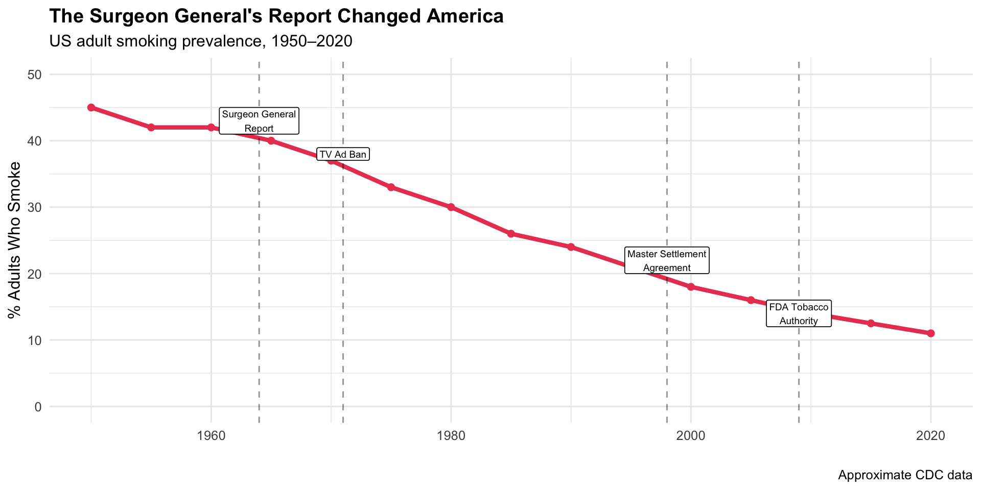
The 1964 Surgeon General’s Report compiled the Doll & Hill data and other studies into authoritative charts presented to the American public. The report led to cigarette warning labels, advertising bans, and decades of declining smoking rates.
Key Insight for Students: The Surgeon General’s Report is the gold standard for how data visualization drives policy. It wasn’t new data — it was the authoritative presentation of existing data that moved a nation. Note the ~20-year lag between the report (1964) and the peak in lung cancer deaths (~1990) — a reminder that public health interventions take time.
9. The Kaplan-Meier Survival Curve (1958–present)
The Story
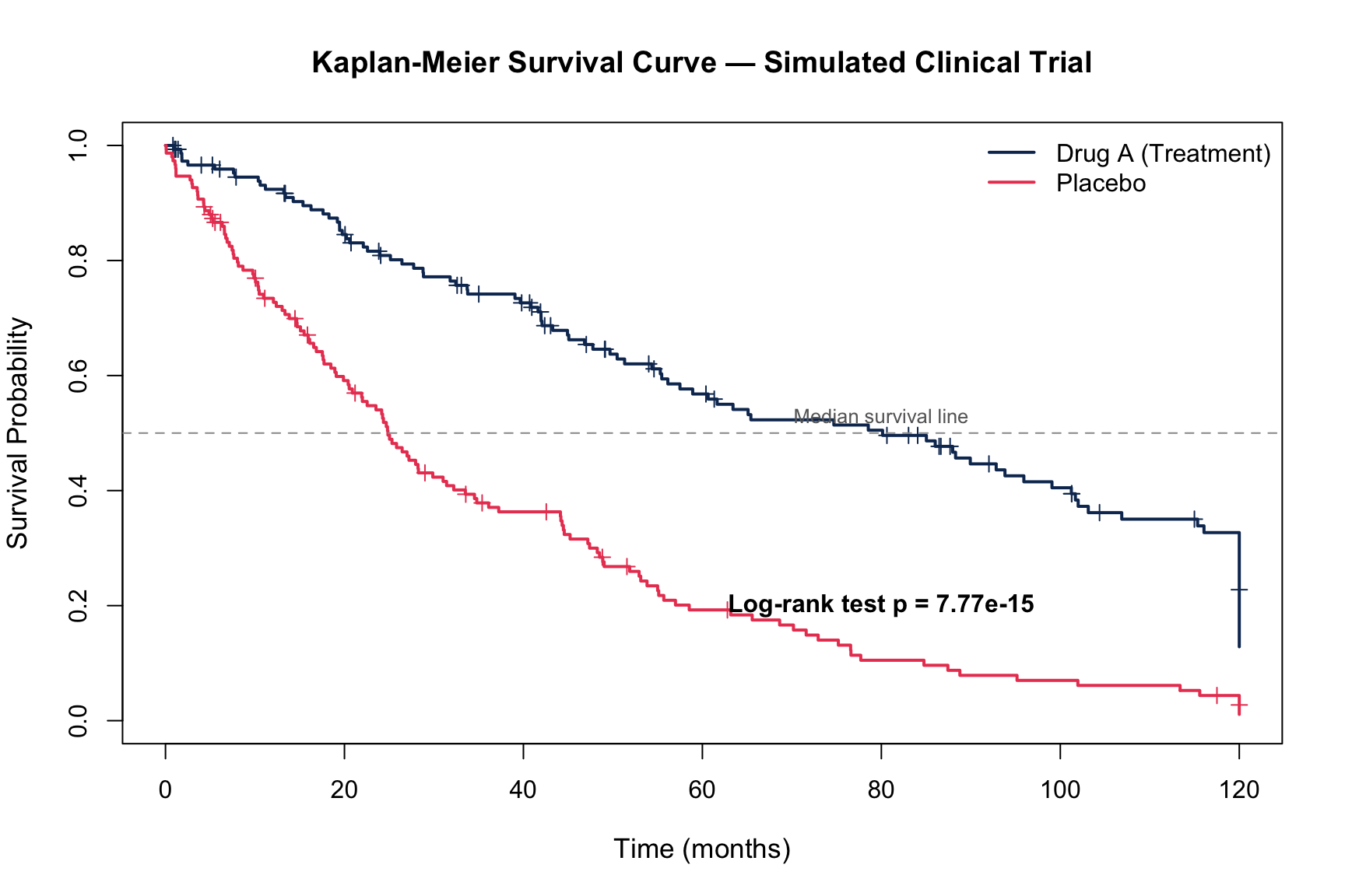
Introduced by Edward Kaplan and Paul Meier in 1958, the survival curve became the most reproduced chart type in clinical medicine. It shows the probability of surviving past a given time point, accounting for censored data — patients lost to follow-up.
1958Survival CurveClinical Trials
R Recreation
Show R Code
library(survival)# Simulate a clinical trial comparing Drug A vs. Placebo for cancer survivalset.seed(2024)n_per_group <-150trial_data <-data.frame(time =c(rexp(n_per_group, rate =0.015), # Drug A (better survival)rexp(n_per_group, rate =0.025)), # Placebostatus =c(rbinom(n_per_group, 1, 0.7),rbinom(n_per_group, 1, 0.85)),group =rep(c("Drug A (Treatment)", "Placebo (Control)"), each = n_per_group)) %>%mutate(time =pmin(time, 120)) # Cap at 120 months (10 years)# Fit KM curveskm_fit <-survfit(Surv(time, status) ~ group, data = trial_data)# Plotplot(km_fit, col =c("#0f3460", "#e94560"), lwd =2, mark.time =TRUE,xlab ="Time (months)", ylab ="Survival Probability",main ="Kaplan-Meier Survival Curve — Simulated Clinical Trial",cex.main =1.2, cex.lab =1.1)legend("topright", legend =c("Drug A (Treatment)", "Placebo"),col =c("#0f3460", "#e94560"), lwd =2, bty ="n")abline(h =0.5, lty =2, col ="grey60")text(80, 0.53, "Median survival line", cex =0.8, col ="grey40")# Add p-value from log-rank testlr_test <-survdiff(Surv(time, status) ~ group, data = trial_data)p_val <-1-pchisq(lr_test$chisq, df =1)text(80, 0.2, paste0("Log-rank test p = ", format.pval(p_val, digits =3)),cex =1, font =2)
Key Insight for Students: You will read hundreds of Kaplan-Meier curves during medical school and throughout your career. Every oncology paper, every drug trial, every surgical outcome study uses them. Key things to always check: the number at risk at each time point, the confidence intervals, and whether the curves separate early or late (which has different clinical implications).
10. The Epidemic Curve (Epi Curve)
The Story
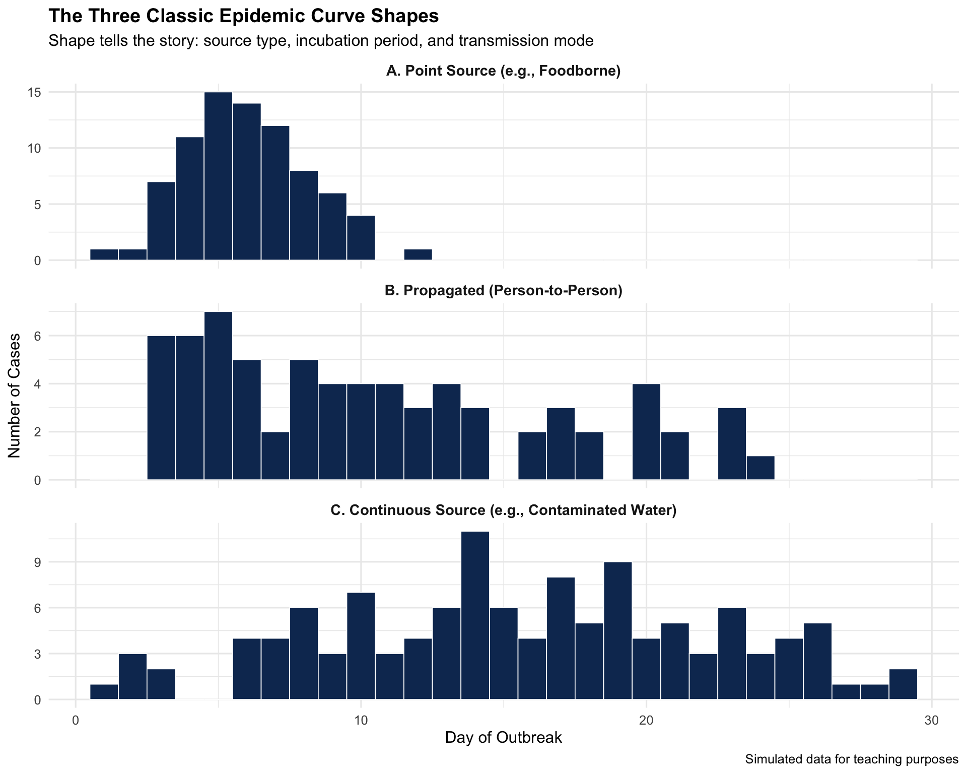
The epidemic curve — a histogram of case counts over time — became the foundational tool of outbreak investigation. Its shape reveals whether an outbreak is from a common source (sharp peak), person-to-person spread (propagated waves), or continuous exposure.
Key Insight for Students: In your clinical rotations, if you ever report a suspected outbreak to public health, the first thing epidemiologists will do is build an epi curve. The shape immediately narrows the investigation: a sharp spike = look for a common source (food, water); successive waves = look for person-to-person transmission.
Discussion Questions for Era 2
Framingham’s legacy: How has the concept of “risk factors” changed how you think about disease? Is there a downside to reducing complex diseases to numerical scores?
Doll & Hill vs. industry: The tobacco industry fought the smoking–cancer link for decades. What parallels do you see with current public health debates (e.g., sugar, vaping, air pollution)?
Kaplan-Meier curves: Find a recent oncology paper and identify: What’s the median survival in each arm? Are the curves separating early or late? What does the number at risk look like at 5 years?
Epi curves in practice: During COVID-19, many people saw epi curves for the first time. How well do you think the public understood them?
Source Code
---title: "Era 2: Chronic Disease Epidemiology (1948–1964)"subtitle: "Visualizing the invisible killers"---```{r}#| include: falselibrary(ggplot2)library(dplyr)library(tidyr)```::: {.era-card}The mid-20th century shifted public health from infectious to chronic diseases. **Heart disease and cancer** became the leading killers, and a new generation of studies — Framingham, Doll & Hill — produced the graphs that changed medicine forever. This era also gave us the Kaplan-Meier survival curve and the epidemic curve, tools you'll use throughout your medical career.:::---## 6. The Framingham Heart Study Risk Visualizations (1948–present) {#framingham}::: {.viz-box}### The StoryThe Framingham Heart Study, launched in 1948 with 5,209 participants, identified the major modifiable risk factors for cardiovascular disease. Its risk score calculator — visualizing 10-year heart attack probability — changed how doctors practice preventive medicine.::: {.viz-meta}[1948]{.timeline-marker}[Risk Score Charts]{style="background:#e8eaf6;padding:0.2rem 0.7rem;border-radius:15px;font-size:0.85rem;"}[Cardiovascular Disease]{style="background:#e8eaf6;padding:0.2rem 0.7rem;border-radius:15px;font-size:0.85rem;"}:::### R Recreation: Framingham Risk Score Visualization```{r}#| fig-height: 6#| fig-width: 10# Simulated Framingham-style risk factor dataset.seed(42)n <-500framingham_sim <-data.frame(age =round(runif(n, 30, 75)),total_chol =round(rnorm(n, 220, 40)),hdl =round(rnorm(n, 50, 15)),sbp =round(rnorm(n, 130, 20)),smoker =rbinom(n, 1, 0.25),diabetes =rbinom(n, 1, 0.1)) %>%mutate(hdl =pmax(hdl, 20),# Simplified Framingham-like risk scorerisk_score =0.05* (age -30) +0.01* (total_chol -200) +-0.02* (hdl -50) +0.02* (sbp -120) +3* smoker +2* diabetes +rnorm(n, 0, 2),ten_yr_risk =pmin(pmax(1/ (1+exp(-0.3* (risk_score -5))) *35, 1), 35),risk_cat =cut(ten_yr_risk, breaks =c(0, 5, 10, 20, 100),labels =c("Low (<5%)", "Moderate (5-10%)", "High (10-20%)", "Very High (>20%)")) )ggplot(framingham_sim, aes(x = age, y = ten_yr_risk, colour = risk_cat)) +geom_point(alpha =0.5, size =1.8) +geom_smooth(aes(group =1), method ="loess", colour ="black",linewidth =1, se =TRUE, alpha =0.15) +scale_colour_manual(values =c("Low (<5%)"="#4caf50", "Moderate (5-10%)"="#ff9800","High (10-20%)"="#f44336", "Very High (>20%)"="#880e4f")) +geom_hline(yintercept =c(10, 20), linetype ="dashed", alpha =0.3) +annotate("text", x =32, y =11, label ="Treatment threshold (10%)", size =3, hjust =0) +labs(title ="Framingham-Style 10-Year Cardiovascular Risk",subtitle ="Simulated cohort showing risk increases with age and risk factors",x ="Age (years)", y ="10-Year CVD Risk (%)", colour ="Risk Category",caption ="Simulated data | Inspired by the Framingham Risk Score" ) +theme_minimal(base_size =12) +theme(plot.title =element_text(face ="bold"), legend.position ="bottom")```### Risk Factor Impact```{r}#| fig-height: 4#| fig-width: 9# Show relative impact of each factorrisk_factors <-data.frame(factor_name =c("Age (per 10 yrs)", "Smoking", "Diabetes","Total Cholesterol\n(per 40 mg/dL)", "Low HDL\n(<40 mg/dL)","Systolic BP\n(per 20 mmHg)"),relative_risk =c(2.0, 2.5, 2.2, 1.4, 1.6, 1.5),modifiable =c("No", "Yes", "Yes", "Yes", "Yes", "Yes"))risk_factors$factor_name <-factor(risk_factors$factor_name,levels = risk_factors$factor_name[order(risk_factors$relative_risk)])ggplot(risk_factors, aes(x = factor_name, y = relative_risk, fill = modifiable)) +geom_col(width =0.6) +geom_hline(yintercept =1, linetype ="dashed") +geom_text(aes(label =paste0(relative_risk, "x")), hjust =-0.2, fontface ="bold") +scale_fill_manual(values =c("Yes"="#4caf50", "No"="#9e9e9e")) +coord_flip() +scale_y_continuous(limits =c(0, 3)) +labs(title ="Framingham: Relative Risk of Major Cardiovascular Risk Factors",subtitle ="Green = modifiable through lifestyle or medication",x ="", y ="Relative Risk", fill ="Modifiable?" ) +theme_minimal(base_size =12) +theme(plot.title =element_text(face ="bold"))```::: {.callout-insight}**Key Insight for Students:** Framingham transformed medicine from *reactive* to *preventive*. Before Framingham, doctors waited for heart attacks. After Framingham, they could *predict and prevent* them. The risk score you'll use in clinical practice was born from these visualizations.::::::---## 7. Doll & Hill's Smoking–Lung Cancer Dose-Response (1950–1954) {#dollhill}::: {.viz-box}### The StoryRichard Doll and Austin Bradford Hill's British Doctors Study provided the first definitive dose-response evidence linking smoking to lung cancer. Their graphs — showing a near-linear increase in lung cancer mortality with cigarettes smoked — changed the world.::: {.viz-meta}[1950–1954]{.timeline-marker}[Dose-Response Curve]{style="background:#e8eaf6;padding:0.2rem 0.7rem;border-radius:15px;font-size:0.85rem;"}[Tobacco & Cancer]{style="background:#e8eaf6;padding:0.2rem 0.7rem;border-radius:15px;font-size:0.85rem;"}:::### R Recreation```{r}#| fig-height: 5#| fig-width: 9# Data from Doll & Hill's British Doctors Study (approximate published values)doll_hill <-data.frame(cigs_per_day =c(0, 1, 5, 10, 15, 20, 25, 35, 45),lung_cancer_rate =c(0.07, 0.47, 0.86, 1.34, 1.75, 2.27, 2.51, 3.21, 4.17),category =c("Non-smoker", rep("Light", 2), rep("Moderate", 2),rep("Heavy", 2), rep("Very Heavy", 2)))ggplot(doll_hill, aes(x = cigs_per_day, y = lung_cancer_rate)) +geom_point(aes(colour = category), size =4) +geom_smooth(method ="lm", se =TRUE, colour ="#e94560", fill ="#e94560", alpha =0.15) +geom_line(colour ="#333333", linewidth =0.5, linetype ="dashed") +scale_colour_manual(values =c("Non-smoker"="#4caf50", "Light"="#ff9800","Moderate"="#f44336", "Heavy"="#c62828","Very Heavy"="#880e4f")) +annotate("text", x =30, y =1.5, label ="The dose-response relationship\nthat ended the debate",size =3.5, fontface ="italic", colour ="grey40") +labs(title ="Doll & Hill: Smoking and Lung Cancer Mortality",subtitle ="British Doctors Study — Death rate per 1,000 per year from lung cancer",x ="Average Cigarettes per Day", y ="Lung Cancer Death Rate\n(per 1,000 per year)",colour ="Smoking Level",caption ="Approximate data from Doll & Hill (1954, 1964) | British Doctors Study" ) +theme_minimal(base_size =12) +theme(plot.title =element_text(face ="bold"), legend.position ="right")```### All-Cause Mortality: The Full Picture```{r}#| fig-height: 5#| fig-width: 9# 50-year follow-up data (approximate from Doll et al. 2004)doll_survival <-data.frame(age =rep(seq(40, 90, by =10), 2),survival_pct =c(# Non-smokers100, 96, 88, 74, 53, 26,# Continued smokers100, 91, 72, 50, 24, 6 ),group =rep(c("Non-smokers", "Continued Smokers"), each =6))ggplot(doll_survival, aes(x = age, y = survival_pct, colour = group)) +geom_line(linewidth =1.5) +geom_point(size =3) +geom_ribbon(data = doll_survival %>%pivot_wider(names_from = group, values_from = survival_pct),aes(x = age, ymin =`Continued Smokers`, ymax =`Non-smokers`),fill ="#e94560", alpha =0.1, inherit.aes =FALSE) +annotate("text", x =73, y =62, label ="~10 years of\nlife lost",size =4, fontface ="bold", colour ="#e94560") +annotate("segment", x =70, xend =70, y =50, yend =74,colour ="#e94560", linewidth =1, arrow =arrow(ends ="both", length =unit(0.2, "cm"))) +scale_colour_manual(values =c("Non-smokers"="#4caf50", "Continued Smokers"="#e94560")) +scale_y_continuous(limits =c(0, 105), breaks =seq(0, 100, 20)) +labs(title ="50-Year Follow-Up: Survival of Smokers vs. Non-Smokers",subtitle ="British Doctors Study — Smoking costs ~10 years of life expectancy",x ="Age (years)", y ="% Surviving", colour ="",caption ="Approximate data from Doll et al. (2004), BMJ" ) +theme_minimal(base_size =12) +theme(plot.title =element_text(face ="bold"), legend.position ="bottom")```::: {.callout-insight}**Key Insight for Students:** This is one of the most important dose-response relationships in all of medicine. The near-linear relationship meant there was **no safe level** of smoking. It took decades of policy battles, but this graph — and the Surgeon General's 1964 report that built on it — ultimately saved millions of lives.::::::---## 8. The 1964 U.S. Surgeon General's Report {#surgeongeneral}::: {.viz-box}### The StoryThe 1964 Surgeon General's Report compiled the Doll & Hill data and other studies into authoritative charts presented to the American public. The report led to cigarette warning labels, advertising bans, and decades of declining smoking rates.::: {.viz-meta}[1964]{.timeline-marker}[Government Report]{style="background:#e8eaf6;padding:0.2rem 0.7rem;border-radius:15px;font-size:0.85rem;"}[Tobacco Policy]{style="background:#e8eaf6;padding:0.2rem 0.7rem;border-radius:15px;font-size:0.85rem;"}:::### R Recreation: The Impact Over Time```{r}#| fig-height: 5#| fig-width: 10# US smoking prevalence and lung cancer mortality over timesmoking_trend <-data.frame(year =seq(1950, 2020, by =5),smoking_pct =c(45, 42, 42, 40, 37, 33, 30, 26, 24, 21, 18, 16, 14, 12.5, 11),lung_cancer_rate =c(15, 20, 28, 38, 48, 55, 62, 65, 63, 58, 52, 45, 40, 38, 35))# Key policy eventsevents <-data.frame(year =c(1964, 1971, 1998, 2009),label =c("Surgeon General\nReport", "TV Ad Ban", "Master Settlement\nAgreement", "FDA Tobacco\nAuthority"),y =c(43, 38, 22, 14))p1 <-ggplot(smoking_trend) +geom_line(aes(x = year, y = smoking_pct), colour ="#e94560", linewidth =1.5) +geom_point(aes(x = year, y = smoking_pct), colour ="#e94560", size =2) +geom_vline(data = events, aes(xintercept = year), linetype ="dashed", alpha =0.4) +geom_label(data = events, aes(x = year, y = y, label = label),size =2.5, fill ="white", label.size =0.3) +scale_y_continuous(limits =c(0, 50)) +labs(title ="The Surgeon General's Report Changed America",subtitle ="US adult smoking prevalence, 1950–2020",x ="", y ="% Adults Who Smoke",caption ="Approximate CDC data" ) +theme_minimal(base_size =12) +theme(plot.title =element_text(face ="bold"))p1```::: {.callout-insight}**Key Insight for Students:** The Surgeon General's Report is the gold standard for how **data visualization drives policy**. It wasn't new data — it was the authoritative *presentation* of existing data that moved a nation. Note the ~20-year lag between the report (1964) and the peak in lung cancer deaths (~1990) — a reminder that public health interventions take time.::::::---## 9. The Kaplan-Meier Survival Curve (1958–present) {#kaplanmeier}::: {.viz-box}### The StoryIntroduced by Edward Kaplan and Paul Meier in 1958, the survival curve became the most reproduced chart type in clinical medicine. It shows the probability of surviving past a given time point, accounting for censored data — patients lost to follow-up.::: {.viz-meta}[1958]{.timeline-marker}[Survival Curve]{style="background:#e8eaf6;padding:0.2rem 0.7rem;border-radius:15px;font-size:0.85rem;"}[Clinical Trials]{style="background:#e8eaf6;padding:0.2rem 0.7rem;border-radius:15px;font-size:0.85rem;"}:::### R Recreation```{r}#| fig-height: 6#| fig-width: 9library(survival)# Simulate a clinical trial comparing Drug A vs. Placebo for cancer survivalset.seed(2024)n_per_group <-150trial_data <-data.frame(time =c(rexp(n_per_group, rate =0.015), # Drug A (better survival)rexp(n_per_group, rate =0.025)), # Placebostatus =c(rbinom(n_per_group, 1, 0.7),rbinom(n_per_group, 1, 0.85)),group =rep(c("Drug A (Treatment)", "Placebo (Control)"), each = n_per_group)) %>%mutate(time =pmin(time, 120)) # Cap at 120 months (10 years)# Fit KM curveskm_fit <-survfit(Surv(time, status) ~ group, data = trial_data)# Plotplot(km_fit, col =c("#0f3460", "#e94560"), lwd =2, mark.time =TRUE,xlab ="Time (months)", ylab ="Survival Probability",main ="Kaplan-Meier Survival Curve — Simulated Clinical Trial",cex.main =1.2, cex.lab =1.1)legend("topright", legend =c("Drug A (Treatment)", "Placebo"),col =c("#0f3460", "#e94560"), lwd =2, bty ="n")abline(h =0.5, lty =2, col ="grey60")text(80, 0.53, "Median survival line", cex =0.8, col ="grey40")# Add p-value from log-rank testlr_test <-survdiff(Surv(time, status) ~ group, data = trial_data)p_val <-1-pchisq(lr_test$chisq, df =1)text(80, 0.2, paste0("Log-rank test p = ", format.pval(p_val, digits =3)),cex =1, font =2)```::: {.callout-insight}**Key Insight for Students:** You will read hundreds of Kaplan-Meier curves during medical school and throughout your career. Every oncology paper, every drug trial, every surgical outcome study uses them. Key things to always check: the **number at risk** at each time point, the **confidence intervals**, and whether the curves **separate early or late** (which has different clinical implications).::::::---## 10. The Epidemic Curve (Epi Curve) {#epicurve}::: {.viz-box}### The StoryThe epidemic curve — a histogram of case counts over time — became the foundational tool of outbreak investigation. Its shape reveals whether an outbreak is from a **common source** (sharp peak), **person-to-person** spread (propagated waves), or **continuous exposure**.::: {.viz-meta}[Standard Tool]{.timeline-marker}[Histogram]{style="background:#e8eaf6;padding:0.2rem 0.7rem;border-radius:15px;font-size:0.85rem;"}[Outbreak Investigation]{style="background:#e8eaf6;padding:0.2rem 0.7rem;border-radius:15px;font-size:0.85rem;"}:::### R Recreation: Three Types of Epi Curves```{r}#| fig-height: 8#| fig-width: 10set.seed(123)# 1. Point-source outbreak (e.g., foodborne)point_source <-data.frame(day =rpois(80, lambda =5) +1,type ="A. Point Source (e.g., Foodborne)") %>%filter(day <=14)# 2. Propagated (person-to-person)wave1 <-data.frame(day =rpois(30, 4) +1)wave2 <-data.frame(day =rpois(25, 11) +1)wave3 <-data.frame(day =rpois(15, 18) +1)propagated <-rbind(wave1, wave2, wave3) %>%mutate(type ="B. Propagated (Person-to-Person)") %>%filter(day <=25)# 3. Continuous sourcecontinuous <-data.frame(day =sample(1:30, 120, replace =TRUE, prob =dnorm(1:30, 15, 8)),type ="C. Continuous Source (e.g., Contaminated Water)")epi_data <-bind_rows(point_source, propagated, continuous)ggplot(epi_data, aes(x = day)) +geom_histogram(binwidth =1, fill ="#0f3460", colour ="white", linewidth =0.3) +facet_wrap(~ type, ncol =1, scales ="free_y") +labs(title ="The Three Classic Epidemic Curve Shapes",subtitle ="Shape tells the story: source type, incubation period, and transmission mode",x ="Day of Outbreak", y ="Number of Cases",caption ="Simulated data for teaching purposes" ) +theme_minimal(base_size =12) +theme(plot.title =element_text(face ="bold"),strip.text =element_text(face ="bold", size =11) )```::: {.callout-insight}**Key Insight for Students:** In your clinical rotations, if you ever report a suspected outbreak to public health, the first thing epidemiologists will do is build an epi curve. The shape immediately narrows the investigation: a sharp spike = look for a common source (food, water); successive waves = look for person-to-person transmission.::::::---## Discussion Questions for Era 21. **Framingham's legacy:** How has the concept of "risk factors" changed how you think about disease? Is there a downside to reducing complex diseases to numerical scores?2. **Doll & Hill vs. industry:** The tobacco industry fought the smoking–cancer link for decades. What parallels do you see with current public health debates (e.g., sugar, vaping, air pollution)?3. **Kaplan-Meier curves:** Find a recent oncology paper and identify: What's the median survival in each arm? Are the curves separating early or late? What does the number at risk look like at 5 years?4. **Epi curves in practice:** During COVID-19, many people saw epi curves for the first time. How well do you think the public understood them?