Data stories from the world’s most populous nation
India presents a unique public health story — a nation that eradicated polio, built the world’s largest biometric health ID system, fought recurring Nipah outbreaks, and crowdsourced one of the best COVID-19 dashboards on the planet. With 1.4 billion people, 36 states/UTs, and enormous diversity in health outcomes, India’s data visualizations tell a story of both remarkable progress and persistent challenges. These visualizations are especially relevant for medical students training in the Indian health system.
I1. India’s Polio Eradication: The Surveillance Map (1995–2014)
The Story
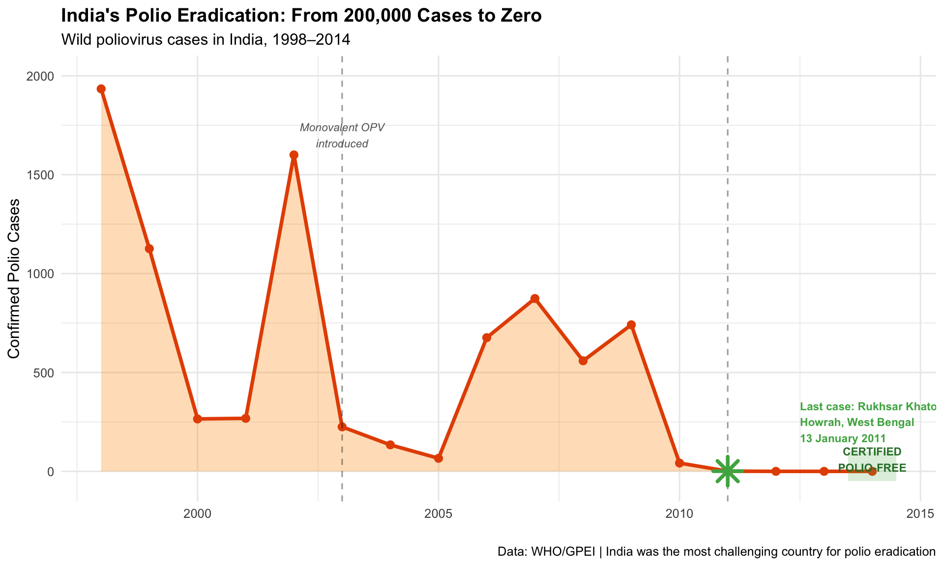
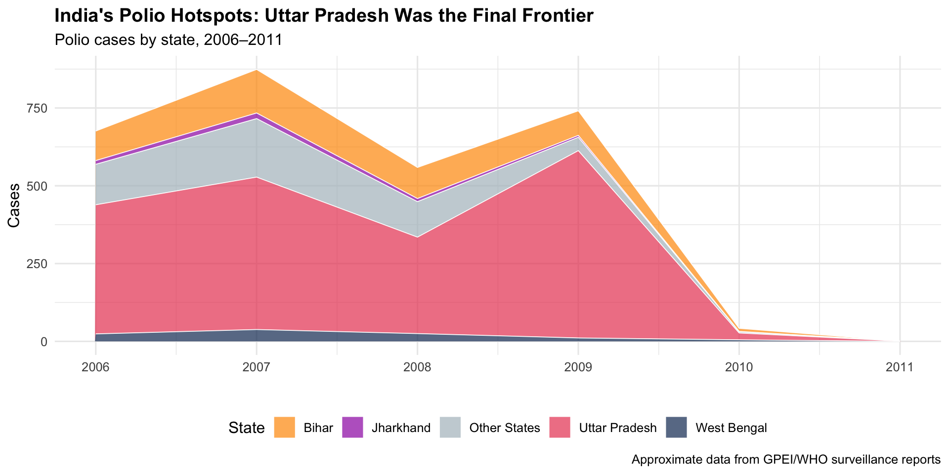
India reported its last case of wild poliovirus on 13 January 2011 — a 2-year-old girl named Rukhsar Khatoon in Howrah, West Bengal. India was officially certified polio-free in 2014. The surveillance maps tracking AFP (Acute Flaccid Paralysis) cases district-by-district were critical to identifying persistent pockets — especially in Uttar Pradesh and Bihar — and directing pulse immunisation campaigns.
1995–2014Surveillance MapDisease Eradication
R Recreation: India’s Polio Elimination Journey
Show R Code
# India polio case data (approximate WHO/GPEI data)india_polio <-data.frame(year =1998:2014,cases =c(1934, 1126, 265, 268, 1600, 225, 134, 66, 676, 874, 559, 741, 42, 1, 0, 0, 0))# Key eventspolio_events <-data.frame(year =c(1995, 2003, 2011, 2014),label =c("Pulse Polio\nLaunched", "Monovalent OPV\nIntroduced", "Last Case\n(13 Jan 2011)", "Polio-Free\nCertified"),y =c(1800, 300, 200, 100))ggplot(india_polio, aes(x = year, y = cases)) +geom_area(fill ="#ff9800", alpha =0.3) +geom_line(colour ="#e65100", linewidth =1.3) +geom_point(colour ="#e65100", size =2.5) +geom_vline(xintercept =c(2003, 2011), linetype ="dashed", alpha =0.4) +annotate("text", x =2003, y =1700, label ="Monovalent OPV\nintroduced", size =3,fontface ="italic", colour ="grey40") +annotate("point", x =2011, y =1, colour ="#4caf50", size =6, shape =8, stroke =2) +annotate("text", x =2012.5, y =250,label ="Last case: Rukhsar Khatoon\nHowrah, West Bengal\n13 January 2011",size =3, fontface ="bold", colour ="#4caf50", hjust =0) +annotate("rect", xmin =2013.5, xmax =2014.5, ymin =-50, ymax =100,fill ="#4caf50", alpha =0.2) +annotate("text", x =2014, y =60, label ="CERTIFIED\nPOLIO-FREE", size =3,fontface ="bold", colour ="#2e7d32") +scale_y_continuous(limits =c(-50, 2000)) +labs(title ="India's Polio Eradication: From 200,000 Cases to Zero",subtitle ="Wild poliovirus cases in India, 1998–2014",x ="", y ="Confirmed Polio Cases",caption ="Data: WHO/GPEI | India was the most challenging country for polio eradication" ) +theme_minimal(base_size =12) +theme(plot.title =element_text(face ="bold"))
Endemic States — The Final Pockets
Show R Code
# Polio cases by state (approximate, key endemic states)state_polio <-data.frame(state =rep(c("Uttar Pradesh", "Bihar", "West Bengal", "Jharkhand", "Other States"), each =6),year =rep(c(2006, 2007, 2008, 2009, 2010, 2011), 5),cases =c(# UP415, 490, 310, 602, 22, 1,# Bihar95, 140, 100, 79, 10, 0,# West Bengal24, 38, 25, 11, 5, 0,# Jharkhand12, 18, 10, 6, 1, 0,# Others130, 188, 114, 43, 4, 0 ))ggplot(state_polio, aes(x = year, y = cases, fill = state)) +geom_area(alpha =0.7, colour ="white", linewidth =0.3) +scale_fill_manual(values =c("Uttar Pradesh"="#e94560", "Bihar"="#ff9800","West Bengal"="#0f3460", "Jharkhand"="#9c27b0","Other States"="#b0bec5")) +labs(title ="India's Polio Hotspots: Uttar Pradesh Was the Final Frontier",subtitle ="Polio cases by state, 2006–2011",x ="", y ="Cases", fill ="State",caption ="Approximate data from GPEI/WHO surveillance reports" ) +theme_minimal(base_size =12) +theme(plot.title =element_text(face ="bold"), legend.position ="bottom")
Key Insight for Students: India’s polio eradication — once thought impossible given its population density, sanitation challenges, and weak cold chain — became a model for the world. The district-level surveillance maps were essential: they showed that the problem wasn’t “India has polio” but rather “specific blocks in UP and Bihar have polio.” This granular targeting made eradication achievable.
I2. The “Kerala Model”: Health Outcomes Across Indian States (NFHS)
The Story
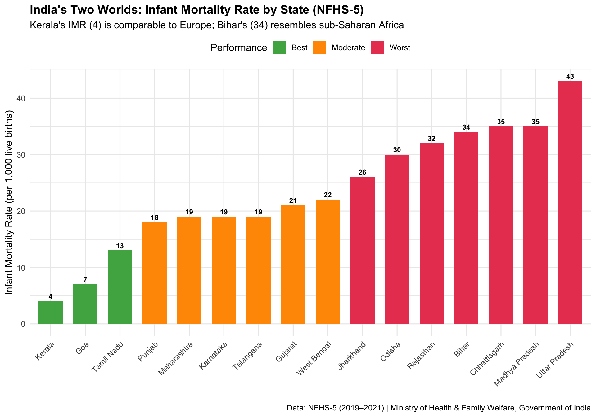
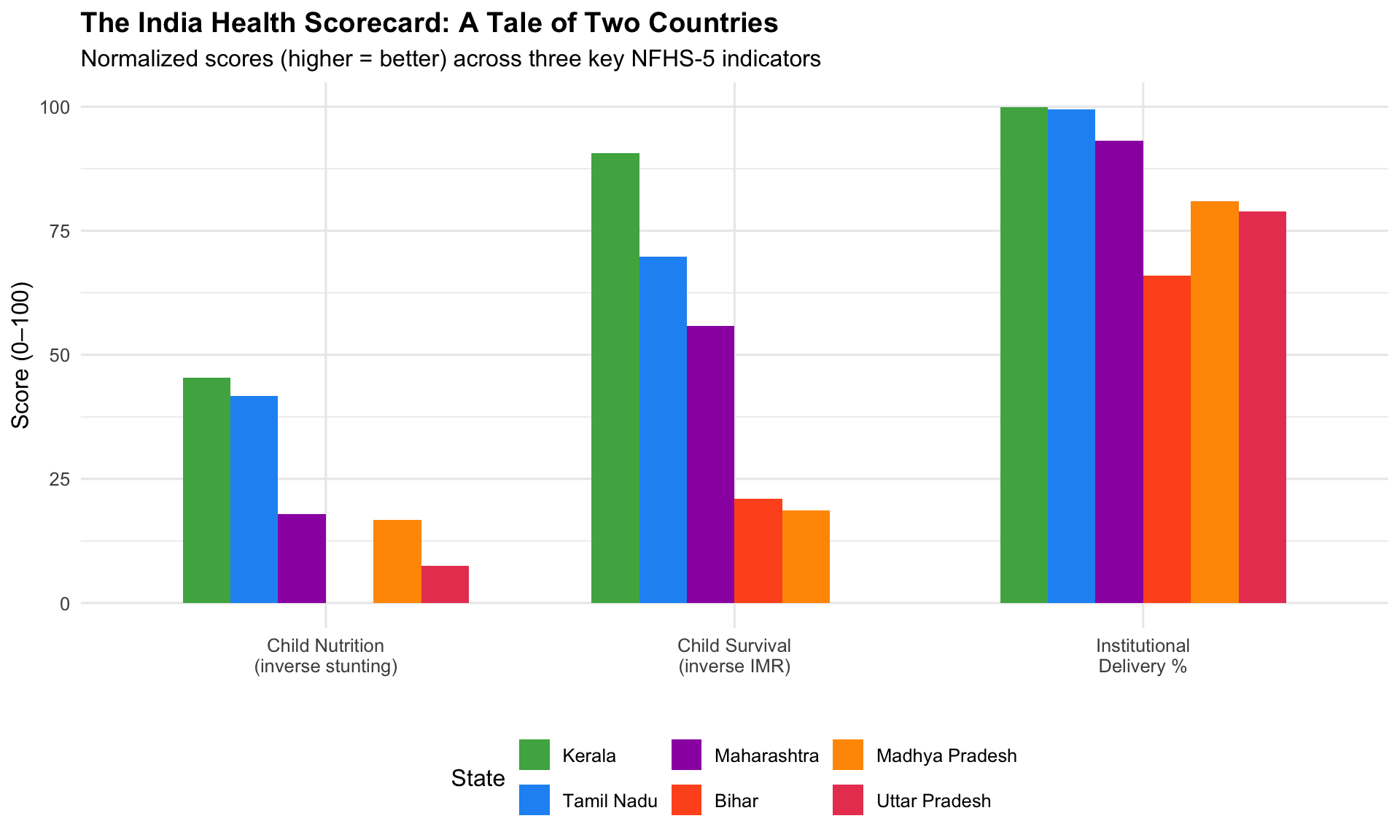
Kerala has long been studied as a global health anomaly — a low-income state with health outcomes comparable to wealthy nations. The National Family Health Survey (NFHS) data, visualized across states, makes the extraordinary interstate variation in India starkly visible: from Kerala and Tamil Nadu’s high performance to the persistent challenges in Bihar, Uttar Pradesh, and Madhya Pradesh.
Key Insight for Students: The “Kerala Model” shows that health outcomes are not simply a function of wealth. Kerala’s investments in female literacy, decentralised health governance, and primary care access produced rich-country health outcomes at developing-country income levels. As future doctors, remember: the health of your patients depends as much on their PIN code as on their genetic code.
I3. COVID19India.org — The Volunteer-Driven Tracker (2020–2021)
The Story
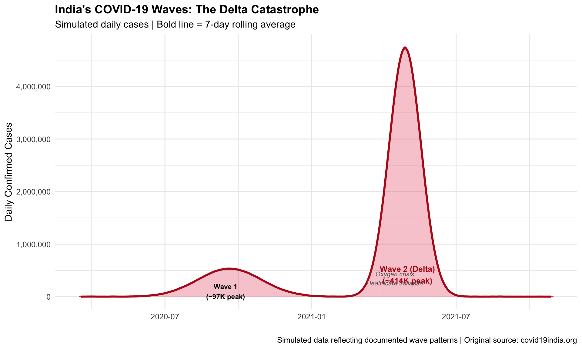
When official government dashboards were slow and fragmented during India’s COVID-19 crisis, a group of volunteer data scientists built covid19india.org — a real-time, open-source dashboard tracking cases, deaths, testing, and vaccination across all states and districts. It became India’s most trusted source for COVID-19 data, used by journalists, researchers, policymakers, and millions of citizens.
2020–2021Crowdsourced DashboardCitizen Science
R Recreation: India’s Two COVID Waves
Show R Code
# Simulated India COVID-19 daily cases (approximating the two major waves)set.seed(2021)dates <-seq(as.Date("2020-03-15"), as.Date("2021-10-31"), by ="day")n <-length(dates)t_seq <-1:n# Wave 1 (Sep 2020 peak) + Wave 2 (May 2021 Delta peak)wave1 <-90000*dnorm(t_seq, 190, 40) * nwave2 <-400000*dnorm(t_seq, 410, 20) * ndaily_cases <-pmax(2000, wave1 + wave2 +rnorm(n, 0, 3000))india_covid <-data.frame(date = dates, daily_cases = daily_cases)ggplot(india_covid, aes(x = date, y = daily_cases)) +geom_area(fill ="#e94560", alpha =0.3) +geom_line(colour ="#e94560", linewidth =0.5) +# 7-day rolling averagegeom_line(aes(y = zoo::rollmean(daily_cases, 7, fill =NA)),colour ="#b71c1c", linewidth =1.2) +annotate("text", x =as.Date("2020-09-15"), y =100000,label ="Wave 1\n(~97K peak)", size =3, fontface ="bold") +annotate("text", x =as.Date("2021-05-01"), y =420000,label ="Wave 2 (Delta)\n(~414K peak)", size =3.5,fontface ="bold", colour ="#b71c1c") +annotate("text", x =as.Date("2021-04-15"), y =350000,label ="Oxygen crisis\nHealthcare collapse",size =2.8, colour ="grey40", fontface ="italic") +scale_y_continuous(labels = scales::comma) +labs(title ="India's COVID-19 Waves: The Delta Catastrophe",subtitle ="Simulated daily cases | Bold line = 7-day rolling average",x ="", y ="Daily Confirmed Cases",caption ="Simulated data reflecting documented wave patterns | Original source: covid19india.org" ) +theme_minimal(base_size =12) +theme(plot.title =element_text(face ="bold"))
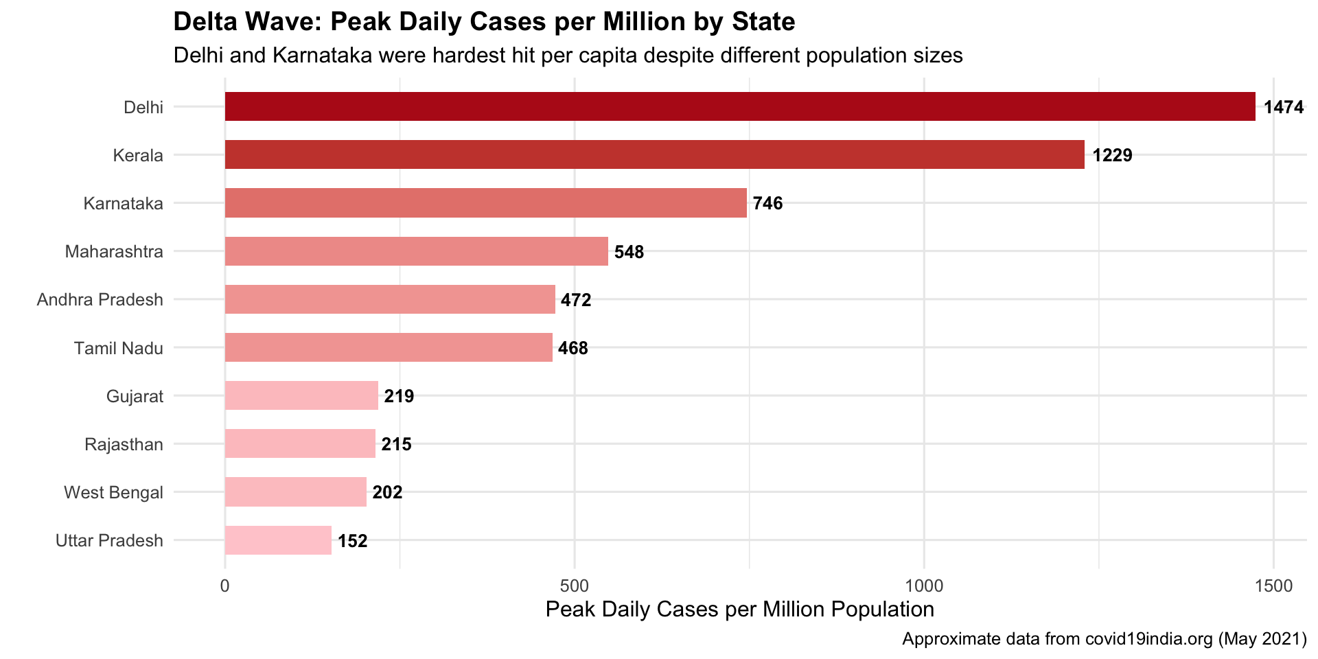
State-Level Disparities During Delta
Show R Code
# Approximate state-wise peak daily cases during Delta wave (May 2021)delta_peak <-data.frame(state =c("Maharashtra", "Karnataka", "Kerala", "Tamil Nadu", "Uttar Pradesh","Andhra Pradesh", "West Bengal", "Delhi", "Rajasthan", "Gujarat"),peak_daily =c(68000, 50000, 43000, 36000, 35000, 25000, 20000, 28000, 17000, 14000),pop_millions =c(124, 67, 35, 77, 231, 53, 99, 19, 79, 64)) %>%mutate(per_million =round(peak_daily / pop_millions),state =factor(state, levels = state[order(per_million)]) )ggplot(delta_peak, aes(x = state, y = per_million, fill = per_million)) +geom_col(width =0.6) +geom_text(aes(label = per_million), hjust =-0.2, fontface ="bold", size =3.5) +coord_flip() +scale_fill_gradient(low ="#ffcdd2", high ="#b71c1c", guide ="none") +labs(title ="Delta Wave: Peak Daily Cases per Million by State",subtitle ="Delhi and Karnataka were hardest hit per capita despite different population sizes",x ="", y ="Peak Daily Cases per Million Population",caption ="Approximate data from covid19india.org (May 2021)" ) +theme_minimal(base_size =12) +theme(plot.title =element_text(face ="bold"))
Key Insight for Students: COVID19India.org is a landmark in citizen health data science. When institutional dashboards failed, volunteers filled the gap — scraping state bulletins, verifying data, and building APIs used by researchers worldwide. It also exposed major data quality issues: massive undercounting of deaths, inconsistent state reporting, and the gap between official numbers and ground reality. This taught India (and the world) that data infrastructure is public health infrastructure.
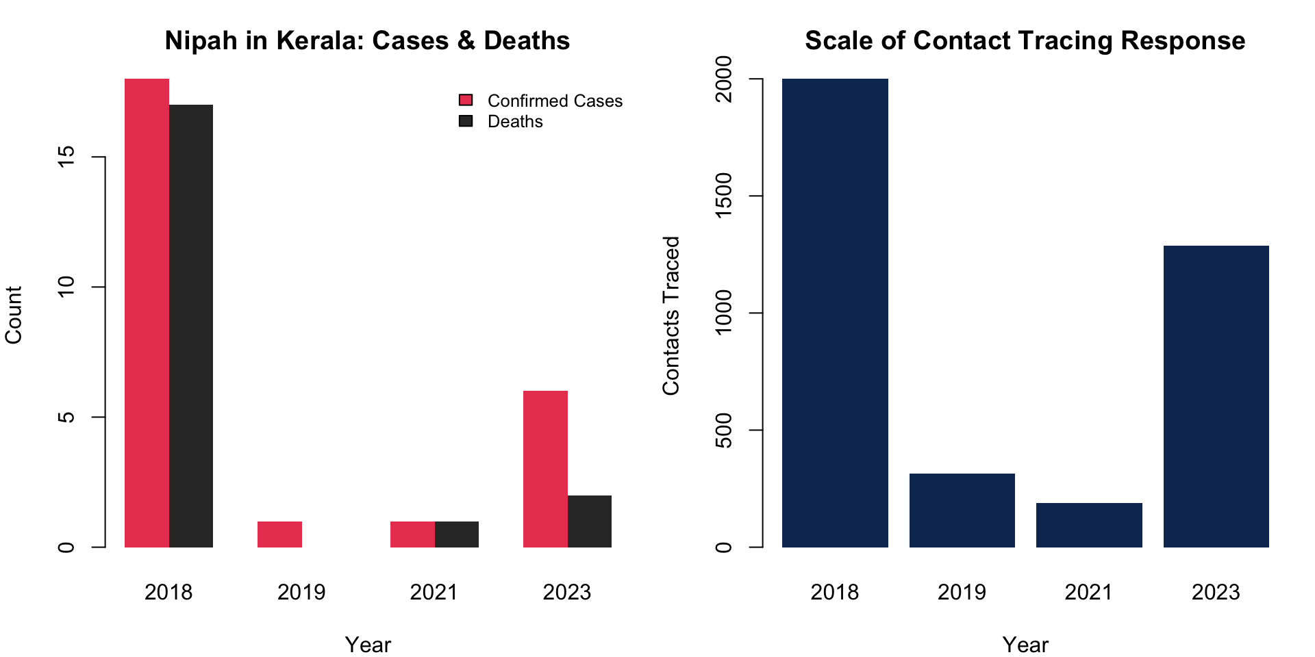
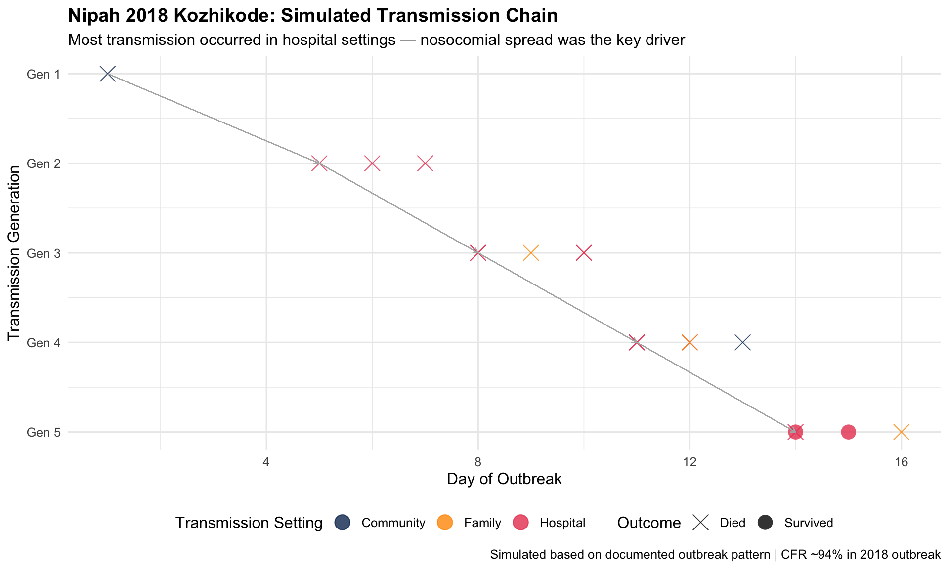
Kerala’s response to recurring Nipah virus outbreaks (2018, 2019, 2021, 2023) became a global case study in contact tracing and containment visualization. With a 40–75% case fatality rate and no vaccine, Kerala’s health system relied on meticulous contact tracing maps and epi curves to contain each outbreak within weeks.
Key Insight for Students: Kerala’s Nipah response demonstrates what “boots on the ground” epidemiology looks like in India. With no vaccine or treatment, the entire response depended on rapid contact identification, quarantine, and infection prevention in hospitals. The 2018 outbreak killed 17 of 18 confirmed cases — but was contained in 6 weeks through aggressive surveillance. The epi curve and transmission chain charts were the war maps for this battle.
I5. NFHS Through the Decades: India’s Health Transformation
The Story
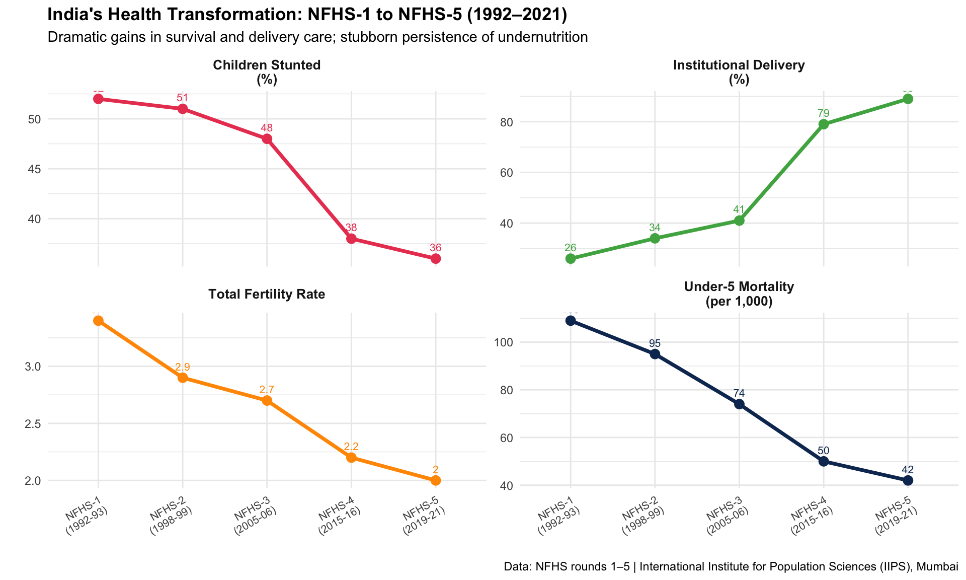
The National Family Health Survey (NFHS), conducted approximately every 5–7 years since 1992, is India’s most important health data source. Comparing NFHS rounds reveals a transformation: dramatic declines in child mortality and fertility, increases in institutional delivery, but persistent undernutrition and anaemia.
1992–2021Longitudinal SurveyPopulation Health
R Recreation: India’s Health Trajectory
Show R Code
# NFHS rounds comparison (approximate national averages)nfhs_rounds <-data.frame(round =rep(c("NFHS-1\n(1992-93)", "NFHS-2\n(1998-99)", "NFHS-3\n(2005-06)","NFHS-4\n(2015-16)", "NFHS-5\n(2019-21)"), 4),indicator =rep(c("Under-5 Mortality\n(per 1,000)", "Institutional Delivery\n(%)","Children Stunted\n(%)", "Total Fertility Rate"), each =5),value =c(# U5MR109, 95, 74, 50, 42,# Institutional delivery26, 34, 41, 79, 89,# Stunting52, 51, 48, 38, 36,# TFR3.4, 2.9, 2.7, 2.2, 2.0 ))# Normalize for comparable displaynfhs_plot <- nfhs_rounds %>%mutate(round_num =rep(1:5, 4))ggplot(nfhs_plot, aes(x = round, y = value, group = indicator, colour = indicator)) +geom_line(linewidth =1.3) +geom_point(size =3) +geom_text(aes(label = value), vjust =-1, size =2.8) +facet_wrap(~ indicator, scales ="free_y", ncol =2) +scale_colour_manual(values =c("#e94560", "#4caf50", "#ff9800", "#0f3460")) +labs(title ="India's Health Transformation: NFHS-1 to NFHS-5 (1992–2021)",subtitle ="Dramatic gains in survival and delivery care; stubborn persistence of undernutrition",x ="", y ="",caption ="Data: NFHS rounds 1–5 | International Institute for Population Sciences (IIPS), Mumbai" ) +theme_minimal(base_size =11) +theme(plot.title =element_text(face ="bold"),strip.text =element_text(face ="bold", size =10),legend.position ="none",axis.text.x =element_text(size =8, angle =30, hjust =1) )
Key Insight for Students: The NFHS data tells the story of India’s health transition: infectious disease declining, chronic disease rising, and nutrition stuck in the middle. Institutional delivery rose from 26% to 89% in three decades — an extraordinary achievement. But stunting has barely moved from 52% to 36%. This is the paradox that will define Indian public health in your careers.
I6. India’s Disease Surveillance: IDSP & IHIP
The Story
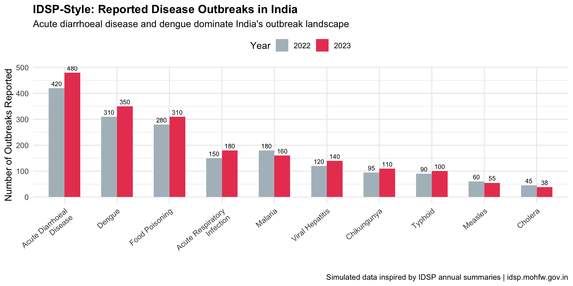
India’s Integrated Disease Surveillance Programme (IDSP), now transitioning to the Integrated Health Information Platform (IHIP), monitors epidemic-prone diseases across the country. Weekly outbreak reports and district-level dashboards form the backbone of India’s early warning system — though data quality and timeliness remain challenges.
Key Insight for Students: India’s surveillance system is a work in progress. IDSP reports weekly data from ~97% of districts, but quality varies enormously — private sector cases are underreported, death reporting is incomplete, and there are known “Sunday dips” in data caused by reporting gaps on weekends. When you use Indian health data, always ask: what’s not in this chart?
I7. India’s Tobacco Burden: The GBD India Story
The Story
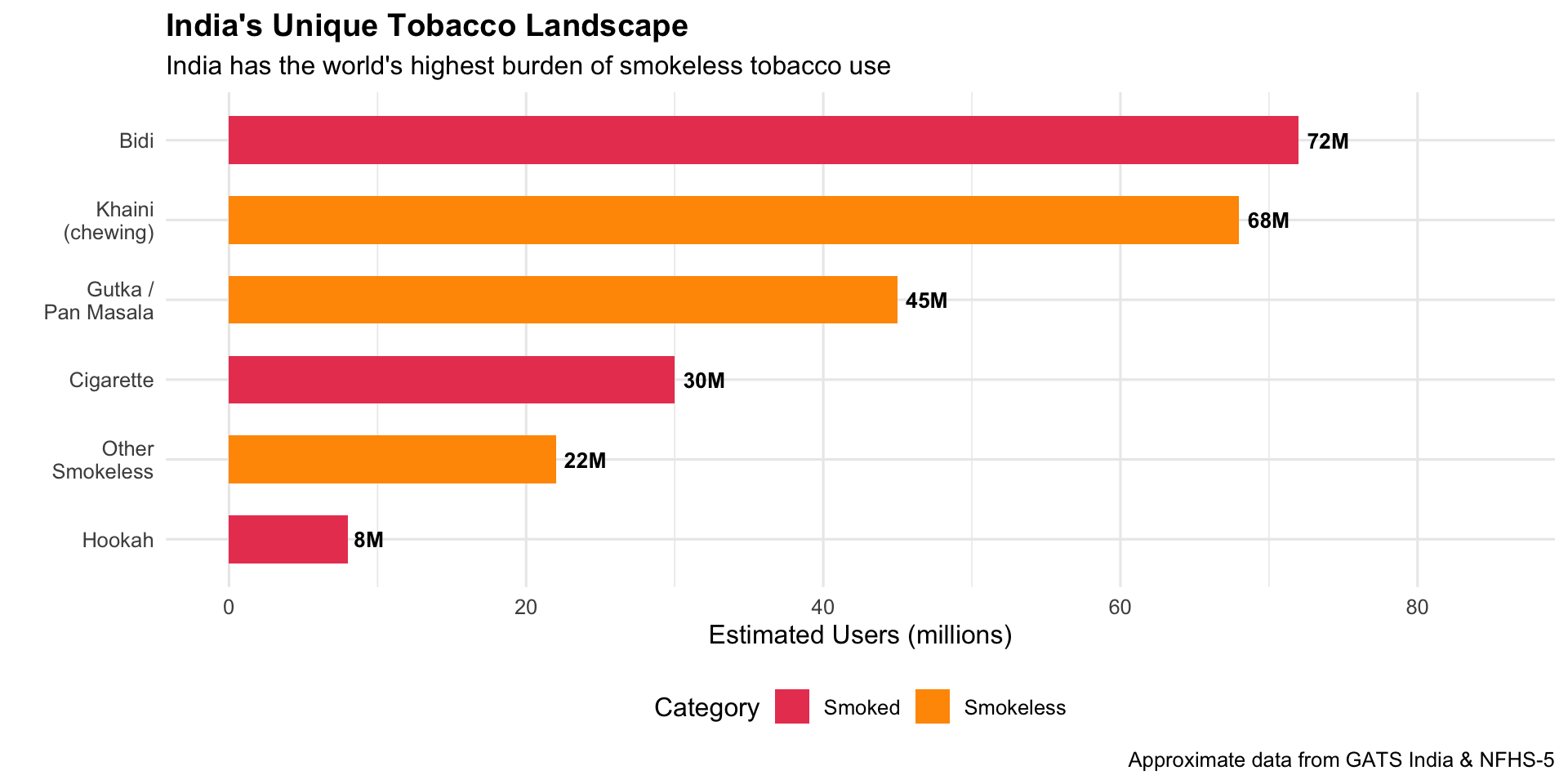
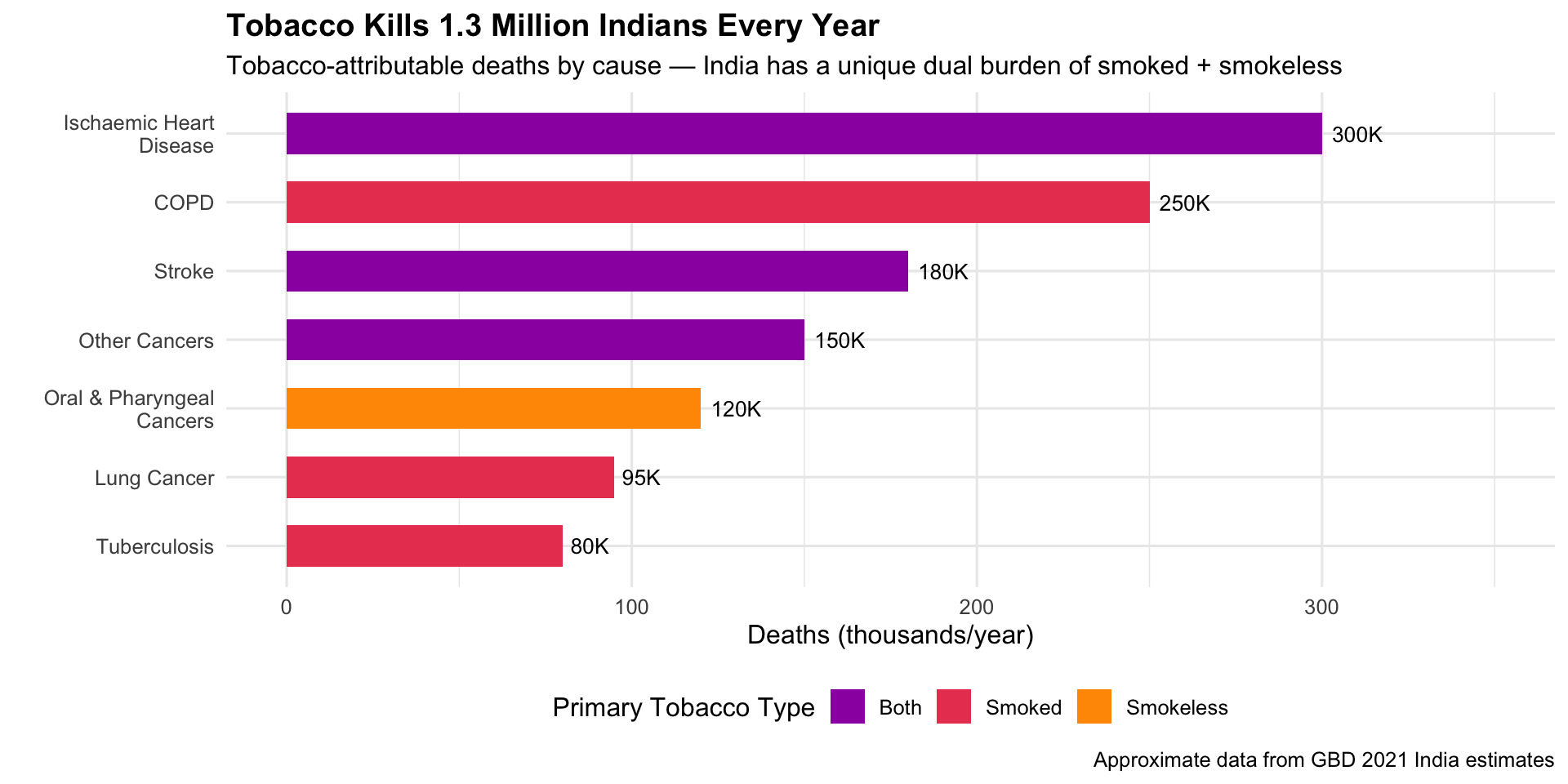
India has the world’s second-largest population of tobacco users — and the most diverse: cigarettes, bidis, gutka, khaini, hookah, and other smokeless forms. The GBD India visualizations show that tobacco kills over 1.3 million Indians per year and is the leading preventable risk factor for cancer and cardiovascular disease.
GBD 2021Risk Factor AnalysisTobacco Control
R Recreation
Show R Code
# India tobacco use types (approximate GATS/NFHS data)india_tobacco <-data.frame(type =c("Bidi", "Cigarette", "Khaini\n(chewing)", "Gutka /\nPan Masala","Hookah", "Other\nSmokeless"),users_millions =c(72, 30, 68, 45, 8, 22),category =c("Smoked", "Smoked", "Smokeless", "Smokeless", "Smoked", "Smokeless"))india_tobacco$type <-factor(india_tobacco$type,levels = india_tobacco$type[order(india_tobacco$users_millions)])ggplot(india_tobacco, aes(x = type, y = users_millions, fill = category)) +geom_col(width =0.6) +geom_text(aes(label =paste0(users_millions, "M")), hjust =-0.2, fontface ="bold", size =3.5) +coord_flip() +scale_fill_manual(values =c("Smoked"="#e94560", "Smokeless"="#ff9800")) +scale_y_continuous(limits =c(0, 85)) +labs(title ="India's Unique Tobacco Landscape",subtitle ="India has the world's highest burden of smokeless tobacco use",x ="", y ="Estimated Users (millions)", fill ="Category",caption ="Approximate data from GATS India & NFHS-5" ) +theme_minimal(base_size =12) +theme(plot.title =element_text(face ="bold"), legend.position ="bottom")
Show R Code
# Tobacco-attributable deaths in India by diseaseindia_tobacco_deaths <-data.frame(cause =c("Oral & Pharyngeal\nCancers", "Lung Cancer", "COPD","Ischaemic Heart\nDisease", "Stroke", "Tuberculosis", "Other Cancers"),deaths_thousands =c(120, 95, 250, 300, 180, 80, 150),tobacco_type =c("Smokeless", "Smoked", "Smoked", "Both", "Both", "Smoked", "Both"))india_tobacco_deaths$cause <-factor(india_tobacco_deaths$cause,levels = india_tobacco_deaths$cause[order(india_tobacco_deaths$deaths_thousands)])ggplot(india_tobacco_deaths, aes(x = cause, y = deaths_thousands, fill = tobacco_type)) +geom_col(width =0.6) +geom_text(aes(label =paste0(deaths_thousands, "K")), hjust =-0.2, size =3.5) +coord_flip() +scale_fill_manual(values =c("Smoked"="#e94560", "Smokeless"="#ff9800", "Both"="#9c27b0")) +scale_y_continuous(limits =c(0, 350)) +labs(title ="Tobacco Kills 1.3 Million Indians Every Year",subtitle ="Tobacco-attributable deaths by cause — India has a unique dual burden of smoked + smokeless",x ="", y ="Deaths (thousands/year)", fill ="Primary Tobacco Type",caption ="Approximate data from GBD 2021 India estimates" ) +theme_minimal(base_size =12) +theme(plot.title =element_text(face ="bold"), legend.position ="bottom")
Key Insight for Students: India’s tobacco burden is fundamentally different from the West. Oral cancers from smokeless tobacco (gutka, khaini) are a uniquely South Asian epidemic. In your clinical rotations, especially in oral medicine and oncology, you’ll see the consequences daily. The COTPA act and cigarette pack warnings were driven by exactly these data visualizations. Yet enforcement remains a challenge.
Discussion Questions: India Focus
Polio to COVID: India eradicated polio through district-level targeting. Why couldn’t the same approach work for COVID-19?
The Kerala paradox: Kerala has the best health outcomes but also had very high COVID-19 case rates. Does this undermine the “Kerala Model” or validate it?
Citizen data science: COVID19India.org filled a data gap left by government. Should governments embrace or be concerned by such initiatives?
Tobacco in India: India’s tobacco landscape (bidi, gutka) is very different from the West. How should tobacco control policy be adapted for this context?
Data quality: A common criticism of Indian health data is underreporting. How does this affect the visualizations you’ve seen, and what can be done?
Source Code
---title: "🇮🇳 India Focus: Public Health Visualizations from India"subtitle: "Data stories from the world's most populous nation"---```{r}#| include: falselibrary(ggplot2)library(dplyr)library(tidyr)```::: {.era-card}India presents a unique public health story — a nation that **eradicated polio**, built the world's largest biometric health ID system, fought recurring Nipah outbreaks, and crowdsourced one of the best COVID-19 dashboards on the planet. With 1.4 billion people, 36 states/UTs, and enormous diversity in health outcomes, India's data visualizations tell a story of both remarkable progress and persistent challenges. These visualizations are especially relevant for medical students training in the Indian health system.:::---## I1. India's Polio Eradication: The Surveillance Map (1995–2014) {#polio}::: {.viz-box}### The StoryIndia reported its last case of wild poliovirus on 13 January 2011 — a 2-year-old girl named Rukhsar Khatoon in Howrah, West Bengal. India was officially certified polio-free in 2014. The surveillance maps tracking AFP (Acute Flaccid Paralysis) cases district-by-district were critical to identifying persistent pockets — especially in Uttar Pradesh and Bihar — and directing pulse immunisation campaigns.::: {.viz-meta}[1995–2014]{.timeline-marker}[Surveillance Map]{style="background:#e8eaf6;padding:0.2rem 0.7rem;border-radius:15px;font-size:0.85rem;"}[Disease Eradication]{style="background:#e8eaf6;padding:0.2rem 0.7rem;border-radius:15px;font-size:0.85rem;"}:::### R Recreation: India's Polio Elimination Journey```{r}#| fig-height: 6#| fig-width: 10# India polio case data (approximate WHO/GPEI data)india_polio <-data.frame(year =1998:2014,cases =c(1934, 1126, 265, 268, 1600, 225, 134, 66, 676, 874, 559, 741, 42, 1, 0, 0, 0))# Key eventspolio_events <-data.frame(year =c(1995, 2003, 2011, 2014),label =c("Pulse Polio\nLaunched", "Monovalent OPV\nIntroduced", "Last Case\n(13 Jan 2011)", "Polio-Free\nCertified"),y =c(1800, 300, 200, 100))ggplot(india_polio, aes(x = year, y = cases)) +geom_area(fill ="#ff9800", alpha =0.3) +geom_line(colour ="#e65100", linewidth =1.3) +geom_point(colour ="#e65100", size =2.5) +geom_vline(xintercept =c(2003, 2011), linetype ="dashed", alpha =0.4) +annotate("text", x =2003, y =1700, label ="Monovalent OPV\nintroduced", size =3,fontface ="italic", colour ="grey40") +annotate("point", x =2011, y =1, colour ="#4caf50", size =6, shape =8, stroke =2) +annotate("text", x =2012.5, y =250,label ="Last case: Rukhsar Khatoon\nHowrah, West Bengal\n13 January 2011",size =3, fontface ="bold", colour ="#4caf50", hjust =0) +annotate("rect", xmin =2013.5, xmax =2014.5, ymin =-50, ymax =100,fill ="#4caf50", alpha =0.2) +annotate("text", x =2014, y =60, label ="CERTIFIED\nPOLIO-FREE", size =3,fontface ="bold", colour ="#2e7d32") +scale_y_continuous(limits =c(-50, 2000)) +labs(title ="India's Polio Eradication: From 200,000 Cases to Zero",subtitle ="Wild poliovirus cases in India, 1998–2014",x ="", y ="Confirmed Polio Cases",caption ="Data: WHO/GPEI | India was the most challenging country for polio eradication" ) +theme_minimal(base_size =12) +theme(plot.title =element_text(face ="bold"))```### Endemic States — The Final Pockets```{r}#| fig-height: 5#| fig-width: 10# Polio cases by state (approximate, key endemic states)state_polio <-data.frame(state =rep(c("Uttar Pradesh", "Bihar", "West Bengal", "Jharkhand", "Other States"), each =6),year =rep(c(2006, 2007, 2008, 2009, 2010, 2011), 5),cases =c(# UP415, 490, 310, 602, 22, 1,# Bihar95, 140, 100, 79, 10, 0,# West Bengal24, 38, 25, 11, 5, 0,# Jharkhand12, 18, 10, 6, 1, 0,# Others130, 188, 114, 43, 4, 0 ))ggplot(state_polio, aes(x = year, y = cases, fill = state)) +geom_area(alpha =0.7, colour ="white", linewidth =0.3) +scale_fill_manual(values =c("Uttar Pradesh"="#e94560", "Bihar"="#ff9800","West Bengal"="#0f3460", "Jharkhand"="#9c27b0","Other States"="#b0bec5")) +labs(title ="India's Polio Hotspots: Uttar Pradesh Was the Final Frontier",subtitle ="Polio cases by state, 2006–2011",x ="", y ="Cases", fill ="State",caption ="Approximate data from GPEI/WHO surveillance reports" ) +theme_minimal(base_size =12) +theme(plot.title =element_text(face ="bold"), legend.position ="bottom")```::: {.callout-insight}**Key Insight for Students:** India's polio eradication — once thought impossible given its population density, sanitation challenges, and weak cold chain — became a model for the world. The district-level surveillance maps were essential: they showed that the problem wasn't "India has polio" but rather "specific blocks in UP and Bihar have polio." This **granular targeting** made eradication achievable.::::::---## I2. The "Kerala Model": Health Outcomes Across Indian States (NFHS) {#keralamodel}::: {.viz-box}### The StoryKerala has long been studied as a global health anomaly — a low-income state with health outcomes comparable to wealthy nations. The National Family Health Survey (NFHS) data, visualized across states, makes the extraordinary interstate variation in India starkly visible: from Kerala and Tamil Nadu's high performance to the persistent challenges in Bihar, Uttar Pradesh, and Madhya Pradesh.::: {.viz-meta}[NFHS-5, 2019–2021]{.timeline-marker}[State Comparison Dashboard]{style="background:#e8eaf6;padding:0.2rem 0.7rem;border-radius:15px;font-size:0.85rem;"}[Health Equity]{style="background:#e8eaf6;padding:0.2rem 0.7rem;border-radius:15px;font-size:0.85rem;"}:::### R Recreation: Interstate Health Disparities```{r}#| fig-height: 7#| fig-width: 10# NFHS-5 key indicators by state (approximate)nfhs5 <-data.frame(state =c("Kerala", "Tamil Nadu", "Goa", "Maharashtra", "Punjab","Karnataka", "Telangana", "West Bengal", "Gujarat", "Odisha","Rajasthan", "Chhattisgarh", "Madhya Pradesh", "Jharkhand","Uttar Pradesh", "Bihar"),imr =c(4, 13, 7, 19, 18, 19, 19, 22, 21, 30, 32, 35, 35, 26, 43, 34),institutional_delivery =c(99.9, 99.5, 99.3, 93.1, 94.6, 95.8, 94.6, 93.0, 95.2, 86.1,85.1, 73.7, 81.0, 70.0, 78.9, 65.9),stunting_u5 =c(23.4, 25.0, 25.8, 35.2, 24.5, 35.4, 33.1, 33.8, 39.0, 31.0,31.8, 34.6, 35.7, 39.6, 39.7, 42.9))nfhs5$state <-factor(nfhs5$state, levels = nfhs5$state[order(nfhs5$imr)])ggplot(nfhs5, aes(x = state, y = imr,fill =ifelse(imr <=15, "Best", ifelse(imr <=25, "Moderate", "Worst")))) +geom_col(width =0.7, show.legend =TRUE) +geom_text(aes(label = imr), vjust =-0.5, size =3, fontface ="bold") +scale_fill_manual(values =c("Best"="#4caf50", "Moderate"="#ff9800", "Worst"="#e94560"),name ="Performance") +labs(title ="India's Two Worlds: Infant Mortality Rate by State (NFHS-5)",subtitle ="Kerala's IMR (4) is comparable to Europe; Bihar's (34) resembles sub-Saharan Africa",x ="", y ="Infant Mortality Rate (per 1,000 live births)",caption ="Data: NFHS-5 (2019–2021) | Ministry of Health & Family Welfare, Government of India" ) +theme_minimal(base_size =12) +theme(plot.title =element_text(face ="bold"),axis.text.x =element_text(angle =45, hjust =1),legend.position ="top" )```### Multi-Indicator State Comparison```{r}#| fig-height: 6#| fig-width: 10# Radar-style comparison of selected statescompare_states <- nfhs5 %>%filter(state %in%c("Kerala", "Tamil Nadu", "Bihar", "Uttar Pradesh", "Madhya Pradesh", "Maharashtra")) %>%mutate(# Normalize: higher is better for all (invert negative indicators)imr_score =100- (imr /max(nfhs5$imr) *100),delivery_score = institutional_delivery,nutrition_score =100- (stunting_u5 /max(nfhs5$stunting_u5) *100) ) %>%select(state, imr_score, delivery_score, nutrition_score) %>%pivot_longer(cols =-state, names_to ="indicator", values_to ="score") %>%mutate(indicator =case_when( indicator =="imr_score"~"Child Survival\n(inverse IMR)", indicator =="delivery_score"~"Institutional\nDelivery %", indicator =="nutrition_score"~"Child Nutrition\n(inverse stunting)" ) )ggplot(compare_states, aes(x = indicator, y = score, fill = state)) +geom_col(position ="dodge", width =0.7) +scale_fill_manual(values =c("Kerala"="#4caf50", "Tamil Nadu"="#2196f3","Maharashtra"="#9c27b0","Uttar Pradesh"="#e94560", "Bihar"="#ff5722","Madhya Pradesh"="#ff9800")) +labs(title ="The India Health Scorecard: A Tale of Two Countries",subtitle ="Normalized scores (higher = better) across three key NFHS-5 indicators",x ="", y ="Score (0–100)", fill ="State" ) +theme_minimal(base_size =12) +theme(plot.title =element_text(face ="bold"), legend.position ="bottom")```### Explore the NFHS-5 Data🔗 **[NFHS-5 State Fact Sheets →](http://rchiips.org/nfhs/factsheet_NFHS-5.shtml)**🔗 **[Health Heatmap of India (interactive) →](https://healthheatmapindia.org/)**::: {.callout-insight}**Key Insight for Students:** The "Kerala Model" shows that **health outcomes are not simply a function of wealth**. Kerala's investments in female literacy, decentralised health governance, and primary care access produced rich-country health outcomes at developing-country income levels. As future doctors, remember: the health of your patients depends as much on their PIN code as on their genetic code.::::::---## I3. COVID19India.org — The Volunteer-Driven Tracker (2020–2021) {#covidindia}::: {.viz-box}### The StoryWhen official government dashboards were slow and fragmented during India's COVID-19 crisis, a group of **volunteer data scientists** built [covid19india.org](https://www.covid19india.org/) — a real-time, open-source dashboard tracking cases, deaths, testing, and vaccination across all states and districts. It became India's most trusted source for COVID-19 data, used by journalists, researchers, policymakers, and millions of citizens.::: {.viz-meta}[2020–2021]{.timeline-marker}[Crowdsourced Dashboard]{style="background:#e8eaf6;padding:0.2rem 0.7rem;border-radius:15px;font-size:0.85rem;"}[Citizen Science]{style="background:#e8eaf6;padding:0.2rem 0.7rem;border-radius:15px;font-size:0.85rem;"}:::### R Recreation: India's Two COVID Waves```{r}#| fig-height: 6#| fig-width: 10# Simulated India COVID-19 daily cases (approximating the two major waves)set.seed(2021)dates <-seq(as.Date("2020-03-15"), as.Date("2021-10-31"), by ="day")n <-length(dates)t_seq <-1:n# Wave 1 (Sep 2020 peak) + Wave 2 (May 2021 Delta peak)wave1 <-90000*dnorm(t_seq, 190, 40) * nwave2 <-400000*dnorm(t_seq, 410, 20) * ndaily_cases <-pmax(2000, wave1 + wave2 +rnorm(n, 0, 3000))india_covid <-data.frame(date = dates, daily_cases = daily_cases)ggplot(india_covid, aes(x = date, y = daily_cases)) +geom_area(fill ="#e94560", alpha =0.3) +geom_line(colour ="#e94560", linewidth =0.5) +# 7-day rolling averagegeom_line(aes(y = zoo::rollmean(daily_cases, 7, fill =NA)),colour ="#b71c1c", linewidth =1.2) +annotate("text", x =as.Date("2020-09-15"), y =100000,label ="Wave 1\n(~97K peak)", size =3, fontface ="bold") +annotate("text", x =as.Date("2021-05-01"), y =420000,label ="Wave 2 (Delta)\n(~414K peak)", size =3.5,fontface ="bold", colour ="#b71c1c") +annotate("text", x =as.Date("2021-04-15"), y =350000,label ="Oxygen crisis\nHealthcare collapse",size =2.8, colour ="grey40", fontface ="italic") +scale_y_continuous(labels = scales::comma) +labs(title ="India's COVID-19 Waves: The Delta Catastrophe",subtitle ="Simulated daily cases | Bold line = 7-day rolling average",x ="", y ="Daily Confirmed Cases",caption ="Simulated data reflecting documented wave patterns | Original source: covid19india.org" ) +theme_minimal(base_size =12) +theme(plot.title =element_text(face ="bold"))```### State-Level Disparities During Delta```{r}#| fig-height: 5#| fig-width: 10# Approximate state-wise peak daily cases during Delta wave (May 2021)delta_peak <-data.frame(state =c("Maharashtra", "Karnataka", "Kerala", "Tamil Nadu", "Uttar Pradesh","Andhra Pradesh", "West Bengal", "Delhi", "Rajasthan", "Gujarat"),peak_daily =c(68000, 50000, 43000, 36000, 35000, 25000, 20000, 28000, 17000, 14000),pop_millions =c(124, 67, 35, 77, 231, 53, 99, 19, 79, 64)) %>%mutate(per_million =round(peak_daily / pop_millions),state =factor(state, levels = state[order(per_million)]) )ggplot(delta_peak, aes(x = state, y = per_million, fill = per_million)) +geom_col(width =0.6) +geom_text(aes(label = per_million), hjust =-0.2, fontface ="bold", size =3.5) +coord_flip() +scale_fill_gradient(low ="#ffcdd2", high ="#b71c1c", guide ="none") +labs(title ="Delta Wave: Peak Daily Cases per Million by State",subtitle ="Delhi and Karnataka were hardest hit per capita despite different population sizes",x ="", y ="Peak Daily Cases per Million Population",caption ="Approximate data from covid19india.org (May 2021)" ) +theme_minimal(base_size =12) +theme(plot.title =element_text(face ="bold"))```### Explore the Original🔗 **[COVID19India.org (archived) →](https://www.covid19india.org/)**::: {.callout-insight}**Key Insight for Students:** COVID19India.org is a landmark in **citizen health data science**. When institutional dashboards failed, volunteers filled the gap — scraping state bulletins, verifying data, and building APIs used by researchers worldwide. It also exposed major data quality issues: massive undercounting of deaths, inconsistent state reporting, and the gap between official numbers and ground reality. This taught India (and the world) that **data infrastructure is public health infrastructure**.::::::---## I4. Kerala's Nipah Outbreak Contact Tracing (2018–2023) {#nipah}::: {.viz-box}### The StoryKerala's response to recurring Nipah virus outbreaks (2018, 2019, 2021, 2023) became a global case study in contact tracing and containment visualization. With a 40–75% case fatality rate and no vaccine, Kerala's health system relied on **meticulous contact tracing maps and epi curves** to contain each outbreak within weeks.::: {.viz-meta}[2018–2023]{.timeline-marker}[Contact Tracing / Epi Curve]{style="background:#e8eaf6;padding:0.2rem 0.7rem;border-radius:15px;font-size:0.85rem;"}[Outbreak Response]{style="background:#e8eaf6;padding:0.2rem 0.7rem;border-radius:15px;font-size:0.85rem;"}:::### R Recreation: Nipah Outbreak Timeline & Transmission Chain```{r}#| fig-height: 5#| fig-width: 10# Kerala Nipah outbreaks summarynipah_outbreaks <-data.frame(year =c(2018, 2019, 2021, 2023),location =c("Kozhikode &\nMalappuram", "Ernakulam", "Kozhikode", "Kozhikode"),confirmed_cases =c(18, 1, 1, 6),deaths =c(17, 0, 1, 2),contacts_traced =c(2000, 314, 188, 1288))par(mfrow =c(1, 2), mar =c(4, 4, 3, 1))# Cases and deathsbarplot(rbind(nipah_outbreaks$confirmed_cases, nipah_outbreaks$deaths),beside =TRUE, names.arg = nipah_outbreaks$year,col =c("#e94560", "#333333"), border =NA,main ="Nipah in Kerala: Cases & Deaths",ylab ="Count", xlab ="Year")legend("topright", legend =c("Confirmed Cases", "Deaths"),fill =c("#e94560", "#333333"), bty ="n", cex =0.8)# Contacts traced (shows scale of response)barplot(nipah_outbreaks$contacts_traced, names.arg = nipah_outbreaks$year,col ="#0f3460", border =NA,main ="Scale of Contact Tracing Response",ylab ="Contacts Traced", xlab ="Year")``````{r}#| fig-height: 1par(mfrow =c(1, 1))```### Simulated Transmission Chain (2018 Outbreak)```{r}#| fig-height: 6#| fig-width: 10# Simulated transmission tree for the 2018 Kozhikode outbreaktransmission <-data.frame(case_id =1:18,day =c(1, 5, 6, 7, 8, 8, 9, 10, 10, 11, 11, 12, 12, 13, 14, 14, 15, 16),generation =c(1, 2, 2, 2, 3, 3, 3, 3, 3, 4, 4, 4, 4, 4, 5, 5, 5, 5),setting =c("Community", rep("Hospital", 5), "Family", rep("Hospital", 5),"Family", "Community", rep("Hospital", 3), "Family"),status =c(rep("Died", 14), "Died", "Survived", "Survived", "Died"))ggplot(transmission, aes(x = day, y = generation, colour = setting, shape = status)) +geom_point(size =5, alpha =0.8) +geom_segment(aes(x =1, xend =5, y =1, yend =2), colour ="grey70",arrow =arrow(length =unit(0.15, "cm")), linewidth =0.3) +geom_segment(aes(x =5, xend =8, y =2, yend =3), colour ="grey70",arrow =arrow(length =unit(0.15, "cm")), linewidth =0.3) +geom_segment(aes(x =8, xend =11, y =3, yend =4), colour ="grey70",arrow =arrow(length =unit(0.15, "cm")), linewidth =0.3) +geom_segment(aes(x =11, xend =14, y =4, yend =5), colour ="grey70",arrow =arrow(length =unit(0.15, "cm")), linewidth =0.3) +scale_colour_manual(values =c("Hospital"="#e94560", "Family"="#ff9800", "Community"="#0f3460")) +scale_shape_manual(values =c("Died"=4, "Survived"=16)) +scale_y_reverse(breaks =1:5, labels =paste("Gen", 1:5)) +labs(title ="Nipah 2018 Kozhikode: Simulated Transmission Chain",subtitle ="Most transmission occurred in hospital settings — nosocomial spread was the key driver",x ="Day of Outbreak", y ="Transmission Generation",colour ="Transmission Setting", shape ="Outcome",caption ="Simulated based on documented outbreak pattern | CFR ~94% in 2018 outbreak" ) +theme_minimal(base_size =12) +theme(plot.title =element_text(face ="bold"), legend.position ="bottom")```::: {.callout-insight}**Key Insight for Students:** Kerala's Nipah response demonstrates what **"boots on the ground" epidemiology** looks like in India. With no vaccine or treatment, the entire response depended on rapid contact identification, quarantine, and infection prevention in hospitals. The 2018 outbreak killed 17 of 18 confirmed cases — but was contained in 6 weeks through aggressive surveillance. The epi curve and transmission chain charts were the war maps for this battle.::::::---## I5. NFHS Through the Decades: India's Health Transformation {#nfhstrend}::: {.viz-box}### The StoryThe National Family Health Survey (NFHS), conducted approximately every 5–7 years since 1992, is India's most important health data source. Comparing NFHS rounds reveals a transformation: dramatic declines in child mortality and fertility, increases in institutional delivery, but persistent undernutrition and anaemia.::: {.viz-meta}[1992–2021]{.timeline-marker}[Longitudinal Survey]{style="background:#e8eaf6;padding:0.2rem 0.7rem;border-radius:15px;font-size:0.85rem;"}[Population Health]{style="background:#e8eaf6;padding:0.2rem 0.7rem;border-radius:15px;font-size:0.85rem;"}:::### R Recreation: India's Health Trajectory```{r}#| fig-height: 6#| fig-width: 10# NFHS rounds comparison (approximate national averages)nfhs_rounds <-data.frame(round =rep(c("NFHS-1\n(1992-93)", "NFHS-2\n(1998-99)", "NFHS-3\n(2005-06)","NFHS-4\n(2015-16)", "NFHS-5\n(2019-21)"), 4),indicator =rep(c("Under-5 Mortality\n(per 1,000)", "Institutional Delivery\n(%)","Children Stunted\n(%)", "Total Fertility Rate"), each =5),value =c(# U5MR109, 95, 74, 50, 42,# Institutional delivery26, 34, 41, 79, 89,# Stunting52, 51, 48, 38, 36,# TFR3.4, 2.9, 2.7, 2.2, 2.0 ))# Normalize for comparable displaynfhs_plot <- nfhs_rounds %>%mutate(round_num =rep(1:5, 4))ggplot(nfhs_plot, aes(x = round, y = value, group = indicator, colour = indicator)) +geom_line(linewidth =1.3) +geom_point(size =3) +geom_text(aes(label = value), vjust =-1, size =2.8) +facet_wrap(~ indicator, scales ="free_y", ncol =2) +scale_colour_manual(values =c("#e94560", "#4caf50", "#ff9800", "#0f3460")) +labs(title ="India's Health Transformation: NFHS-1 to NFHS-5 (1992–2021)",subtitle ="Dramatic gains in survival and delivery care; stubborn persistence of undernutrition",x ="", y ="",caption ="Data: NFHS rounds 1–5 | International Institute for Population Sciences (IIPS), Mumbai" ) +theme_minimal(base_size =11) +theme(plot.title =element_text(face ="bold"),strip.text =element_text(face ="bold", size =10),legend.position ="none",axis.text.x =element_text(size =8, angle =30, hjust =1) )```::: {.callout-insight}**Key Insight for Students:** The NFHS data tells the story of India's health transition: **infectious disease declining, chronic disease rising, and nutrition stuck in the middle.** Institutional delivery rose from 26% to 89% in three decades — an extraordinary achievement. But stunting has barely moved from 52% to 36%. This is the paradox that will define Indian public health in your careers.::::::---## I6. India's Disease Surveillance: IDSP & IHIP {#idsp}::: {.viz-box}### The StoryIndia's Integrated Disease Surveillance Programme (IDSP), now transitioning to the Integrated Health Information Platform (IHIP), monitors epidemic-prone diseases across the country. Weekly outbreak reports and district-level dashboards form the backbone of India's early warning system — though data quality and timeliness remain challenges.::: {.viz-meta}[2004–present]{.timeline-marker}[Surveillance Dashboard]{style="background:#e8eaf6;padding:0.2rem 0.7rem;border-radius:15px;font-size:0.85rem;"}[Disease Surveillance]{style="background:#e8eaf6;padding:0.2rem 0.7rem;border-radius:15px;font-size:0.85rem;"}:::### R Recreation: IDSP-Style Outbreak Summary```{r}#| fig-height: 5#| fig-width: 10# Simulated IDSP annual outbreak data (inspired by IDSP annual summaries)idsp_outbreaks <-data.frame(disease =c("Acute Diarrhoeal\nDisease", "Food Poisoning", "Dengue","Chikungunya", "Malaria", "Viral Hepatitis","Acute Respiratory\nInfection", "Cholera", "Measles", "Typhoid"),outbreaks_2022 =c(420, 280, 310, 95, 180, 120, 150, 45, 60, 90),outbreaks_2023 =c(480, 310, 350, 110, 160, 140, 180, 38, 55, 100))idsp_long <- idsp_outbreaks %>%pivot_longer(cols =c(outbreaks_2022, outbreaks_2023),names_to ="year", values_to ="outbreaks") %>%mutate(year =ifelse(year =="outbreaks_2022", "2022", "2023"))idsp_long$disease <-factor(idsp_long$disease,levels = idsp_outbreaks$disease[order(idsp_outbreaks$outbreaks_2023, decreasing =TRUE)])ggplot(idsp_long, aes(x = disease, y = outbreaks, fill = year)) +geom_col(position ="dodge", width =0.6) +geom_text(aes(label = outbreaks), position =position_dodge(0.6), vjust =-0.5, size =2.8) +scale_fill_manual(values =c("2022"="#b0bec5", "2023"="#e94560")) +labs(title ="IDSP-Style: Reported Disease Outbreaks in India",subtitle ="Acute diarrhoeal disease and dengue dominate India's outbreak landscape",x ="", y ="Number of Outbreaks Reported", fill ="Year",caption ="Simulated data inspired by IDSP annual summaries | idsp.mohfw.gov.in" ) +theme_minimal(base_size =12) +theme(plot.title =element_text(face ="bold"),axis.text.x =element_text(angle =40, hjust =1),legend.position ="top" )```### Explore Indian Health Dashboards🔗 **[IDSP/IHIP Portal →](https://idsp.mohfw.gov.in/)**🔗 **[Health Heatmap of India →](https://healthheatmapindia.org/)**🔗 **[NHM HMIS Portal →](https://hmis.mohfw.gov.in/)**🔗 **[NFHS-5 Dashboard →](http://rchiips.org/nfhs/factsheet_NFHS-5.shtml)**::: {.callout-insight}**Key Insight for Students:** India's surveillance system is a work in progress. IDSP reports weekly data from ~97% of districts, but **quality varies enormously** — private sector cases are underreported, death reporting is incomplete, and there are known "Sunday dips" in data caused by reporting gaps on weekends. When you use Indian health data, always ask: what's *not* in this chart?::::::---## I7. India's Tobacco Burden: The GBD India Story {#indiatobacco}::: {.viz-box}### The StoryIndia has the world's second-largest population of tobacco users — and the most diverse: cigarettes, bidis, gutka, khaini, hookah, and other smokeless forms. The GBD India visualizations show that **tobacco kills over 1.3 million Indians per year** and is the leading preventable risk factor for cancer and cardiovascular disease.::: {.viz-meta}[GBD 2021]{.timeline-marker}[Risk Factor Analysis]{style="background:#e8eaf6;padding:0.2rem 0.7rem;border-radius:15px;font-size:0.85rem;"}[Tobacco Control]{style="background:#e8eaf6;padding:0.2rem 0.7rem;border-radius:15px;font-size:0.85rem;"}:::### R Recreation```{r}#| fig-height: 5#| fig-width: 10# India tobacco use types (approximate GATS/NFHS data)india_tobacco <-data.frame(type =c("Bidi", "Cigarette", "Khaini\n(chewing)", "Gutka /\nPan Masala","Hookah", "Other\nSmokeless"),users_millions =c(72, 30, 68, 45, 8, 22),category =c("Smoked", "Smoked", "Smokeless", "Smokeless", "Smoked", "Smokeless"))india_tobacco$type <-factor(india_tobacco$type,levels = india_tobacco$type[order(india_tobacco$users_millions)])ggplot(india_tobacco, aes(x = type, y = users_millions, fill = category)) +geom_col(width =0.6) +geom_text(aes(label =paste0(users_millions, "M")), hjust =-0.2, fontface ="bold", size =3.5) +coord_flip() +scale_fill_manual(values =c("Smoked"="#e94560", "Smokeless"="#ff9800")) +scale_y_continuous(limits =c(0, 85)) +labs(title ="India's Unique Tobacco Landscape",subtitle ="India has the world's highest burden of smokeless tobacco use",x ="", y ="Estimated Users (millions)", fill ="Category",caption ="Approximate data from GATS India & NFHS-5" ) +theme_minimal(base_size =12) +theme(plot.title =element_text(face ="bold"), legend.position ="bottom")``````{r}#| fig-height: 5#| fig-width: 10# Tobacco-attributable deaths in India by diseaseindia_tobacco_deaths <-data.frame(cause =c("Oral & Pharyngeal\nCancers", "Lung Cancer", "COPD","Ischaemic Heart\nDisease", "Stroke", "Tuberculosis", "Other Cancers"),deaths_thousands =c(120, 95, 250, 300, 180, 80, 150),tobacco_type =c("Smokeless", "Smoked", "Smoked", "Both", "Both", "Smoked", "Both"))india_tobacco_deaths$cause <-factor(india_tobacco_deaths$cause,levels = india_tobacco_deaths$cause[order(india_tobacco_deaths$deaths_thousands)])ggplot(india_tobacco_deaths, aes(x = cause, y = deaths_thousands, fill = tobacco_type)) +geom_col(width =0.6) +geom_text(aes(label =paste0(deaths_thousands, "K")), hjust =-0.2, size =3.5) +coord_flip() +scale_fill_manual(values =c("Smoked"="#e94560", "Smokeless"="#ff9800", "Both"="#9c27b0")) +scale_y_continuous(limits =c(0, 350)) +labs(title ="Tobacco Kills 1.3 Million Indians Every Year",subtitle ="Tobacco-attributable deaths by cause — India has a unique dual burden of smoked + smokeless",x ="", y ="Deaths (thousands/year)", fill ="Primary Tobacco Type",caption ="Approximate data from GBD 2021 India estimates" ) +theme_minimal(base_size =12) +theme(plot.title =element_text(face ="bold"), legend.position ="bottom")```::: {.callout-insight}**Key Insight for Students:** India's tobacco burden is **fundamentally different** from the West. Oral cancers from smokeless tobacco (gutka, khaini) are a uniquely South Asian epidemic. In your clinical rotations, especially in oral medicine and oncology, you'll see the consequences daily. The COTPA act and cigarette pack warnings were driven by exactly these data visualizations. Yet enforcement remains a challenge.::::::---## Discussion Questions: India Focus1. **Polio to COVID:** India eradicated polio through district-level targeting. Why couldn't the same approach work for COVID-19?2. **The Kerala paradox:** Kerala has the best health outcomes but also had very high COVID-19 case rates. Does this undermine the "Kerala Model" or validate it?3. **Citizen data science:** COVID19India.org filled a data gap left by government. Should governments embrace or be concerned by such initiatives?4. **Tobacco in India:** India's tobacco landscape (bidi, gutka) is very different from the West. How should tobacco control policy be adapted for this context?5. **Data quality:** A common criticism of Indian health data is underreporting. How does this affect the visualizations you've seen, and what can be done?