The second half of the 20th century saw public health go truly global. Smallpox eradication was guided by surveillance maps, mathematical models (SIR) became predictive tools, and the HIV/AIDS epidemic produced some of the most emotionally powerful data visualizations in history — from the AIDS Memorial Quilt to UNAIDS dashboards that directed billions in funding.
11. WHO Smallpox Eradication Campaign Maps (1958–1980)
The Story
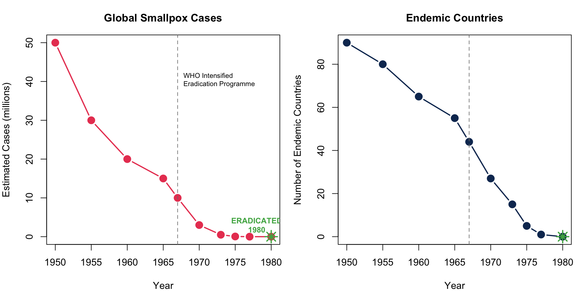
The WHO’s maps tracking smallpox-endemic areas from 1958 onwards galvanized the global eradication campaign. As countries turned from red to green on the surveillance maps, the world witnessed — in real time — the only successful eradication of a human disease.
Key Insight for Students: The smallpox surveillance maps were one of the first examples of data-driven global health governance. Countries that cleared smallpox were publicly celebrated; those that hadn’t were targeted for additional resources. This transparency-through-visualization model became the template for polio eradication and COVID-19 tracking.
12. The SIR Model and Epidemic Modeling (1927 onward, widely used 1970s+)
The Story
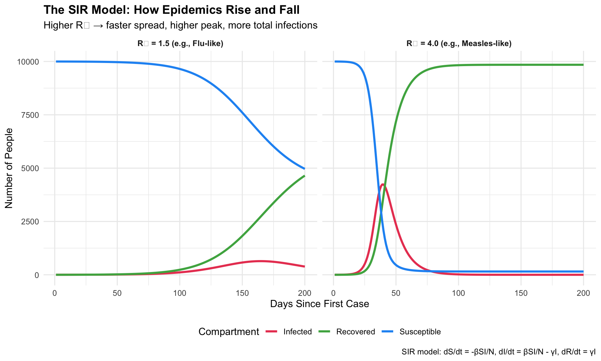
The SIR (Susceptible–Infected–Recovered) model, first proposed by Kermack and McKendrick in 1927, became a standard visualization in epidemiology textbooks and pandemic planning. Its outputs — curves showing how epidemics rise and fall — are the intellectual ancestor of “Flatten the Curve.”
1927/1970s+Mathematical ModelEpidemic Forecasting
R Recreation: Interactive SIR Model
Show R Code
# SIR Model simulationsir_model <-function(beta, gamma, S0, I0, R0, days) { N <- S0 + I0 + R0 S <-numeric(days); I <-numeric(days); R <-numeric(days) S[1] <- S0; I[1] <- I0; R[1] <- R0for (t in2:days) { dS <--beta * S[t-1] * I[t-1] / N dI <- beta * S[t-1] * I[t-1] / N - gamma * I[t-1] dR <- gamma * I[t-1] S[t] <- S[t-1] + dS I[t] <- I[t-1] + dI R[t] <- R[t-1] + dR }data.frame(day =1:days, S = S, I = I, R = R)}# Two scenarios: high vs. low R0high_r0 <-sir_model(beta =0.4, gamma =0.1, S0 =9999, I0 =1, R0 =0, days =200)low_r0 <-sir_model(beta =0.15, gamma =0.1, S0 =9999, I0 =1, R0 =0, days =200)high_r0$scenario <-"R₀ = 4.0 (e.g., Measles-like)"low_r0$scenario <-"R₀ = 1.5 (e.g., Flu-like)"sir_combined <-bind_rows(high_r0, low_r0) %>%pivot_longer(cols =c(S, I, R), names_to ="compartment", values_to ="count")ggplot(sir_combined, aes(x = day, y = count, colour = compartment)) +geom_line(linewidth =1.2) +facet_wrap(~ scenario, ncol =2) +scale_colour_manual(values =c("S"="#2196f3", "I"="#e94560", "R"="#4caf50"),labels =c("S"="Susceptible", "I"="Infected", "R"="Recovered") ) +labs(title ="The SIR Model: How Epidemics Rise and Fall",subtitle ="Higher R₀ → faster spread, higher peak, more total infections",x ="Days Since First Case", y ="Number of People",colour ="Compartment",caption ="SIR model: dS/dt = -βSI/N, dI/dt = βSI/N - γI, dR/dt = γI" ) +theme_minimal(base_size =12) +theme(plot.title =element_text(face ="bold"),strip.text =element_text(face ="bold"),legend.position ="bottom" )
Key Insight for Students: The red infection curve’s peak height is what overwhelms hospitals. This is exactly what “Flatten the Curve” targeted during COVID-19. Also note: in both scenarios, the epidemic eventually ends when enough people have recovered (herd immunity). The SIR model makes these dynamics visible.
13. The AIDS Memorial Quilt (1985–present)
The Story
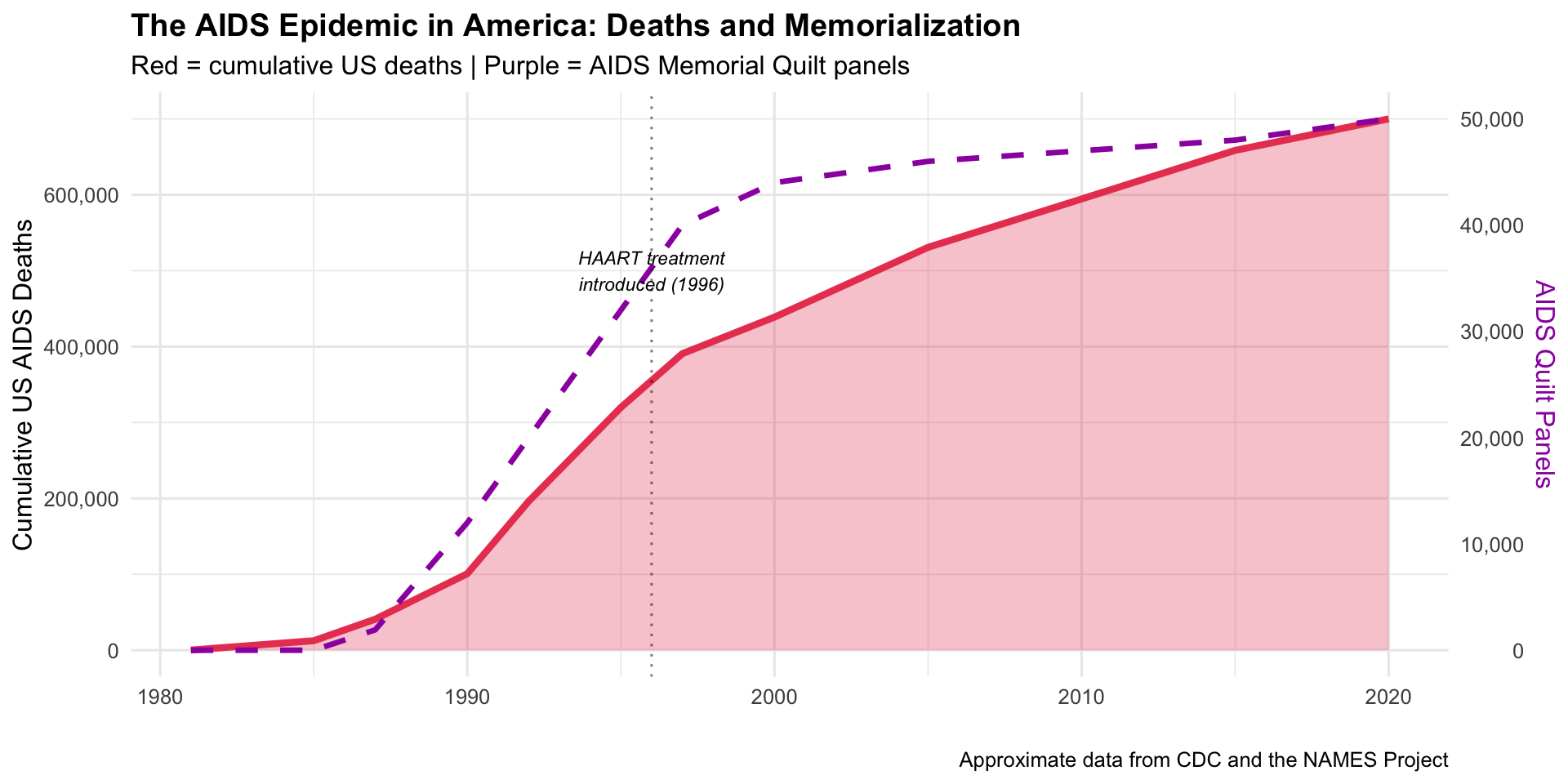
The AIDS Memorial Quilt is perhaps the most powerful “data visualization” ever created — each of its 48,000+ panels represents one human life lost to AIDS. Conceived in 1985 when stigma prevented many from receiving funerals, the quilt made the epidemic’s toll viscerally tangible.
1985Physical Data ArtHIV/AIDS Advocacy
The Scale of the Epidemic
Show R Code
# AIDS deaths and quilt panels over timeaids_data <-data.frame(year =c(1981, 1985, 1987, 1990, 1992, 1995, 1997, 2000, 2005, 2010, 2015, 2020),us_cumulative_deaths =c(234, 12529, 40849, 100813, 196283, 319849, 390692,438795, 530756, 594496, 658507, 700000),quilt_panels =c(0, 1, 1920, 12000, 20000, 32000, 40000, 44000, 46000, 47000, 48000, 50000))ggplot(aids_data) +geom_area(aes(x = year, y = us_cumulative_deaths), fill ="#e94560", alpha =0.3) +geom_line(aes(x = year, y = us_cumulative_deaths), colour ="#e94560", linewidth =1.5) +geom_line(aes(x = year, y = quilt_panels *14), colour ="#9c27b0", linewidth =1.2, linetype ="dashed") +scale_y_continuous(labels = scales::comma,sec.axis =sec_axis(~ . /14, name ="AIDS Quilt Panels", labels = scales::comma) ) +annotate("text", x =1996, y =500000, label ="HAART treatment\nintroduced (1996)",size =3, fontface ="italic") +geom_vline(xintercept =1996, linetype ="dotted", alpha =0.5) +labs(title ="The AIDS Epidemic in America: Deaths and Memorialization",subtitle ="Red = cumulative US deaths | Purple = AIDS Memorial Quilt panels",x ="", y ="Cumulative US AIDS Deaths",caption ="Approximate data from CDC and the NAMES Project" ) +theme_minimal(base_size =12) +theme(plot.title =element_text(face ="bold"),axis.title.y.right =element_text(colour ="#9c27b0"))
Key Insight for Students: The AIDS Quilt teaches us that numbers alone don’t move people — stories do. Each panel was made by someone who loved the person who died. The quilt forced politicians and the public to see AIDS victims as human beings, not statistics. In your practice, remember: behind every data point is a patient, a family, a life.
14. UNAIDS Global HIV/AIDS Maps (1996–present)
The Story
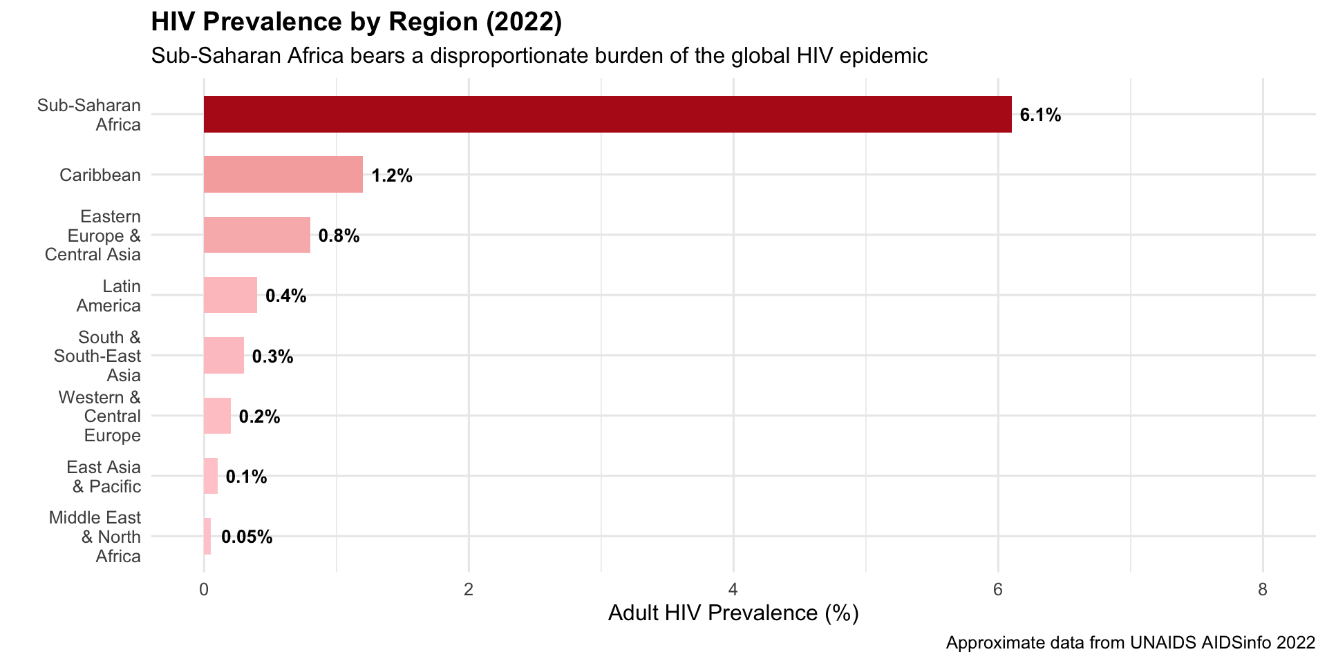
UNAIDS choropleth maps showing HIV prevalence by country — with sub-Saharan Africa in deep red — became iconic images that directed billions in global health funding through PEPFAR and the Global Fund.
1996–presentChoropleth / DashboardGlobal Health Funding
R Recreation: HIV Prevalence by Region
Show R Code
# Regional HIV prevalence data (approximate UNAIDS 2022)hiv_regions <-data.frame(region =c("Sub-Saharan\nAfrica", "Caribbean", "Eastern\nEurope &\nCentral Asia","Latin\nAmerica", "South &\nSouth-East\nAsia", "Western &\nCentral\nEurope","East Asia\n& Pacific", "Middle East\n& North\nAfrica"),prevalence =c(6.1, 1.2, 0.8, 0.4, 0.3, 0.2, 0.1, 0.05),plhiv_millions =c(25.6, 0.33, 1.8, 2.2, 5.8, 2.3, 1.3, 0.19))hiv_regions$region <-factor(hiv_regions$region,levels = hiv_regions$region[order(hiv_regions$prevalence)])ggplot(hiv_regions, aes(x = region, y = prevalence, fill = prevalence)) +geom_col(width =0.6) +geom_text(aes(label =paste0(prevalence, "%")), hjust =-0.2, fontface ="bold", size =3.5) +scale_fill_gradient(low ="#ffcdd2", high ="#b71c1c", guide ="none") +coord_flip() +scale_y_continuous(limits =c(0, 8)) +labs(title ="HIV Prevalence by Region (2022)",subtitle ="Sub-Saharan Africa bears a disproportionate burden of the global HIV epidemic",x ="", y ="Adult HIV Prevalence (%)",caption ="Approximate data from UNAIDS AIDSinfo 2022" ) +theme_minimal(base_size =12) +theme(plot.title =element_text(face ="bold"))
Key Insight for Students: The UNAIDS maps are a masterclass in how visualization drives resource allocation. The deep red shading of sub-Saharan Africa created political urgency that led to PEPFAR ($100B+ invested), the Global Fund, and dramatic improvements in treatment access. Data visualization didn’t just describe the problem — it helped solve it.
15. IHME’s Global Burden of Disease (GBD) Visualizations (1990–present)
The Story
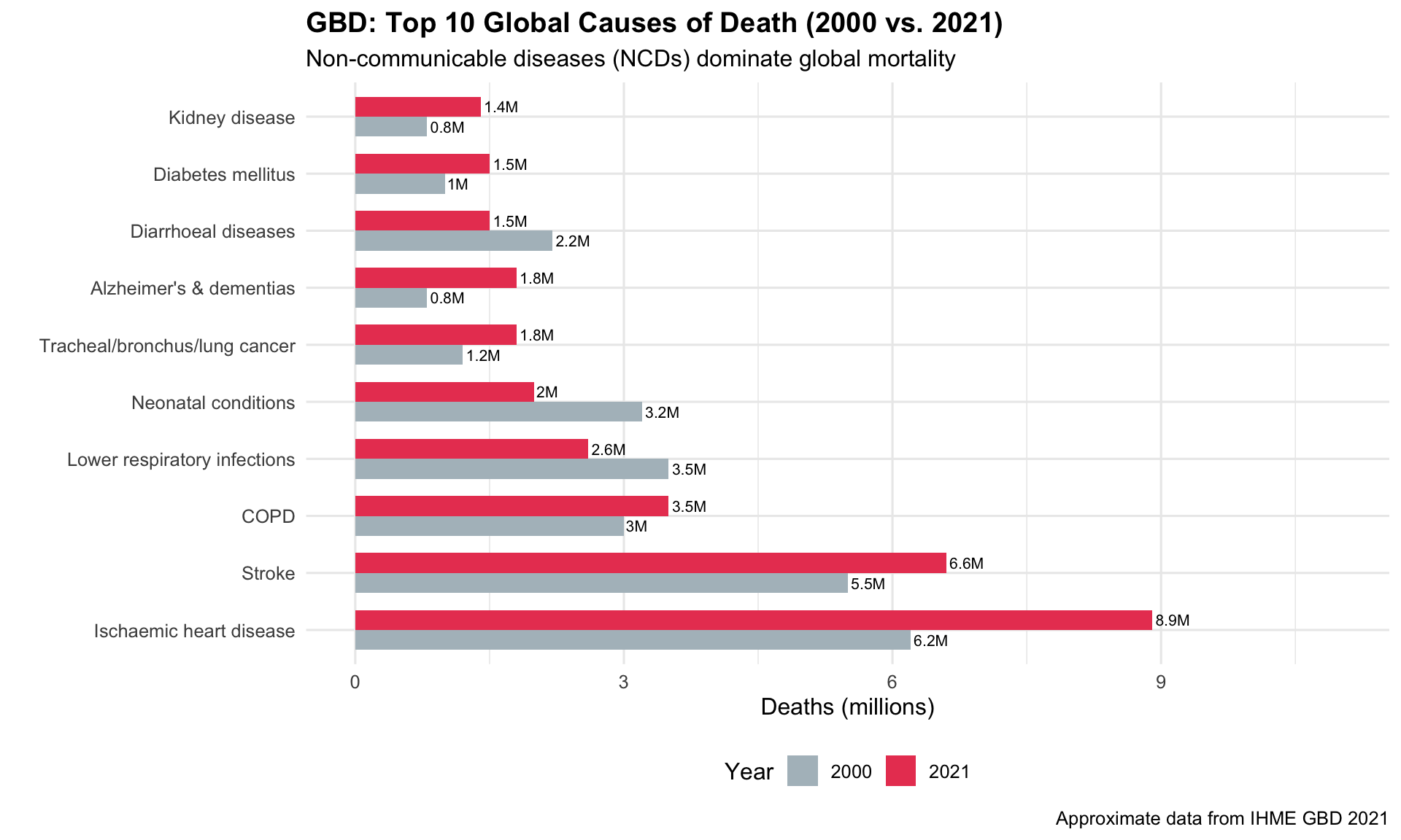
The Institute for Health Metrics and Evaluation (IHME) at the University of Washington created the most comprehensive visualization of global health ever assembled. The GBD Compare tool lets users explore disease burden across 204 countries, 371 diseases, and 88 risk factors.
1990–presentInteractive DashboardGlobal Health Policy
R Recreation: Top 10 Causes of Death
Show R Code
# Approximate GBD 2021 top causes of death globallygbd_top10 <-data.frame(cause =c("Ischaemic heart disease", "Stroke", "COPD","Lower respiratory infections", "Neonatal conditions","Tracheal/bronchus/lung cancer", "Alzheimer's & dementias","Diarrhoeal diseases", "Diabetes mellitus", "Kidney disease"),deaths_2000 =c(6.2, 5.5, 3.0, 3.5, 3.2, 1.2, 0.8, 2.2, 1.0, 0.8),deaths_2021 =c(8.9, 6.6, 3.5, 2.6, 2.0, 1.8, 1.8, 1.5, 1.5, 1.4),category =c("NCD", "NCD", "NCD", "Communicable", "Communicable","NCD", "NCD", "Communicable", "NCD", "NCD"))gbd_long <- gbd_top10 %>%pivot_longer(cols =c(deaths_2000, deaths_2021), names_to ="year", values_to ="deaths") %>%mutate(year =ifelse(year =="deaths_2000", "2000", "2021"))gbd_long$cause <-factor(gbd_long$cause,levels = gbd_top10$cause[order(gbd_top10$deaths_2021, decreasing =TRUE)])ggplot(gbd_long, aes(x = cause, y = deaths, fill = year)) +geom_col(position ="dodge", width =0.7) +geom_text(aes(label =paste0(deaths, "M")), position =position_dodge(0.7),hjust =-0.1, size =2.8) +scale_fill_manual(values =c("2000"="#b0bec5", "2021"="#e94560")) +coord_flip() +scale_y_continuous(limits =c(0, 11)) +labs(title ="GBD: Top 10 Global Causes of Death (2000 vs. 2021)",subtitle ="Non-communicable diseases (NCDs) dominate global mortality",x ="", y ="Deaths (millions)", fill ="Year",caption ="Approximate data from IHME GBD 2021" ) +theme_minimal(base_size =12) +theme(plot.title =element_text(face ="bold"), legend.position ="bottom")
Key Insight for Students: The GBD is the data backbone of global health policy. When the WHO, World Bank, or any government allocates health funding, GBD data is usually the starting point. Learning to use the GBD Compare tool is one of the most valuable skills for any physician interested in public health or global health.
Discussion Questions for Era 3
Smallpox and polio: Why did smallpox eradication succeed where polio eradication has stalled? What role did surveillance maps play?
Models and reality: SIR models are simplifications. What assumptions do they make that might not hold in real outbreaks?
Data and empathy: Compare the AIDS Quilt (physical, emotional) with UNAIDS dashboards (digital, statistical). Which is more effective at driving action? Do we need both?
GBD rankings: Look up your country in GBD Compare. What surprises you about the top causes of death and disability?
Source Code
---title: "Era 3: Global Health Campaigns (1958–2000s)"subtitle: "Mapping pandemics, eradicating diseases, fighting HIV/AIDS"---```{r}#| include: falselibrary(ggplot2)library(dplyr)library(tidyr)```::: {.era-card}The second half of the 20th century saw public health go truly global. **Smallpox eradication** was guided by surveillance maps, **mathematical models** (SIR) became predictive tools, and the **HIV/AIDS epidemic** produced some of the most emotionally powerful data visualizations in history — from the AIDS Memorial Quilt to UNAIDS dashboards that directed billions in funding.:::---## 11. WHO Smallpox Eradication Campaign Maps (1958–1980) {#smallpox}::: {.viz-box}### The StoryThe WHO's maps tracking smallpox-endemic areas from 1958 onwards galvanized the global eradication campaign. As countries turned from red to green on the surveillance maps, the world witnessed — in real time — the only successful eradication of a human disease.::: {.viz-meta}[1958–1980]{.timeline-marker}[Choropleth Map]{style="background:#e8eaf6;padding:0.2rem 0.7rem;border-radius:15px;font-size:0.85rem;"}[Disease Eradication]{style="background:#e8eaf6;padding:0.2rem 0.7rem;border-radius:15px;font-size:0.85rem;"}:::### R Recreation: The Shrinking Map of Smallpox```{r}#| fig-height: 5#| fig-width: 10# Simulated global smallpox case counts by decadesmallpox_data <-data.frame(year =c(1950, 1955, 1960, 1965, 1967, 1970, 1973, 1975, 1977, 1980),cases =c(50000000, 30000000, 20000000, 15000000, 10000000, 3000000, 500000, 50000, 3234, 0),endemic_countries =c(90, 80, 65, 55, 44, 27, 15, 5, 1, 0))par(mfrow =c(1, 2), mar =c(4, 4, 3, 1))# Panel 1: Casesplot(smallpox_data$year, smallpox_data$cases /1e6, type ="b", pch =19,col ="#e94560", lwd =2, cex =1.5,xlab ="Year", ylab ="Estimated Cases (millions)",main ="Global Smallpox Cases", cex.main =1.1)abline(v =1967, lty =2, col ="grey50")text(1967, 40, "WHO Intensified\nEradication Programme", cex =0.7, pos =4)points(1980, 0, pch =8, cex =2, col ="#4caf50", lwd =2)text(1978, 3, "ERADICATED\n1980", col ="#4caf50", font =2, cex =0.8)# Panel 2: Endemic countriesplot(smallpox_data$year, smallpox_data$endemic_countries, type ="b", pch =19,col ="#0f3460", lwd =2, cex =1.5,xlab ="Year", ylab ="Number of Endemic Countries",main ="Endemic Countries", cex.main =1.1)abline(v =1967, lty =2, col ="grey50")points(1980, 0, pch =8, cex =2, col ="#4caf50", lwd =2)``````{r}#| fig-height: 1par(mfrow =c(1, 1))```::: {.callout-insight}**Key Insight for Students:** The smallpox surveillance maps were one of the first examples of **data-driven global health governance**. Countries that cleared smallpox were publicly celebrated; those that hadn't were targeted for additional resources. This transparency-through-visualization model became the template for polio eradication and COVID-19 tracking.::::::---## 12. The SIR Model and Epidemic Modeling (1927 onward, widely used 1970s+) {#sir}::: {.viz-box}### The StoryThe SIR (Susceptible–Infected–Recovered) model, first proposed by Kermack and McKendrick in 1927, became a standard visualization in epidemiology textbooks and pandemic planning. Its outputs — curves showing how epidemics rise and fall — are the intellectual ancestor of "Flatten the Curve."::: {.viz-meta}[1927/1970s+]{.timeline-marker}[Mathematical Model]{style="background:#e8eaf6;padding:0.2rem 0.7rem;border-radius:15px;font-size:0.85rem;"}[Epidemic Forecasting]{style="background:#e8eaf6;padding:0.2rem 0.7rem;border-radius:15px;font-size:0.85rem;"}:::### R Recreation: Interactive SIR Model```{r}#| fig-height: 6#| fig-width: 10# SIR Model simulationsir_model <-function(beta, gamma, S0, I0, R0, days) { N <- S0 + I0 + R0 S <-numeric(days); I <-numeric(days); R <-numeric(days) S[1] <- S0; I[1] <- I0; R[1] <- R0for (t in2:days) { dS <--beta * S[t-1] * I[t-1] / N dI <- beta * S[t-1] * I[t-1] / N - gamma * I[t-1] dR <- gamma * I[t-1] S[t] <- S[t-1] + dS I[t] <- I[t-1] + dI R[t] <- R[t-1] + dR }data.frame(day =1:days, S = S, I = I, R = R)}# Two scenarios: high vs. low R0high_r0 <-sir_model(beta =0.4, gamma =0.1, S0 =9999, I0 =1, R0 =0, days =200)low_r0 <-sir_model(beta =0.15, gamma =0.1, S0 =9999, I0 =1, R0 =0, days =200)high_r0$scenario <-"R₀ = 4.0 (e.g., Measles-like)"low_r0$scenario <-"R₀ = 1.5 (e.g., Flu-like)"sir_combined <-bind_rows(high_r0, low_r0) %>%pivot_longer(cols =c(S, I, R), names_to ="compartment", values_to ="count")ggplot(sir_combined, aes(x = day, y = count, colour = compartment)) +geom_line(linewidth =1.2) +facet_wrap(~ scenario, ncol =2) +scale_colour_manual(values =c("S"="#2196f3", "I"="#e94560", "R"="#4caf50"),labels =c("S"="Susceptible", "I"="Infected", "R"="Recovered") ) +labs(title ="The SIR Model: How Epidemics Rise and Fall",subtitle ="Higher R₀ → faster spread, higher peak, more total infections",x ="Days Since First Case", y ="Number of People",colour ="Compartment",caption ="SIR model: dS/dt = -βSI/N, dI/dt = βSI/N - γI, dR/dt = γI" ) +theme_minimal(base_size =12) +theme(plot.title =element_text(face ="bold"),strip.text =element_text(face ="bold"),legend.position ="bottom" )```::: {.callout-insight}**Key Insight for Students:** The red infection curve's **peak height** is what overwhelms hospitals. This is exactly what "Flatten the Curve" targeted during COVID-19. Also note: in both scenarios, the epidemic eventually ends when enough people have recovered (herd immunity). The SIR model makes these dynamics *visible*.::::::---## 13. The AIDS Memorial Quilt (1985–present) {#aidsquilt}::: {.viz-box}### The StoryThe AIDS Memorial Quilt is perhaps the most powerful "data visualization" ever created — each of its 48,000+ panels represents one human life lost to AIDS. Conceived in 1985 when stigma prevented many from receiving funerals, the quilt made the epidemic's toll viscerally tangible.::: {.viz-meta}[1985]{.timeline-marker}[Physical Data Art]{style="background:#e8eaf6;padding:0.2rem 0.7rem;border-radius:15px;font-size:0.85rem;"}[HIV/AIDS Advocacy]{style="background:#e8eaf6;padding:0.2rem 0.7rem;border-radius:15px;font-size:0.85rem;"}:::### The Scale of the Epidemic```{r}#| fig-height: 5#| fig-width: 10# AIDS deaths and quilt panels over timeaids_data <-data.frame(year =c(1981, 1985, 1987, 1990, 1992, 1995, 1997, 2000, 2005, 2010, 2015, 2020),us_cumulative_deaths =c(234, 12529, 40849, 100813, 196283, 319849, 390692,438795, 530756, 594496, 658507, 700000),quilt_panels =c(0, 1, 1920, 12000, 20000, 32000, 40000, 44000, 46000, 47000, 48000, 50000))ggplot(aids_data) +geom_area(aes(x = year, y = us_cumulative_deaths), fill ="#e94560", alpha =0.3) +geom_line(aes(x = year, y = us_cumulative_deaths), colour ="#e94560", linewidth =1.5) +geom_line(aes(x = year, y = quilt_panels *14), colour ="#9c27b0", linewidth =1.2, linetype ="dashed") +scale_y_continuous(labels = scales::comma,sec.axis =sec_axis(~ . /14, name ="AIDS Quilt Panels", labels = scales::comma) ) +annotate("text", x =1996, y =500000, label ="HAART treatment\nintroduced (1996)",size =3, fontface ="italic") +geom_vline(xintercept =1996, linetype ="dotted", alpha =0.5) +labs(title ="The AIDS Epidemic in America: Deaths and Memorialization",subtitle ="Red = cumulative US deaths | Purple = AIDS Memorial Quilt panels",x ="", y ="Cumulative US AIDS Deaths",caption ="Approximate data from CDC and the NAMES Project" ) +theme_minimal(base_size =12) +theme(plot.title =element_text(face ="bold"),axis.title.y.right =element_text(colour ="#9c27b0"))```::: {.callout-insight}**Key Insight for Students:** The AIDS Quilt teaches us that **numbers alone don't move people — stories do.** Each panel was made by someone who loved the person who died. The quilt forced politicians and the public to see AIDS victims as human beings, not statistics. In your practice, remember: behind every data point is a patient, a family, a life.::::::---## 14. UNAIDS Global HIV/AIDS Maps (1996–present) {#unaids}::: {.viz-box}### The StoryUNAIDS choropleth maps showing HIV prevalence by country — with sub-Saharan Africa in deep red — became iconic images that directed billions in global health funding through PEPFAR and the Global Fund.::: {.viz-meta}[1996–present]{.timeline-marker}[Choropleth / Dashboard]{style="background:#e8eaf6;padding:0.2rem 0.7rem;border-radius:15px;font-size:0.85rem;"}[Global Health Funding]{style="background:#e8eaf6;padding:0.2rem 0.7rem;border-radius:15px;font-size:0.85rem;"}:::### R Recreation: HIV Prevalence by Region```{r}#| fig-height: 5#| fig-width: 10# Regional HIV prevalence data (approximate UNAIDS 2022)hiv_regions <-data.frame(region =c("Sub-Saharan\nAfrica", "Caribbean", "Eastern\nEurope &\nCentral Asia","Latin\nAmerica", "South &\nSouth-East\nAsia", "Western &\nCentral\nEurope","East Asia\n& Pacific", "Middle East\n& North\nAfrica"),prevalence =c(6.1, 1.2, 0.8, 0.4, 0.3, 0.2, 0.1, 0.05),plhiv_millions =c(25.6, 0.33, 1.8, 2.2, 5.8, 2.3, 1.3, 0.19))hiv_regions$region <-factor(hiv_regions$region,levels = hiv_regions$region[order(hiv_regions$prevalence)])ggplot(hiv_regions, aes(x = region, y = prevalence, fill = prevalence)) +geom_col(width =0.6) +geom_text(aes(label =paste0(prevalence, "%")), hjust =-0.2, fontface ="bold", size =3.5) +scale_fill_gradient(low ="#ffcdd2", high ="#b71c1c", guide ="none") +coord_flip() +scale_y_continuous(limits =c(0, 8)) +labs(title ="HIV Prevalence by Region (2022)",subtitle ="Sub-Saharan Africa bears a disproportionate burden of the global HIV epidemic",x ="", y ="Adult HIV Prevalence (%)",caption ="Approximate data from UNAIDS AIDSinfo 2022" ) +theme_minimal(base_size =12) +theme(plot.title =element_text(face ="bold"))```### Explore the Live DashboardVisit the interactive UNAIDS dashboard:::: {.embed-container}<iframe src="https://aidsinfo.unaids.org/" class="responsive-iframe" title="UNAIDS AIDSinfo Dashboard" loading="lazy"></iframe>:::*If the embed doesn't load, [visit UNAIDS AIDSinfo directly →](https://aidsinfo.unaids.org/)*::: {.callout-insight}**Key Insight for Students:** The UNAIDS maps are a masterclass in how **visualization drives resource allocation**. The deep red shading of sub-Saharan Africa created political urgency that led to PEPFAR ($100B+ invested), the Global Fund, and dramatic improvements in treatment access. Data visualization didn't just describe the problem — it helped solve it.::::::---## 15. IHME's Global Burden of Disease (GBD) Visualizations (1990–present) {#gbd}::: {.viz-box}### The StoryThe Institute for Health Metrics and Evaluation (IHME) at the University of Washington created the most comprehensive visualization of global health ever assembled. The GBD Compare tool lets users explore disease burden across 204 countries, 371 diseases, and 88 risk factors.::: {.viz-meta}[1990–present]{.timeline-marker}[Interactive Dashboard]{style="background:#e8eaf6;padding:0.2rem 0.7rem;border-radius:15px;font-size:0.85rem;"}[Global Health Policy]{style="background:#e8eaf6;padding:0.2rem 0.7rem;border-radius:15px;font-size:0.85rem;"}:::### R Recreation: Top 10 Causes of Death```{r}#| fig-height: 6#| fig-width: 10# Approximate GBD 2021 top causes of death globallygbd_top10 <-data.frame(cause =c("Ischaemic heart disease", "Stroke", "COPD","Lower respiratory infections", "Neonatal conditions","Tracheal/bronchus/lung cancer", "Alzheimer's & dementias","Diarrhoeal diseases", "Diabetes mellitus", "Kidney disease"),deaths_2000 =c(6.2, 5.5, 3.0, 3.5, 3.2, 1.2, 0.8, 2.2, 1.0, 0.8),deaths_2021 =c(8.9, 6.6, 3.5, 2.6, 2.0, 1.8, 1.8, 1.5, 1.5, 1.4),category =c("NCD", "NCD", "NCD", "Communicable", "Communicable","NCD", "NCD", "Communicable", "NCD", "NCD"))gbd_long <- gbd_top10 %>%pivot_longer(cols =c(deaths_2000, deaths_2021), names_to ="year", values_to ="deaths") %>%mutate(year =ifelse(year =="deaths_2000", "2000", "2021"))gbd_long$cause <-factor(gbd_long$cause,levels = gbd_top10$cause[order(gbd_top10$deaths_2021, decreasing =TRUE)])ggplot(gbd_long, aes(x = cause, y = deaths, fill = year)) +geom_col(position ="dodge", width =0.7) +geom_text(aes(label =paste0(deaths, "M")), position =position_dodge(0.7),hjust =-0.1, size =2.8) +scale_fill_manual(values =c("2000"="#b0bec5", "2021"="#e94560")) +coord_flip() +scale_y_continuous(limits =c(0, 11)) +labs(title ="GBD: Top 10 Global Causes of Death (2000 vs. 2021)",subtitle ="Non-communicable diseases (NCDs) dominate global mortality",x ="", y ="Deaths (millions)", fill ="Year",caption ="Approximate data from IHME GBD 2021" ) +theme_minimal(base_size =12) +theme(plot.title =element_text(face ="bold"), legend.position ="bottom")```### Explore the Live GBD Compare ToolVisit the interactive GBD Compare visualization:🔗 **[IHME GBD Compare Tool →](https://vizhub.healthdata.org/gbd-compare/)**::: {.callout-insight}**Key Insight for Students:** The GBD is the data backbone of global health policy. When the WHO, World Bank, or any government allocates health funding, GBD data is usually the starting point. Learning to use the GBD Compare tool is one of the most valuable skills for any physician interested in public health or global health.::::::---## Discussion Questions for Era 31. **Smallpox and polio:** Why did smallpox eradication succeed where polio eradication has stalled? What role did surveillance maps play?2. **Models and reality:** SIR models are simplifications. What assumptions do they make that might not hold in real outbreaks?3. **Data and empathy:** Compare the AIDS Quilt (physical, emotional) with UNAIDS dashboards (digital, statistical). Which is more effective at driving action? Do we need both?4. **GBD rankings:** Look up your country in GBD Compare. What surprises you about the top causes of death and disability?