The rise of the internet, interactive graphics, and open data transformed public health communication. Hans Rosling made global health data entertaining, Our World in Data made it accessible, the warming stripes linked climate to health, and AIDSVu showed that even in the US, epidemics have geography. This era democratized data visualization — suddenly, everyone could explore health data, not just epidemiologists.
16. Hans Rosling’s Gapminder Bubble Charts (2006)
The Story
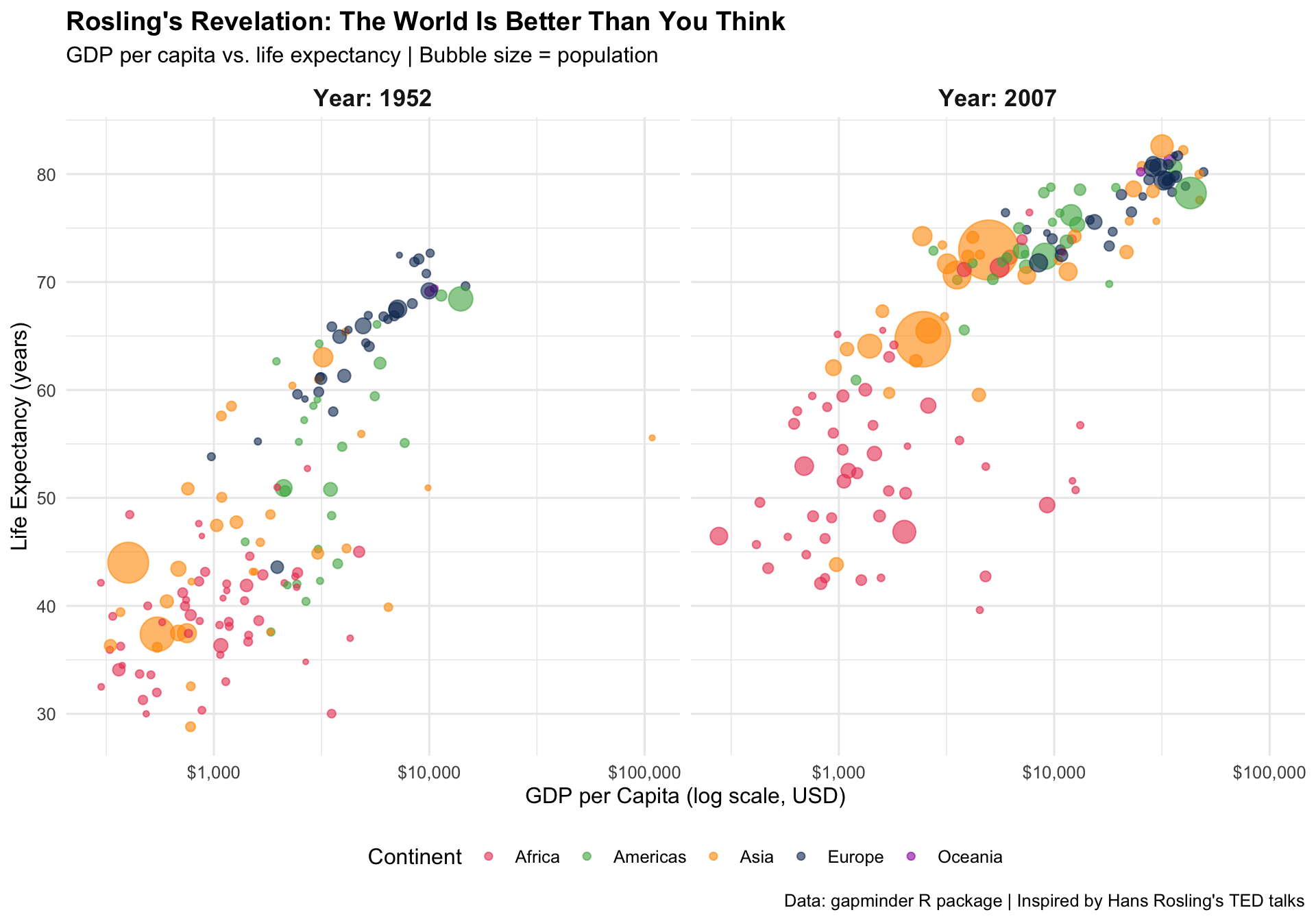
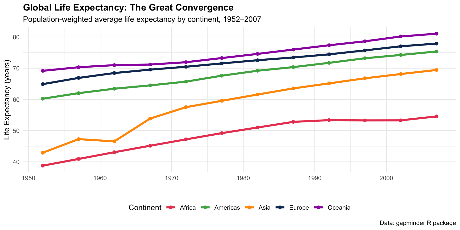
Hans Rosling’s 2006 TED talk, using animated bubble charts showing income vs. life expectancy in 200 countries over 200 years, became one of the most-watched TED talks ever. He shattered the myth of a divided world (“us vs. them”) and showed that most countries are converging toward better health.
2006Animated Bubble ChartGlobal Health Perception
R Recreation
Show R Code
if (!requireNamespace("gapminder", quietly =TRUE)) {install.packages("gapminder", repos ="https://cloud.r-project.org")}library(gapminder)# Show 1952 vs 2007gap_compare <- gapminder %>%filter(year %in%c(1952, 2007)) %>%mutate(year_label =paste("Year:", year))ggplot(gap_compare, aes(x = gdpPercap, y = lifeExp, size = pop, colour = continent)) +geom_point(alpha =0.6) +scale_x_log10(labels = scales::dollar) +scale_size_continuous(range =c(1, 15), labels = scales::comma, guide ="none") +scale_colour_manual(values =c("Africa"="#e94560", "Americas"="#4caf50","Asia"="#ff9800", "Europe"="#0f3460","Oceania"="#9c27b0")) +facet_wrap(~ year_label) +labs(title ="Rosling's Revelation: The World Is Better Than You Think",subtitle ="GDP per capita vs. life expectancy | Bubble size = population",x ="GDP per Capita (log scale, USD)", y ="Life Expectancy (years)",colour ="Continent",caption ="Data: gapminder R package | Inspired by Hans Rosling's TED talks" ) +theme_minimal(base_size =12) +theme(plot.title =element_text(face ="bold"),strip.text =element_text(face ="bold", size =13),legend.position ="bottom" )
The Convergence Story
Show R Code
# Life expectancy trends by continentgap_continent <- gapminder %>%group_by(continent, year) %>%summarise(avg_lifeExp =weighted.mean(lifeExp, pop), .groups ="drop")ggplot(gap_continent, aes(x = year, y = avg_lifeExp, colour = continent)) +geom_line(linewidth =1.5) +geom_point(size =2) +scale_colour_manual(values =c("Africa"="#e94560", "Americas"="#4caf50","Asia"="#ff9800", "Europe"="#0f3460","Oceania"="#9c27b0")) +labs(title ="Global Life Expectancy: The Great Convergence",subtitle ="Population-weighted average life expectancy by continent, 1952–2007",x ="", y ="Life Expectancy (years)", colour ="Continent",caption ="Data: gapminder R package" ) +theme_minimal(base_size =12) +theme(plot.title =element_text(face ="bold"), legend.position ="bottom")
Key Insight for Students: Rosling’s genius wasn’t the data — it was the animation and narrative. He showed that our mental model of the world is 30 years out of date. As physicians, you’ll need to fight the same bias: when you think of “Africa” or “developing world,” remember that the data shows dramatic improvement in most health metrics.
17. Our World in Data — Health & Mortality (2011–present)
The Story
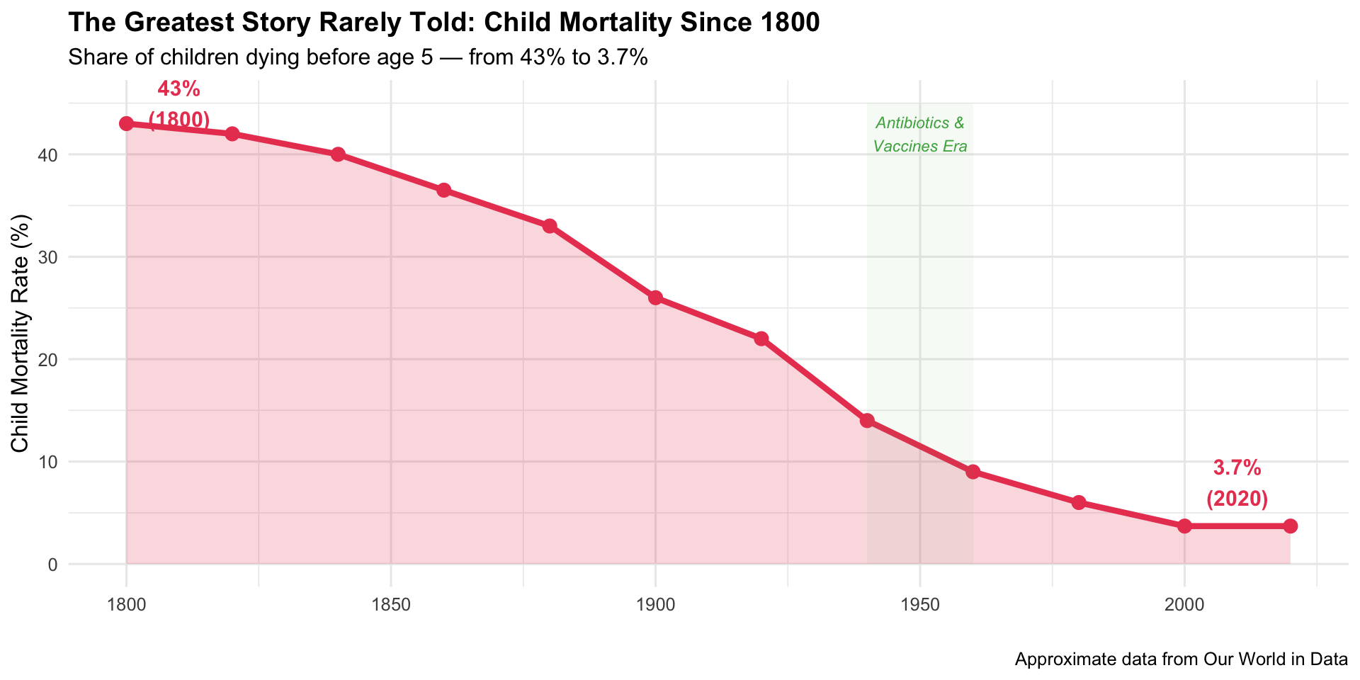
Founded by Max Roser at the University of Oxford, Our World in Data (OWID) became the go-to source for accessible, beautifully presented long-term health data. Their charts on child mortality, vaccination coverage, and life expectancy are cited by governments and media worldwide.
2011–presentInteractive ChartsOpen Data
R Recreation: Child Mortality Decline
Show R Code
# Global child mortality decline (approximate OWID data)child_mort <-data.frame(year =seq(1800, 2020, by =20),rate =c(43, 42, 40, 36.5, 33, 26, 22, 14, 9, 6, 3.7, 3.7))ggplot(child_mort, aes(x = year, y = rate)) +geom_area(fill ="#e94560", alpha =0.2) +geom_line(colour ="#e94560", linewidth =1.5) +geom_point(colour ="#e94560", size =3) +annotate("rect", xmin =1940, xmax =1960, ymin =0, ymax =45,fill ="#4caf50", alpha =0.05) +annotate("text", x =1950, y =42, label ="Antibiotics &\nVaccines Era",size =3, colour ="#4caf50", fontface ="italic") +annotate("text", x =2010, y =8, label ="3.7%\n(2020)",size =4, colour ="#e94560", fontface ="bold") +annotate("text", x =1810, y =45, label ="43%\n(1800)",size =4, colour ="#e94560", fontface ="bold") +labs(title ="The Greatest Story Rarely Told: Child Mortality Since 1800",subtitle ="Share of children dying before age 5 — from 43% to 3.7%",x ="", y ="Child Mortality Rate (%)",caption ="Approximate data from Our World in Data" ) +theme_minimal(base_size =12) +theme(plot.title =element_text(face ="bold"))
Key Insight for Students: OWID demonstrates a crucial principle: long-term trends matter more than headlines. While news focuses on crises, the long view shows extraordinary progress. As future doctors, keeping perspective on both crises and progress will help you avoid burnout and make better decisions about where to focus effort.
18. AIDSVu Interactive HIV Maps (2012–present)
The Story
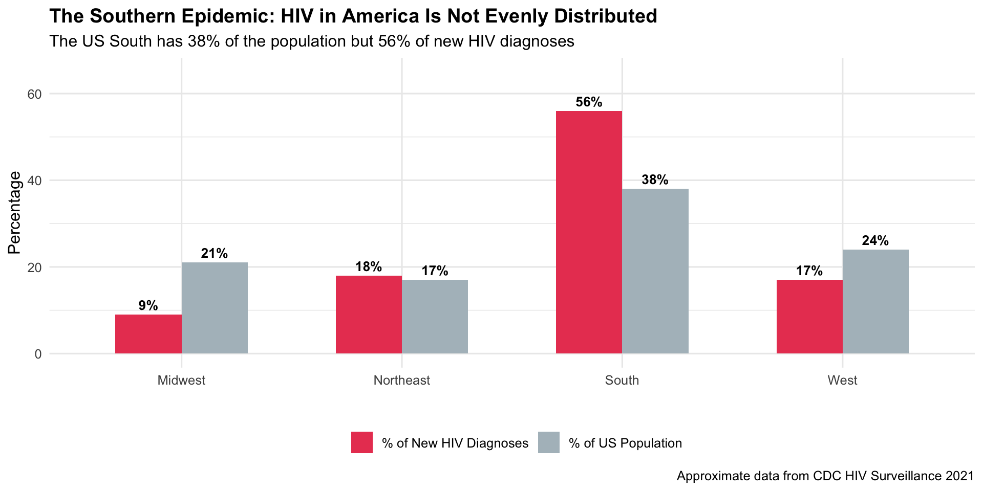
Developed by Emory University, AIDSVu visualizes HIV surveillance data at the ZIP code level across the United States. By revealing the hyperlocal concentration of the epidemic — particularly in the American South and among Black communities — it guided the federal “Ending the HIV Epidemic” initiative.
2012Interactive MapHealth Equity
R Recreation: US Regional HIV Burden
Show R Code
# Approximate US HIV new diagnoses by region (CDC 2021)us_hiv_region <-data.frame(region =c("South", "Northeast", "West", "Midwest"),new_diagnoses =c(18730, 5940, 5570, 3180),pct_of_total =c(56, 18, 17, 9),pop_share_pct =c(38, 17, 24, 21))us_hiv_long <- us_hiv_region %>%select(region, pct_of_total, pop_share_pct) %>%pivot_longer(cols =c(pct_of_total, pop_share_pct),names_to ="measure", values_to ="pct") %>%mutate(measure =ifelse(measure =="pct_of_total","% of New HIV Diagnoses", "% of US Population"))ggplot(us_hiv_long, aes(x = region, y = pct, fill = measure)) +geom_col(position ="dodge", width =0.6) +geom_text(aes(label =paste0(pct, "%")), position =position_dodge(0.6),vjust =-0.5, size =3.5, fontface ="bold") +scale_fill_manual(values =c("% of New HIV Diagnoses"="#e94560","% of US Population"="#b0bec5")) +scale_y_continuous(limits =c(0, 65)) +labs(title ="The Southern Epidemic: HIV in America Is Not Evenly Distributed",subtitle ="The US South has 38% of the population but 56% of new HIV diagnoses",x ="", y ="Percentage", fill ="",caption ="Approximate data from CDC HIV Surveillance 2021" ) +theme_minimal(base_size =12) +theme(plot.title =element_text(face ="bold"), legend.position ="bottom")
Key Insight for Students: AIDSVu demonstrates that national averages hide local crises. The US HIV epidemic is concentrated in specific ZIP codes, often in communities already facing poverty and structural racism. This is a critical lesson: always ask who and where when you see an aggregate statistic.
19. Ed Hawkins’s Warming Stripes — Health Framing (2018)
The Story
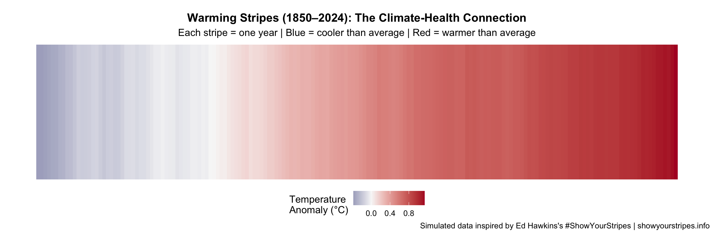
Climate scientist Ed Hawkins’s “warming stripes” — a simple sequence of coloured bars from blue (cool) to red (hot) — became the most iconic climate visualization ever. Health organizations increasingly use this format to communicate heat-related mortality, vector-borne disease expansion, and air quality impacts.
2018Minimalist Data ArtClimate & Health
R Recreation
Show R Code
# Simulated global temperature anomaly data (approximating HadCRUT5)set.seed(42)years <-1850:2024base_trend <-seq(-0.4, 1.2, length.out =length(years))noise <-cumsum(rnorm(length(years), 0, 0.03))temp_anomaly <- base_trend + noise *0.5warming_df <-data.frame(year = years, anomaly = temp_anomaly)ggplot(warming_df, aes(x = year, y =1, fill = anomaly)) +geom_tile(width =1, height =1) +scale_fill_gradient2(low ="#08306b", mid ="#f7f7f7", high ="#b2182b",midpoint =0, name ="Temperature\nAnomaly (°C)" ) +labs(title ="Warming Stripes (1850–2024): The Climate-Health Connection",subtitle ="Each stripe = one year | Blue = cooler than average | Red = warmer than average",caption ="Simulated data inspired by Ed Hawkins's #ShowYourStripes | showyourstripes.info" ) +theme_void(base_size =12) +theme(plot.title =element_text(face ="bold", hjust =0.5, size =14),plot.subtitle =element_text(hjust =0.5),legend.position ="bottom",plot.margin =margin(10, 5, 10, 5) )
Health Impact of Warming
Show R Code
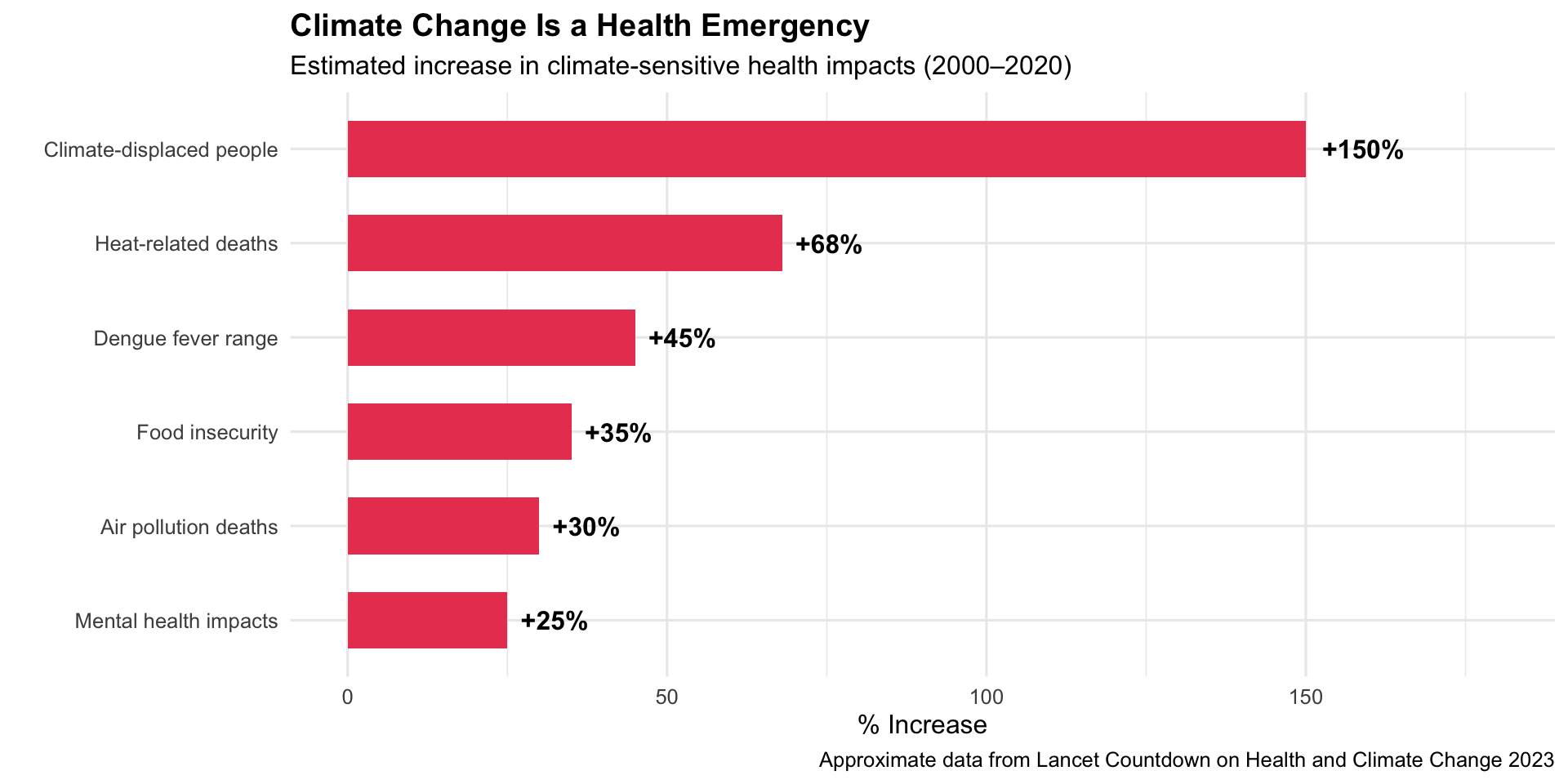
# Climate-sensitive health impactsclimate_health <-data.frame(impact =c("Heat-related deaths", "Dengue fever range", "Air pollution deaths","Climate-displaced people", "Food insecurity", "Mental health impacts"),change_pct =c(68, 45, 30, 150, 35, 25),direction =c("increase", "expansion", "increase", "increase", "increase", "increase"))climate_health$impact <-factor(climate_health$impact,levels = climate_health$impact[order(climate_health$change_pct)])ggplot(climate_health, aes(x = impact, y = change_pct)) +geom_col(fill ="#e94560", width =0.6) +geom_text(aes(label =paste0("+", change_pct, "%")), hjust =-0.2, fontface ="bold") +coord_flip() +scale_y_continuous(limits =c(0, 180)) +labs(title ="Climate Change Is a Health Emergency",subtitle ="Estimated increase in climate-sensitive health impacts (2000–2020)",x ="", y ="% Increase",caption ="Approximate data from Lancet Countdown on Health and Climate Change 2023" ) +theme_minimal(base_size =12) +theme(plot.title =element_text(face ="bold"))
Key Insight for Students: The Lancet Commission has called climate change “the greatest global health threat of the 21st century.” The warming stripes make this threat felt, not just understood. As future physicians, you will see the health effects of climate change in your practice — from heat stroke to expanding tropical diseases to mental health impacts of climate anxiety.
20. Personal Health Dashboards & Wearables (2014–present)
The Story
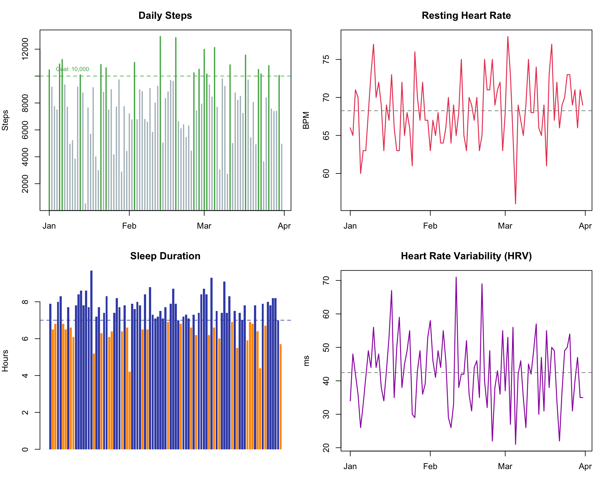
Apple Watch, Fitbit, and smartphone health apps put health data visualization on billions of wrists and screens. Heart rate trends, step counts, sleep patterns, and menstrual cycle tracking have made personal health data visible to everyday people for the first time in history.
2014–presentConsumer DashboardsPersonal Health
R Recreation: Simulated Wearable Health Dashboard
Show R Code
set.seed(2024)days <-seq(as.Date("2024-01-01"), as.Date("2024-03-31"), by ="day")n_days <-length(days)wearable_data <-data.frame(date = days,steps =round(rnorm(n_days, 8000, 2500)),resting_hr =round(rnorm(n_days, 68, 4)),sleep_hrs =round(rnorm(n_days, 7.2, 1.1), 1),hrv =round(rnorm(n_days, 42, 10))) %>%mutate(steps =pmax(steps, 500),sleep_hrs =pmax(sleep_hrs, 3),hrv =pmax(hrv, 15))par(mfrow =c(2, 2), mar =c(3, 4, 3, 1))# Stepsplot(wearable_data$date, wearable_data$steps, type ="h",col =ifelse(wearable_data$steps >=10000, "#4caf50", "#b0bec5"),lwd =2, xlab ="", ylab ="Steps", main ="Daily Steps")abline(h =10000, lty =2, col ="#4caf50")text(wearable_data$date[10], 10500, "Goal: 10,000", cex =0.7, col ="#4caf50")# Resting HRplot(wearable_data$date, wearable_data$resting_hr, type ="l",col ="#e94560", lwd =1.5, xlab ="", ylab ="BPM", main ="Resting Heart Rate")abline(h =mean(wearable_data$resting_hr), lty =2, col ="grey50")# Sleepbarplot(wearable_data$sleep_hrs, col =ifelse(wearable_data$sleep_hrs >=7, "#3f51b5", "#ff9800"),border =NA, main ="Sleep Duration", ylab ="Hours")abline(h =7, lty =2, col ="#3f51b5")# HRVplot(wearable_data$date, wearable_data$hrv, type ="l",col ="#9c27b0", lwd =1.5, xlab ="", ylab ="ms", main ="Heart Rate Variability (HRV)")abline(h =mean(wearable_data$hrv), lty =2, col ="grey50")
Show R Code
par(mfrow =c(1, 1))
Key Insight for Students: Your patients are increasingly arriving with their own health data — Apple Watch ECGs, continuous glucose monitors, sleep tracking. Learning to interpret and contextualize consumer health visualizations is becoming a core clinical skill. Key pitfalls: patients may over-interpret normal variation, and device accuracy varies by skin tone, body size, and wear position.
Discussion Questions for Era 4
Rosling’s optimism: Is the “world is getting better” narrative helpful or harmful for public health advocacy? Does it breed complacency?
Open data: OWID makes all its data freely available. What are the benefits and risks of open health data?
AIDSVu and ZIP-code epidemiology: How does hyperlocal data change health policy compared to national-level data?
Wearables in clinic: A patient shows you their Apple Watch data and says “my HRV is dropping — am I having a heart attack?” How do you respond?
Source Code
---title: "Era 4: The Data Revolution (2006–2019)"subtitle: "When health data went interactive and global"---```{r}#| include: falselibrary(ggplot2)library(dplyr)library(tidyr)```::: {.era-card}The rise of the internet, interactive graphics, and open data transformed public health communication. **Hans Rosling** made global health data entertaining, **Our World in Data** made it accessible, the **warming stripes** linked climate to health, and **AIDSVu** showed that even in the US, epidemics have geography. This era democratized data visualization — suddenly, everyone could explore health data, not just epidemiologists.:::---## 16. Hans Rosling's Gapminder Bubble Charts (2006) {#gapminder}::: {.viz-box}### The StoryHans Rosling's 2006 TED talk, using animated bubble charts showing income vs. life expectancy in 200 countries over 200 years, became one of the most-watched TED talks ever. He shattered the myth of a divided world ("us vs. them") and showed that most countries are converging toward better health.::: {.viz-meta}[2006]{.timeline-marker}[Animated Bubble Chart]{style="background:#e8eaf6;padding:0.2rem 0.7rem;border-radius:15px;font-size:0.85rem;"}[Global Health Perception]{style="background:#e8eaf6;padding:0.2rem 0.7rem;border-radius:15px;font-size:0.85rem;"}:::### R Recreation```{r}#| fig-height: 7#| fig-width: 10if (!requireNamespace("gapminder", quietly =TRUE)) {install.packages("gapminder", repos ="https://cloud.r-project.org")}library(gapminder)# Show 1952 vs 2007gap_compare <- gapminder %>%filter(year %in%c(1952, 2007)) %>%mutate(year_label =paste("Year:", year))ggplot(gap_compare, aes(x = gdpPercap, y = lifeExp, size = pop, colour = continent)) +geom_point(alpha =0.6) +scale_x_log10(labels = scales::dollar) +scale_size_continuous(range =c(1, 15), labels = scales::comma, guide ="none") +scale_colour_manual(values =c("Africa"="#e94560", "Americas"="#4caf50","Asia"="#ff9800", "Europe"="#0f3460","Oceania"="#9c27b0")) +facet_wrap(~ year_label) +labs(title ="Rosling's Revelation: The World Is Better Than You Think",subtitle ="GDP per capita vs. life expectancy | Bubble size = population",x ="GDP per Capita (log scale, USD)", y ="Life Expectancy (years)",colour ="Continent",caption ="Data: gapminder R package | Inspired by Hans Rosling's TED talks" ) +theme_minimal(base_size =12) +theme(plot.title =element_text(face ="bold"),strip.text =element_text(face ="bold", size =13),legend.position ="bottom" )```### The Convergence Story```{r}#| fig-height: 5#| fig-width: 10# Life expectancy trends by continentgap_continent <- gapminder %>%group_by(continent, year) %>%summarise(avg_lifeExp =weighted.mean(lifeExp, pop), .groups ="drop")ggplot(gap_continent, aes(x = year, y = avg_lifeExp, colour = continent)) +geom_line(linewidth =1.5) +geom_point(size =2) +scale_colour_manual(values =c("Africa"="#e94560", "Americas"="#4caf50","Asia"="#ff9800", "Europe"="#0f3460","Oceania"="#9c27b0")) +labs(title ="Global Life Expectancy: The Great Convergence",subtitle ="Population-weighted average life expectancy by continent, 1952–2007",x ="", y ="Life Expectancy (years)", colour ="Continent",caption ="Data: gapminder R package" ) +theme_minimal(base_size =12) +theme(plot.title =element_text(face ="bold"), legend.position ="bottom")```### Explore the Original🔗 **[Gapminder Tools (original interactive bubble chart) →](https://www.gapminder.org/tools/)**::: {.callout-insight}**Key Insight for Students:** Rosling's genius wasn't the data — it was the *animation* and *narrative*. He showed that our mental model of the world is 30 years out of date. As physicians, you'll need to fight the same bias: when you think of "Africa" or "developing world," remember that the data shows dramatic improvement in most health metrics.::::::---## 17. Our World in Data — Health & Mortality (2011–present) {#owid}::: {.viz-box}### The StoryFounded by Max Roser at the University of Oxford, Our World in Data (OWID) became the go-to source for accessible, beautifully presented long-term health data. Their charts on child mortality, vaccination coverage, and life expectancy are cited by governments and media worldwide.::: {.viz-meta}[2011–present]{.timeline-marker}[Interactive Charts]{style="background:#e8eaf6;padding:0.2rem 0.7rem;border-radius:15px;font-size:0.85rem;"}[Open Data]{style="background:#e8eaf6;padding:0.2rem 0.7rem;border-radius:15px;font-size:0.85rem;"}:::### R Recreation: Child Mortality Decline```{r}#| fig-height: 5#| fig-width: 10# Global child mortality decline (approximate OWID data)child_mort <-data.frame(year =seq(1800, 2020, by =20),rate =c(43, 42, 40, 36.5, 33, 26, 22, 14, 9, 6, 3.7, 3.7))ggplot(child_mort, aes(x = year, y = rate)) +geom_area(fill ="#e94560", alpha =0.2) +geom_line(colour ="#e94560", linewidth =1.5) +geom_point(colour ="#e94560", size =3) +annotate("rect", xmin =1940, xmax =1960, ymin =0, ymax =45,fill ="#4caf50", alpha =0.05) +annotate("text", x =1950, y =42, label ="Antibiotics &\nVaccines Era",size =3, colour ="#4caf50", fontface ="italic") +annotate("text", x =2010, y =8, label ="3.7%\n(2020)",size =4, colour ="#e94560", fontface ="bold") +annotate("text", x =1810, y =45, label ="43%\n(1800)",size =4, colour ="#e94560", fontface ="bold") +labs(title ="The Greatest Story Rarely Told: Child Mortality Since 1800",subtitle ="Share of children dying before age 5 — from 43% to 3.7%",x ="", y ="Child Mortality Rate (%)",caption ="Approximate data from Our World in Data" ) +theme_minimal(base_size =12) +theme(plot.title =element_text(face ="bold"))```### Explore Live OWID Charts::: {.embed-container}<iframe src="https://ourworldindata.org/grapher/child-mortality" class="responsive-iframe" title="Our World in Data - Child Mortality" loading="lazy"></iframe>:::*[Visit Our World in Data →](https://ourworldindata.org/)*::: {.callout-insight}**Key Insight for Students:** OWID demonstrates a crucial principle: **long-term trends matter more than headlines.** While news focuses on crises, the long view shows extraordinary progress. As future doctors, keeping perspective on both crises *and* progress will help you avoid burnout and make better decisions about where to focus effort.::::::---## 18. AIDSVu Interactive HIV Maps (2012–present) {#aidsvu}::: {.viz-box}### The StoryDeveloped by Emory University, AIDSVu visualizes HIV surveillance data at the ZIP code level across the United States. By revealing the hyperlocal concentration of the epidemic — particularly in the American South and among Black communities — it guided the federal "Ending the HIV Epidemic" initiative.::: {.viz-meta}[2012]{.timeline-marker}[Interactive Map]{style="background:#e8eaf6;padding:0.2rem 0.7rem;border-radius:15px;font-size:0.85rem;"}[Health Equity]{style="background:#e8eaf6;padding:0.2rem 0.7rem;border-radius:15px;font-size:0.85rem;"}:::### R Recreation: US Regional HIV Burden```{r}#| fig-height: 5#| fig-width: 10# Approximate US HIV new diagnoses by region (CDC 2021)us_hiv_region <-data.frame(region =c("South", "Northeast", "West", "Midwest"),new_diagnoses =c(18730, 5940, 5570, 3180),pct_of_total =c(56, 18, 17, 9),pop_share_pct =c(38, 17, 24, 21))us_hiv_long <- us_hiv_region %>%select(region, pct_of_total, pop_share_pct) %>%pivot_longer(cols =c(pct_of_total, pop_share_pct),names_to ="measure", values_to ="pct") %>%mutate(measure =ifelse(measure =="pct_of_total","% of New HIV Diagnoses", "% of US Population"))ggplot(us_hiv_long, aes(x = region, y = pct, fill = measure)) +geom_col(position ="dodge", width =0.6) +geom_text(aes(label =paste0(pct, "%")), position =position_dodge(0.6),vjust =-0.5, size =3.5, fontface ="bold") +scale_fill_manual(values =c("% of New HIV Diagnoses"="#e94560","% of US Population"="#b0bec5")) +scale_y_continuous(limits =c(0, 65)) +labs(title ="The Southern Epidemic: HIV in America Is Not Evenly Distributed",subtitle ="The US South has 38% of the population but 56% of new HIV diagnoses",x ="", y ="Percentage", fill ="",caption ="Approximate data from CDC HIV Surveillance 2021" ) +theme_minimal(base_size =12) +theme(plot.title =element_text(face ="bold"), legend.position ="bottom")```### Explore AIDSVu🔗 **[AIDSVu Interactive Map →](https://aidsvu.org/local-data/united-states/)**::: {.callout-insight}**Key Insight for Students:** AIDSVu demonstrates that **national averages hide local crises.** The US HIV epidemic is concentrated in specific ZIP codes, often in communities already facing poverty and structural racism. This is a critical lesson: always ask *who* and *where* when you see an aggregate statistic.::::::---## 19. Ed Hawkins's Warming Stripes — Health Framing (2018) {#warmingstripes}::: {.viz-box}### The StoryClimate scientist Ed Hawkins's "warming stripes" — a simple sequence of coloured bars from blue (cool) to red (hot) — became the most iconic climate visualization ever. Health organizations increasingly use this format to communicate heat-related mortality, vector-borne disease expansion, and air quality impacts.::: {.viz-meta}[2018]{.timeline-marker}[Minimalist Data Art]{style="background:#e8eaf6;padding:0.2rem 0.7rem;border-radius:15px;font-size:0.85rem;"}[Climate & Health]{style="background:#e8eaf6;padding:0.2rem 0.7rem;border-radius:15px;font-size:0.85rem;"}:::### R Recreation```{r}#| fig-height: 4#| fig-width: 12# Simulated global temperature anomaly data (approximating HadCRUT5)set.seed(42)years <-1850:2024base_trend <-seq(-0.4, 1.2, length.out =length(years))noise <-cumsum(rnorm(length(years), 0, 0.03))temp_anomaly <- base_trend + noise *0.5warming_df <-data.frame(year = years, anomaly = temp_anomaly)ggplot(warming_df, aes(x = year, y =1, fill = anomaly)) +geom_tile(width =1, height =1) +scale_fill_gradient2(low ="#08306b", mid ="#f7f7f7", high ="#b2182b",midpoint =0, name ="Temperature\nAnomaly (°C)" ) +labs(title ="Warming Stripes (1850–2024): The Climate-Health Connection",subtitle ="Each stripe = one year | Blue = cooler than average | Red = warmer than average",caption ="Simulated data inspired by Ed Hawkins's #ShowYourStripes | showyourstripes.info" ) +theme_void(base_size =12) +theme(plot.title =element_text(face ="bold", hjust =0.5, size =14),plot.subtitle =element_text(hjust =0.5),legend.position ="bottom",plot.margin =margin(10, 5, 10, 5) )```### Health Impact of Warming```{r}#| fig-height: 5#| fig-width: 10# Climate-sensitive health impactsclimate_health <-data.frame(impact =c("Heat-related deaths", "Dengue fever range", "Air pollution deaths","Climate-displaced people", "Food insecurity", "Mental health impacts"),change_pct =c(68, 45, 30, 150, 35, 25),direction =c("increase", "expansion", "increase", "increase", "increase", "increase"))climate_health$impact <-factor(climate_health$impact,levels = climate_health$impact[order(climate_health$change_pct)])ggplot(climate_health, aes(x = impact, y = change_pct)) +geom_col(fill ="#e94560", width =0.6) +geom_text(aes(label =paste0("+", change_pct, "%")), hjust =-0.2, fontface ="bold") +coord_flip() +scale_y_continuous(limits =c(0, 180)) +labs(title ="Climate Change Is a Health Emergency",subtitle ="Estimated increase in climate-sensitive health impacts (2000–2020)",x ="", y ="% Increase",caption ="Approximate data from Lancet Countdown on Health and Climate Change 2023" ) +theme_minimal(base_size =12) +theme(plot.title =element_text(face ="bold"))```::: {.callout-insight}**Key Insight for Students:** The Lancet Commission has called climate change "the greatest global health threat of the 21st century." The warming stripes make this threat *felt*, not just understood. As future physicians, you will see the health effects of climate change in your practice — from heat stroke to expanding tropical diseases to mental health impacts of climate anxiety.::::::---## 20. Personal Health Dashboards & Wearables (2014–present) {#wearables}::: {.viz-box}### The StoryApple Watch, Fitbit, and smartphone health apps put health data visualization on billions of wrists and screens. Heart rate trends, step counts, sleep patterns, and menstrual cycle tracking have made personal health data *visible* to everyday people for the first time in history.::: {.viz-meta}[2014–present]{.timeline-marker}[Consumer Dashboards]{style="background:#e8eaf6;padding:0.2rem 0.7rem;border-radius:15px;font-size:0.85rem;"}[Personal Health]{style="background:#e8eaf6;padding:0.2rem 0.7rem;border-radius:15px;font-size:0.85rem;"}:::### R Recreation: Simulated Wearable Health Dashboard```{r}#| fig-height: 8#| fig-width: 10set.seed(2024)days <-seq(as.Date("2024-01-01"), as.Date("2024-03-31"), by ="day")n_days <-length(days)wearable_data <-data.frame(date = days,steps =round(rnorm(n_days, 8000, 2500)),resting_hr =round(rnorm(n_days, 68, 4)),sleep_hrs =round(rnorm(n_days, 7.2, 1.1), 1),hrv =round(rnorm(n_days, 42, 10))) %>%mutate(steps =pmax(steps, 500),sleep_hrs =pmax(sleep_hrs, 3),hrv =pmax(hrv, 15))par(mfrow =c(2, 2), mar =c(3, 4, 3, 1))# Stepsplot(wearable_data$date, wearable_data$steps, type ="h",col =ifelse(wearable_data$steps >=10000, "#4caf50", "#b0bec5"),lwd =2, xlab ="", ylab ="Steps", main ="Daily Steps")abline(h =10000, lty =2, col ="#4caf50")text(wearable_data$date[10], 10500, "Goal: 10,000", cex =0.7, col ="#4caf50")# Resting HRplot(wearable_data$date, wearable_data$resting_hr, type ="l",col ="#e94560", lwd =1.5, xlab ="", ylab ="BPM", main ="Resting Heart Rate")abline(h =mean(wearable_data$resting_hr), lty =2, col ="grey50")# Sleepbarplot(wearable_data$sleep_hrs, col =ifelse(wearable_data$sleep_hrs >=7, "#3f51b5", "#ff9800"),border =NA, main ="Sleep Duration", ylab ="Hours")abline(h =7, lty =2, col ="#3f51b5")# HRVplot(wearable_data$date, wearable_data$hrv, type ="l",col ="#9c27b0", lwd =1.5, xlab ="", ylab ="ms", main ="Heart Rate Variability (HRV)")abline(h =mean(wearable_data$hrv), lty =2, col ="grey50")``````{r}#| fig-height: 1par(mfrow =c(1, 1))```::: {.callout-insight}**Key Insight for Students:** Your patients are increasingly arriving with their own health data — Apple Watch ECGs, continuous glucose monitors, sleep tracking. Learning to *interpret and contextualize* consumer health visualizations is becoming a core clinical skill. Key pitfalls: patients may over-interpret normal variation, and device accuracy varies by skin tone, body size, and wear position.::::::---## Discussion Questions for Era 41. **Rosling's optimism:** Is the "world is getting better" narrative helpful or harmful for public health advocacy? Does it breed complacency?2. **Open data:** OWID makes all its data freely available. What are the benefits and risks of open health data?3. **AIDSVu and ZIP-code epidemiology:** How does hyperlocal data change health policy compared to national-level data?4. **Wearables in clinic:** A patient shows you their Apple Watch data and says "my HRV is dropping — am I having a heart attack?" How do you respond?